
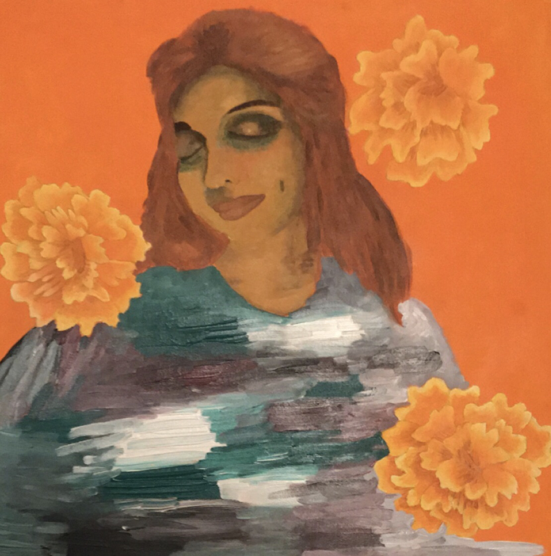
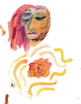
Title: ¿Sale el Sol? 1 & 2
Size: 60.69 cm X 60.69 cm
Medium: acrylic on canvas
Completion Date: August, 2018
Size: 60.69 cm X 60.69 cm
Medium: acrylic on canvas
Completion Date: August, 2018
Exhibition Text
¿Sale el Sol? Is a two part portrait series largely inspired by Paul Gauguin’s Brooding Woman, and Igon Schiele Self Portrait with Physalis and Daydreaming Woman. A focus is taken in Gauguin’s coloration and Shiele’s brush strokes. The purpose is to portray a different version of tranquility which defies the preconceived notion of what it is suppose to look like.
Research/Inspiration
Egon Schiele
Although Egon Schiele’s life was short lived he has had a lasting effect on the art world as huge contributor of Expressionism. Although Egon Schiele started his career off as apprentice of another famous Austrian artist, Gustav Klimt, he soon left behind those stylistic qualities. Soon Schiele became more engrossed in distorted figures and rash brushstrokes than the geometric shapes that Klimt was more familarly known for. It was a new era for Schiele who came to explore darker and mature content. Not only did he start painting and working with more sexually explicit themes. As well as imagery that dealt with pain such as bruised and controrted bodies. Overall he became an a symbol of sexual exploration and expressing bold emotions.
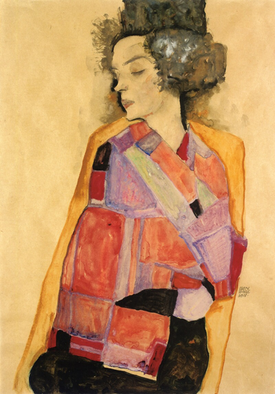
In The Daydreamer, there is still reminents of a Klimt influence but the emotions that Schiele liked to portray begin to appear. The qualities that stand out to me in The Daydreamer, is the female subjects positioning, she is resting but her neck seems to be elongated. As well as the blanket that she has wrapped around her seem to bring a sense of comfort. That is the main feature that I wish to mimic from this piece.
In The Daydreamer, there is still reminents of a Klimt influence but the emotions that Schiele liked to portray begin to appear. The qualities that stand out to me in The Daydreamer, is the female subjects positioning, she is resting but her neck seems to be elongated. As well as the blanket that she has wrapped around her seem to bring a sense of comfort. That is the main feature that I wish to mimic from this piece.
Schiele , Egon. The Daydreamer. 1911.
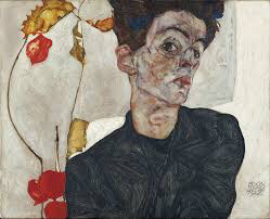
Now as for Self Portrait with a Physalis, the main component I want to try to mimic is Schiele’s sharp brushstrokes. These brushstrokes not only distort the face but they give off the idea that the subject has a lot going on mentally, they are distraught. It seems from just analyzing the painting that there must be physical texture in the canvas to achieve this look and a lot of altering with distinct colors will be needed. Still through using this I hope to be able to convey my message better.
Schiele, Egon. Self Portrait with Physalis. 1912, Leopold Museum, Vienna, Austria .
Paul Gauguin
|
Among the many titles Paul Gauguin takes, from symbolist to the civilized savage, trailerblazer is the one that resonates most. He Inspired many movements after him such as Fauvism and even big name artists like Picasso. He is known for his bold use of unnatural colors and his affinity for the Tahitian island. Still it is the thinking behind his famous paintings in the south seas that really inspires.
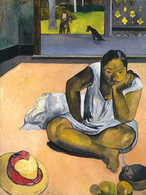
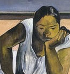
In Brooding Woman by Gauguin there are reoccurring elements. The first is the use of a Tahitian, native woman, as his subject portrayed in a indifferent or brooding. Most notably Gauguin’s time in Tahiti was marked by his public persona raving about the tranquility of the paradise that is Tahiti yet never being more than an outsider. Now while I won’t be using a native woman of Tahiti I will be using myself to interpret tranquility. Moreover there is his distinguishable coloration of the women, warm toned, dark skin woman who seems to glow. As well as he tends to stay in a color scheme that is warm. As a Mexican woman I will also be using this same color scheme since it seems to compliment tanner and dark skin. Especillay since for most of fine art history, woman of color aren’t present. Still as I am the subject, I hope to remove the romantization or exoticofication of race that Gauguin as a white man would employ. Overall those are the key elements I want to mimic from Gauguin. |
|
Gauguin, Paul. The Brooding Woman . 1891, Worcester Art Museum .
Planning
|
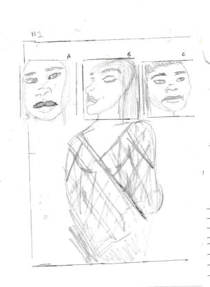
This first sketch is suppose to be my face portrayed in different angles. I needed to portray tranquility but tranquility has many faces. The middle face portrays tranquility as we usually relish it as, eyes closed in euphoria. Still the left and right one are more realistic portrayals that show the indifference or brooding look usually defined by tranquility. The state of tranquility is most usually seen after a spike in stress or anger or excitement, so I wanted to make sure the residue of those emotions were still present. In the end I decided that the first one (a) and the middle one (b) most aligned to what I wanted and they would become the guide to the reference pictures I would take.
|
|
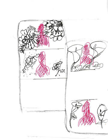
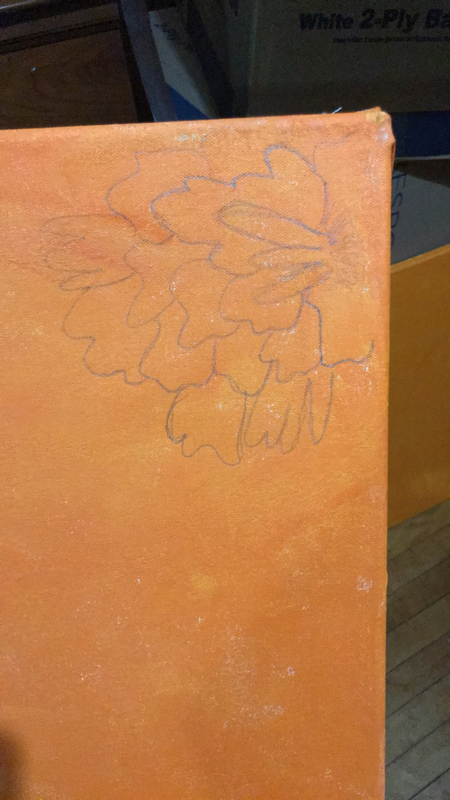
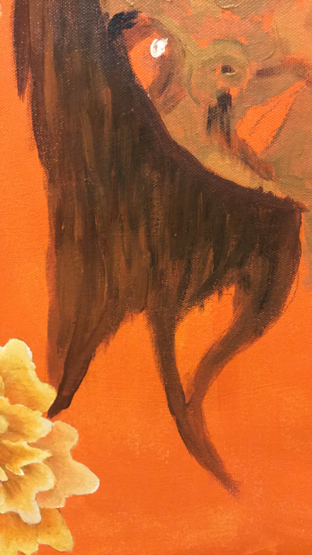
The second sketch was making the decision on how to create the background. I wanted there to be a sense of unity between both portraits, so I knew I wanted imagery that was the same in both. That is when I decided I could also creat unity between some of my earlier work. Such as my first self portrait, Mujer, or my block print, Calla Lily in Flames. One utilizes the tradition Día De los Muertos Flower, Cempazuchitl, the other a Calla Lily popular imagery in Mexican Artist, Diego Rivera’s work. With all of this in mind I believed that the Cempazuchitl best aligned with my message of tranquility, since tranquility is usually aligned with enlightenment, which is the flower’s purpose ,to light the path for the dead returning to the living world. As well as my first self portrait included it so it seemed to keep the idea going and create a motif in my work. I also decided to do them more large this time to give them that guiding presence and to also showcase the idea of, what’s on my mind. Meaning the less flowers present the more tranquility the more flowers the less tranquility.
|
|
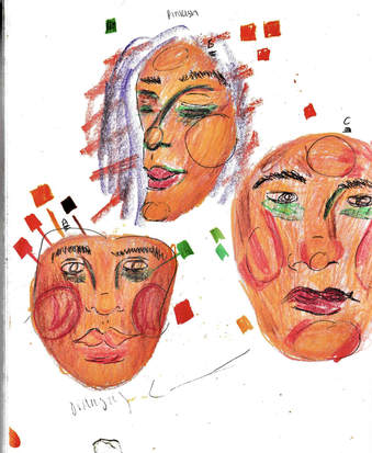
The third set of sketches helped me figure out coloration and brushstroke but with color pencil. I needed to combine the warm skin tones and primary tones of Gauguin with Schiele’s rough strokes. For this I knew I needed two colors that would really help distinguish more rough brushstrokes, red and green. There colors would be used in defining facial feature such as the eye bags, inner eye area, cheeks and chin. Basically areas with darker value would get a more unconventional look closer aligned with Schiele’s expressionist look. Still the midtones and highlights would have the warm and glowy look that’s Gauguin’s Tahitian subjects are known for. Over all look b and c seem to best show both of the inspirations I have but still look very unique to me.
|
|
This final sketch was my attempt to understand the application of color but by using watercolors. I wanted to see if this would be a medium I would rather use than acrylics. Now while it did create the coloration I wanted, it did not give the texture that the rough brush strokes Schiele’s work has. As well as I wanted the Cempazuchitl to have a more glowy and yellow-tones hue look that attracted emphasis which I couldn’t achieve with watercolor. Still this little exercise did help me start to understand how I would go about applying colors onto my canvas but with acrylic.
|
Process
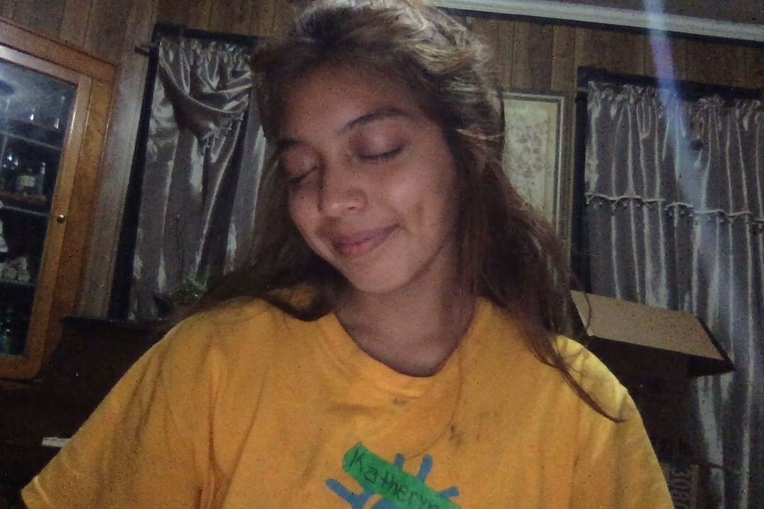
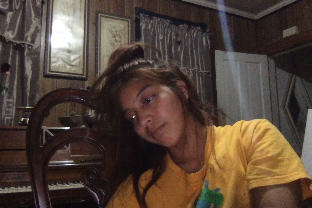
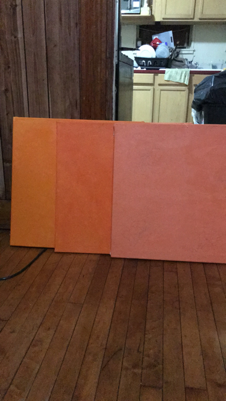
1.To begin the process for both portraits, I started by taking the reference pictures of what I wanted. For the first, I wanted the euphoric qualities tranquility is known for. As for the second one, I wanted the idea of tranquility that usually exists, one that comes after a stressful night. Afterwards I used a large flat brush to coat my canvas in two distinct hues of orange. This was to align with the hues that Gauguin usually uses in his background, warm colors. Then I projected the images of myself onto the canvas and traced myself to finally be able to start to paint.
Click to enlarge pictures
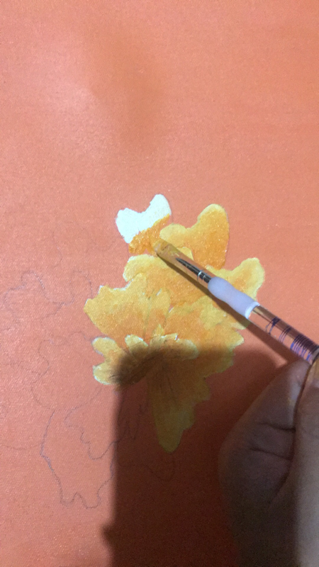
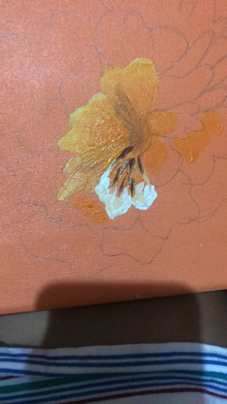
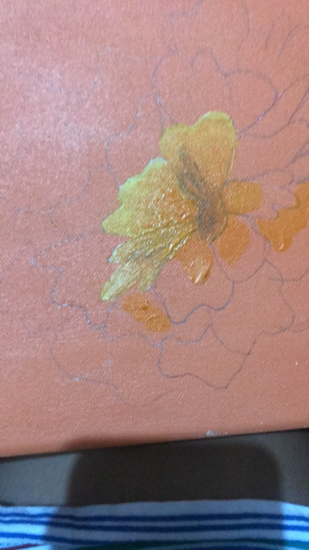
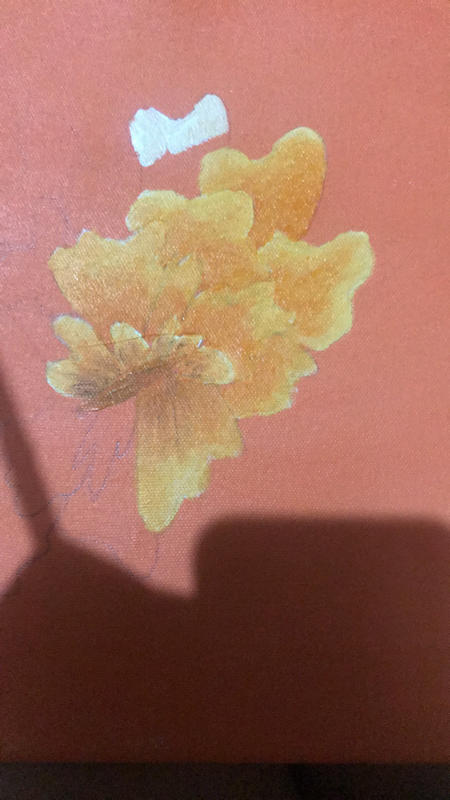
2. The second step for both portraits was creating the Cempazuchitl filled backgrounds. To do this I first drew in the flowers lightly with a pencil. Afterwards I would used a number 4 flat brush to coat the edge of the pedals with white and the centers with orange, which I would then blend out. This gave the flowers a realistic quality whivh I was able to create more efficiently since in my self portrait, Mujer, I was able to experiment with what worked well. The only distinguishing quality between both portraits was that one had more flowers than the other. This was to show the residue of stress present that led to the tranquility. This made sense since lack of space usually correlated to a feeling of pressure or stress. The more euphoric looking portrait contains less flowers since this is suppose to be the ideal portrayal of tranquility.
Individual Portrait
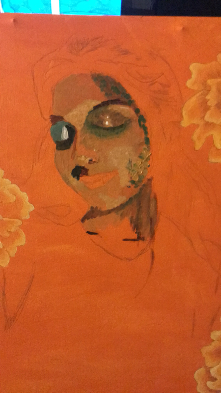
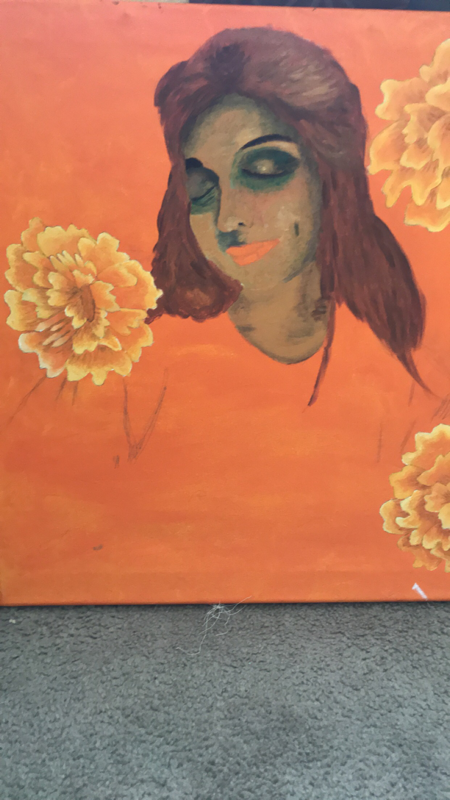
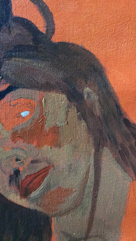
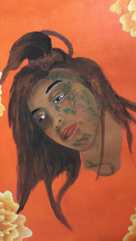
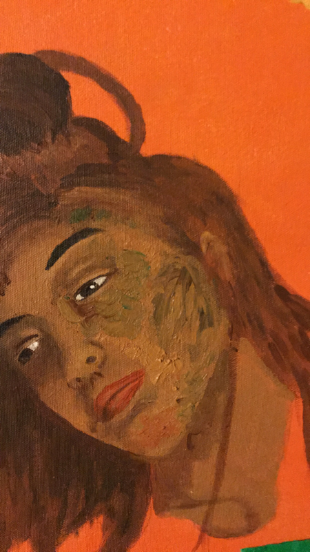
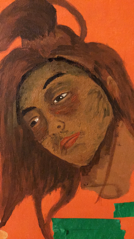
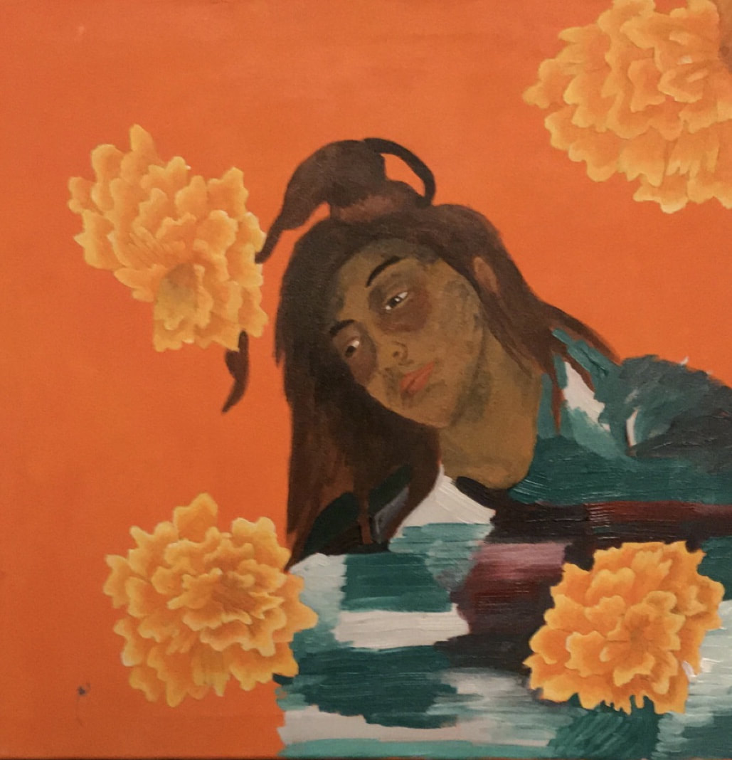
I began by working on the more realistic portrayal of tranquility. The positioning of my face is trying to resemble Gauguin’s Brooding Woman,” since this gave the indifferent look I believe tranquility to more closely resemble. To start I created a skin tone using a heavy amount of yellow, brown, red and white, which I added more brown or white to create the highlight, mid tone and darkest tone. When I traced my portrait I laid out where these tones would go, so I relied on those guidelines. After doing my first wash I went back to each Individual area and added another layer which I blended a lot more heavily. Still after this layer I realized I needed to start adding more rough brush strokes. To do this I started adding green and red to the darker areas. Meaning under the eye bags I would apply thick lines of green. Still I kept blending too much since the thick lines I kept applying didn’t give off the textured quality that Shiele’s brushstrokes have. This is when I realized I needed to work with more texture. This is when I added much more acrylic paint to work with and put red or green paint right on top of that. When I started working in this fashion I realized the rough brushstrokes were much more present since there was texture. Once the face was was finished I worked on details like hair and mouth since they had more red and brown warm tones. As well as I didn’t want those areas to have as much of the rough texture that Schiele does. Then to finish off I painted the shirt, which although originally yellow, I gave a more pattern look to not only resemble Schiele’s The Daydreamer portrait but also look like a serape blanket my mom owns. This would help align with my Mexican culture more since I’m already using the Cempazuchitl. Overall creating this portriat was very intresting since I had to work very hard to paint in a way out of my comfort zone.
Individual Portrait
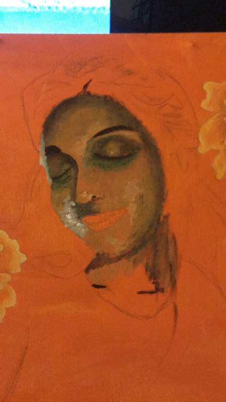
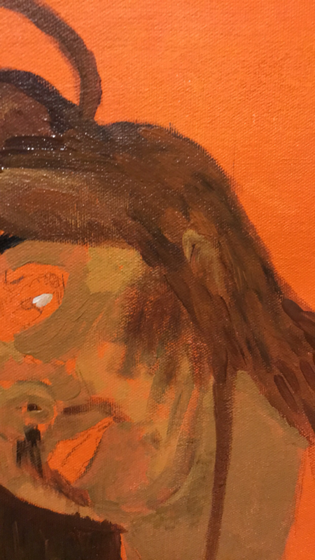
For the second portrait I followed the same procedure for the first except the coloration is less heavy and dark. To start off I created a skin tone that I then added brown to get a shadow and white to get a highlight. I then laid out all the tones in their designated areas to get my first wash. As I did in the first portrait I went back in and did a couple layers where I blended. For this portrait I wanted a clear resemblance to Gauguin, so I wanted to get the warm, glowy, skin tone as correct as possible. Then I moved forward with Schiele’s brushstrokes by adding green to the darkerst areas. Still for this I used my brush in different directions like a crosshatch motion, with one stroke green and then skin tone. As well as I added more red to the cheeks but more smooth to create a blush look rather than rough brush strokes. Afterwards I worked on the hair, lips and neck making sure to get those finishing details clean. For the hair I first did strokes that showed in what direction the hair was moving. After I added copper red and brown in the same directions as those I had laid out according to the values in my hair. Then to finish off I did my shirt and again I decided to make it look more like a serape, pattern. I really wanted to make sure that both portraits looked distinguished in coloration since this one in particular is suppose to have a lighter feel.
Experimentation
Click to enlarge pictures
When creating both portraits I knew I really wanted to get out of my comfort zone to create something that looked different from my first portrait. With that in mind I knew Egon Schiele’s style would be a good way to weave new stylistic qualities into my painting without sacrificing my inspiration of Gauguin. In this more tranquil portrait, I dive into making more bold color choice. Now Gauguin himself used unnatural colors but in my previous portrait, Mujer, the only way I ventured into this was in the skin tone. Still this time I decided to utalize green and red to create a more extreme and bold look on my face. Adding the green under my eye and red to my cheeks added emphasis to the features that showcased the tranquil quality I wanted to portray. I also feathered the color more than just doing rough brush strokes so in thsi portrait it does have a softer feel. Overall this was just the beginning in trying to really push myself to do something different.
Click to enlarge images
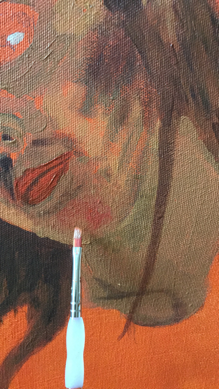
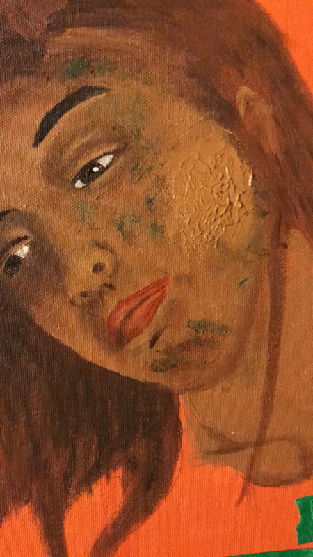
For my second portrait I decided to channel Schiele more and really experiment with paint to create texture, something very new to me. To achieve this I had to first realize that I was blending way too much. At that point I had to find a way to force myself to use more paint. That’s when I decided to take the flat rounded side of a plastic spoon and dip it into my skin tone and directly add all that paint to the canvas. Then I would use either my number 8 or 4 flat brush with a green or red hue and make strokes onto the excess paint. I would do this in areas like the cheeks, in the inner and under eye and chin where it would make the facial features look more brooding. This took a lot of time and work to achieve since it easily could just look messy and not purposeful. In order to get a satisfying look I had to do many layers ontop of each other. In the end I think this made this portrait much more distinguishable from its partner.
Reflection

Click to enlarge images
SuccessesIn creating both these portraits I came to see my artistic style develop in a way I didn’t think it would. To start off I think working with unnatural colors such as green and red really added additional feeling to my work. I largely wanted my influence for Gauguin to be more present than just a glowy skintone and knew I had to take more of a risk. The tiny difference in how much of the color I used in certain areas or the value of the hue made all the difference. For example in the more realistic portrayal of tranquility, the red hue is much darker in the eye area and the green hue is placed on the cheeks to give the face a more drained look. Meanwhile in the more euphoric portrayal the cheeks are flushed and although the eyes are a little exhausted the green emphasizes they are closed in quiet peace.
Another success I would say is the continuation of the Cempazuchitl in my work which I believe has created a motif or reoccurring imagery that connects my work. Not only did the flowers turn out better than I expected, with just the right amount of realistic qualities but the message comes across too. In the more euphoric portrayal the flower seems to fit right in with just the right amount while the more brooding portrait the flowers seem bothersome. I think this allowed me to find my style and see what seems to be working for me across all my artwork. The final thing that I enjoyed about both portraits is how the positioning of the faces do look heavily inspire by Gauguin and Schiele. In the brooding portrait it is clear that it was inspired by Gauguin’s Brooding Woman, just by how indifferent the entire body language is. Then for the more euphoric one it definitely has the same peaceful quality that Schiele’s The Daydreamer has with the head tilted and the eyes closed in peace. As well as both have the some connection to the rough brushstrokes in Schiele’s Self Portrait with Physalis. |
ImprovementsThe first improvement would be the serape, that I added in, it seems too artificial. By that I mean it’s almost like you can tell it was not there before instead of being a blanket wrapped around me. Now the serape was something I thought to do after I had taken my reference picture, so next time I want to actually take my pictures in it. That way instead of freehanding the design I actually have the correct pattern to work with.
Abother improvement I would like to make would be my use of texture in my piece. From the start I knew I would have to apply paint on to the canvas in the rough brushstrokes, that go varying directions, which Schiele is known for. Still I did not realize I would have to build some sort of physical texture to get something that looked remotely similar. I think for my first time it came out alright the general principles are there, vary lines of paint and layers of paint on top of each to create texture. Still there is something missing, the texture seems incomplete or just unnatural in some areas. So next time I would probably go and do a lot more layers and maybe different colors to layer with the skin tone. Overall Schiele was a tough inspiration to combine with Gauguin for the simple fact that they had very different color schemes. Gauguin worked with warm colors, which I’ve worked with before, but Schiele stuck to cool colors and never used woman of color as subjects. This made it hard for me to mimic his style because I wasn’t sure if using the same colors he used on pale woman would be effective on a tanner skin tone. That was when I had to really make my own decision which worked out but they could have been better. |
ACT Connections
1) Clearly explain how you are able to identify the cause-effect relationships between your inspiration and its effect upon your work?
My first inspiration was Gauguin and the effect he had on my work was my use of bold and unnatural colors. As well as his long running theme of tranquility was something that inspired my take on tranquility. My second inspiration was Egon Shiele who used rough brush strokes that served as a foundation for my use of texture and rough brush strokes.
2) What is the overall approach(point of view) the author (from your research) has regarding the topic of your inspiration?
The authors of my research continue to be objective in explaining the artistic style of Egon Shiele and Paul Gauguin. Still Walther researcher for Gauguin is more in depth in his explanation of Gauguin’s work coming off as a true expert.
3) What kind of generalizations and conclusions have you discovered about people, ideas, cultures, etc. while you were researching?
A conclusion I was able to come across on is how transformative color can be in directing the message of a painting. Of course using certain colors give certain meanings like a red background could mean danger. But it is when using color subtlety to make an entirely different color scheme that the intention is much more effective.
4) What was the central idea or theme around your inspirational research?
The theme that inspired my research was the idea of tranquility and the many strings attracted to it. I wanted to show that tranquility does not always look euphoric or aesthetically pleasing.
5) What kind of inferences (conclusions reached on the basis of evidence and reasoning) did you make while reading your research?
The big inference I was able to make is that people are a product of their surrounding. Gauguin lived in what he believed to be paradise in Tahiti but he could never call it home so he always looked for that tranquility in his subjects. As for Shiele he was the apprentice of Klimt, so in order to break out of that style he worked with the most unconventional subjects and unconventional ways of depicting them.
Bibliography
sources:
Cooper, Douglas. “Paul Gauguin.” Encyclopædia Britannica, Encyclopædia Britannica, Inc., 3 June 2018, www.britannica.com/biography/Paul-Gauguin.
Gotthardt, Alexxa. “What You Might Not Know about Egon Schiele.” Artsy, 2018 Artsy, 4 Jan. 2017, www.artsy.net/article/artsy-editorial-cult-egon-schiele-persists-today.
Walther, Ingo F., and Michael Hulse. Gauguin, 1848-1903: the Primitive Sophisticate. Taschen
images:
“Egon Schiele, Self-Portrait with Physalis | Masterpieces of the Collection | The Leopold Collection www.leopoldmuseum.org/en/leopoldcollection/masterpieces/36.
Schiele, Egon. “The Daydreamer (Gerti Schiele), 1911 - Egon Schiele.” Www.wikiart.org, Wikiart.org, www.wikiart.org/en/egon-schiele/the-daydreamer-gerti-schiele-1911.
“The Brooding Woman .” Worcester Art Museum, Worcester Art Museum , www.worcesterart.org/collection/European/1921.186.html
