
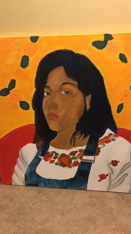
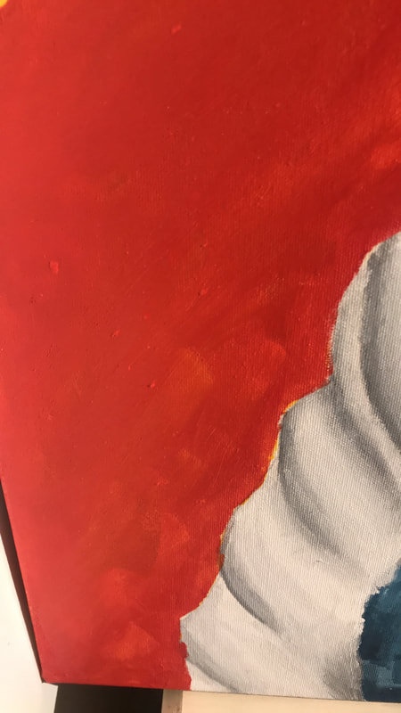
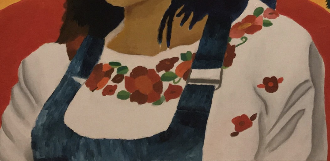
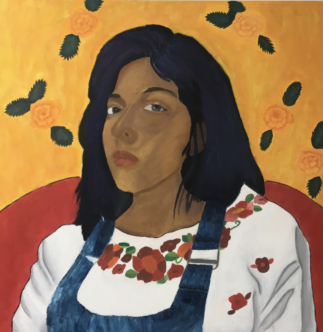
Title: Mujer con Flores
Size: 91 cm by 91 cm
Medium: acrylic on canvas
Date: November 2, 2017
Size: 91 cm by 91 cm
Medium: acrylic on canvas
Date: November 2, 2017
Exhibition Text
Mujer con Flores is a self portrait that was suppose to portray the theme of strength; more so it is suppose to be an ode to the strong Mexican females in my culture despite the prevalent machismo. The theme is largely inspired by Laura Cisneros classic Chicano book,” The House on Mango Street”. It is a painting influenced by the post-impressionist painting techniques and color scheme of Gauguin’s Women with Flowers.
Inspiration
“She was a horse woman too, born like me in the Chinese year of the horse – which is supposed to be bad luck if you're born female – but I think this is a Chinese lie because the Chinese, like the Mexicans, don't like their women strong.” (42)
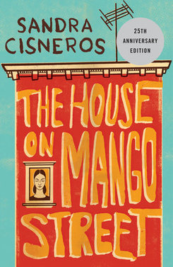
Cisneros, Sandra . The House on Mango Street. Arte Publico Press, 1984.
At first I looked at my Mexican culture as a source of inspiration more than anything because I wanted to explore my culture. As a Mexican-American you live your culture unconsciously but getting to mindfully see it through art was intriguing. Still a pattern in my work has come to my attention; the pattern being that as much as I take from my culture it’s not necessarily celebrating it but criticizing it. This was something I wanted to continue in this piece since my long breaching theme is to challenge a preconceived notion. Still it is important to understand that I can be critical of the culture because as much as I am part of it, I am also equally (or more) an outsider to it. That hyphen in my culture really was what I wanted to pay attention to.
This time around I wanted to take inspiration from literature, especially since in my Native Spanish class the Mexican-American author Laura Cisneros was brought up. We only got to read an excerpt of her classic piece of Chicano Literature The House on Mango Street; but it is within one quote in that book that my theme derives from. The quote goes,”she was a horse woman too, born like me in the Chinese year of the horse – which is supposed to be bad luck if you're born female – but I think this is a Chinese lie because the Chinese, like the Mexicans, don't like their women strong.” (42) It was then that my theme became empowerment, empowerment of the mexican female. I really wanted to showcase features of the strong woman that I had grown up with, such as my mom and my grandma. That was really where I started to make clear decisions about how my portrait would incorporate my culture.
This time around I wanted to take inspiration from literature, especially since in my Native Spanish class the Mexican-American author Laura Cisneros was brought up. We only got to read an excerpt of her classic piece of Chicano Literature The House on Mango Street; but it is within one quote in that book that my theme derives from. The quote goes,”she was a horse woman too, born like me in the Chinese year of the horse – which is supposed to be bad luck if you're born female – but I think this is a Chinese lie because the Chinese, like the Mexicans, don't like their women strong.” (42) It was then that my theme became empowerment, empowerment of the mexican female. I really wanted to showcase features of the strong woman that I had grown up with, such as my mom and my grandma. That was really where I started to make clear decisions about how my portrait would incorporate my culture.
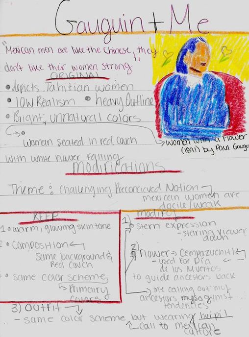
The first thing I decided to do to align with my culture was wear something traditional. At first I thought of doing the obvious and wearing a huipil. I thought I would go all out and also wear the traditional skirt and rebozo (shawl) that goes with it. Still that felt forced, I wanted something that said this is my culture but it isn’t just a costume I occasionally put on, this is something I carry around all the time that I am unconscious of. That’s when I decided that this could be better done if I just wore the huipil with a skirt or jeans; in the fashion that I usually wear them.
The other aspect I wanted focus on was my skin tone because that is the mark of what most Mexicans are mestizos; part indigenous, part Spanish, and most of all ambiguous to race. This is something that for me personally as someone who has colored eyes but neither a light or dark complexion thought was important to acknowledge; as well as a call to my culture.
The final thing I wanted to take away from my culture was the stern look of a Mexican woman. Now while I don’t think this is unique to Mexican woman, universally I feel like all women have this specific look, I thought it was important to note. Especially because I feel like the strongest and most empowering person in a Mexican family is the mother. There is just something about the look that a Mexican mom can give you that could have you on your knees begging for mercy. That being said this was definitely something I wanted for my own expression my portrait.
Paul Gauguin: Post-Impressionism
|
|
|
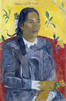
Gauguin, Paul. Vahine no te tiare. 1891, Fondation Beyeler, Riehen.
|
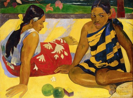
Gauguin, Paul. Parau api. 1892, Fondation Beyeler, Reihen.
|
Paul Gauguin is known for his work in the realm of post impressionism. He known for his obsession for feeling in his work; he believed that a subject could reveal this through color and composition. He even said about the impressionist of the time that,” they look for answers with the eye, not in the mysterious depths of the soul”(). This really comes into play into his work that he made while living on the island of Tahiti. It is here where he paints many of the local woman where most of them give off a relaxed yet mysterious aura. It was looking at his painting of Tahitian woman specifically portrait Vahine no te tiare and Parau api that I decided that certain aspects of Gauguin would work best for my own portrait.
The first thing I wanted to utilize from Gauguin style is his use of color especially the domination of primary colors. Especially since red and yellow are warm colors and evoke a feeling of warmth and fire that I really wanted to be presented in my painting. As well as his use of complementary colors in order to brighten up his pieces. Complementary always tend to be a cool color and warm color. That dynamic is the reason why those colors go together since they counterattack and balance out a piece; the warm can bring attention to the cool or vice versa. This seems to be how it is used in both of Gauguin pieces, adding a sense of tranquility and simplicity but there is still something of about the balance that draws you in. Keeping that in mind that was the color scheme and more than anything the tones I wanted to stick to.
The second also has to do with his use of color but more so his creation of skin tone. Skin tone is something that has to be showcased very dramatically for my portrait to show my culture. Gauguin is someone who worked with medium to darker skin tones and is able to expertly create very warm tones that still have variety to them. Another thing still related to the skin color is his ability to not just use of rich warm tones but also his ability to have undertones that made his figures glow from the inside out. It has more to do with his use of value; where he is able to have dramatic highlights yet have smooth transition into darker values in the skin, that seemingly seem to be blended but not quite is something I’ll be implementing as well.
Howlett, Margaret, editor. “Search for Paradise.” Gauguin : Working With Color, 1989, pp. 6–7.
Planning
|
|
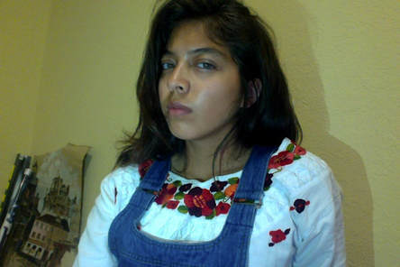
The first step I decided to take is photograph myself in the outfit I had laid out- white huipil with collar embroidery and jean jumper. I did this since I knew I wanted the same composition as Gauguin’s Woman with Flowers; doing that first allowed me to understand how I would modify the piece after I knew how my body was positioned.
Every couple of photographs is taken at different places in my home and in each I test out different lighting methods. For example the ones with the green background are just natural background lighting, nothing manipulated. Those do have warm tones in my skin but the expression lacks the sternness that was an absolute staple in this piece. In the dark background, I decided to turn the light off in my room and angle a lamp in my room, as an attempt to manipulate the lighting. This in fact produced more dramatic looking expression but the color in my face seemed to washed out and yellow. The last set of photos use the lights in my room, followed by me angling my phones flashlight, in multiple fashions. This is where after multiple trials I achieved a photo that had a strong expression and warm skin tone. As well as I feel that my body positioning in that photograph is the least awkward and exudes the most confidence. |
Final Photograph
Sketches: What Am I Changing
|
|
|
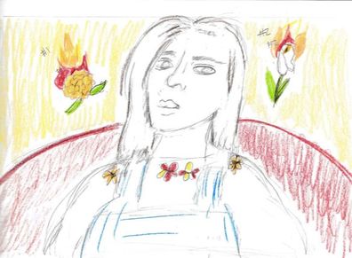
The first sketch I created was taking into account the final photograph of myself. I roughly drew myself but with the Gauguin primary yellow background and red couch. The other thing I did is draw the falling flowers in the background. In this initial sketch I show my debate between using a calla lily or cempazuchitl (marigold) as the falling flowers. I also show my debate between depicting the flowers in flames in order to allude to my block print, Calla Lily in Flames. |
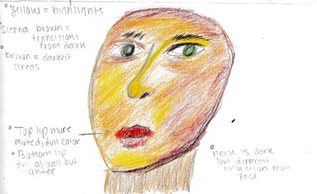
The next portion is a sketch of my face particularly my plans on how to go about painting the face. I have never painted in Gauguin style; while I’ve done baroque style blending techniques as well as the impressionist style of dabs of colors side by side, Gauguin seem like neither but both.
So I decided to map out the shadows and highlight of my face and replicate Gauguin’s coloration with color pencil first. From looking at Gauguin’s Woman with Flowers piece I knew the highlights in the face tended to be golden yellow, while the darkest shadows seems to mimic a rich brown, but most importantly the mid tone, where the transitions were, seemed to be a warm orange that was quite radiant. Keeping that in mind, I made a template of where those different skin tone components would go, to have for reference for when I painted. |
|
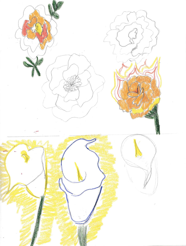
This set of sketches detail my decision making process on whether to use a calla lily or a cempazuchitl. It includes multiple ideas for both flowers from outline of the flowers to color to even shape and position. Still it came down to what made most sense for my theme.
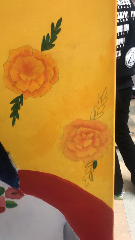
After consideration of both idea I decided that the cempazuchitl, that were not in flames, would make the most sense to use. The first reason was looking back at Gauguin’s work the flowers almost blend into the background. Keeping this in mind I knew if the flames were added they would just blend into the background, which would defeat the purpose of even putting them in. The second reason was the cempazuchitl are a very popular flower to use in Dia De los Muertos alters; their purpose being that as such a bright flower they guide the dead back to the land of the living. I thought using them would not only acknowledge my culture but also be a clear link to my theme of the strength of women, particularly Mexican women. This would show because this idea that Mexican women are made to feel weak comes from tradition, which goes back to my ancestors; hence including the cempazuchitl is sending this message to my ancestor’s misogynist traditions. |
Process
Part 1: Set up
The first thing that had to be done was produce a canvas. This consisted of building a 3 foot by 3 foot frame and then stretching the canvas. I also had to keep in mind that all four angles were at a 90 degree angle, in order for once I put on gesso and it dries the canvas doesn't warp. Next all that had to be done was layout the roll of canvas, cut a sufficient amount to cover the frame. From there I'll I had to do was staple the edges of the canvas onto the frame. Once that was set I could apply gesso, when doing so I had to make sure my canvas was evenly distributed with gesso. Finally I had to let the the canvas dry before I could move onto anything else.
Part 2: Transfer
Click to enlarge
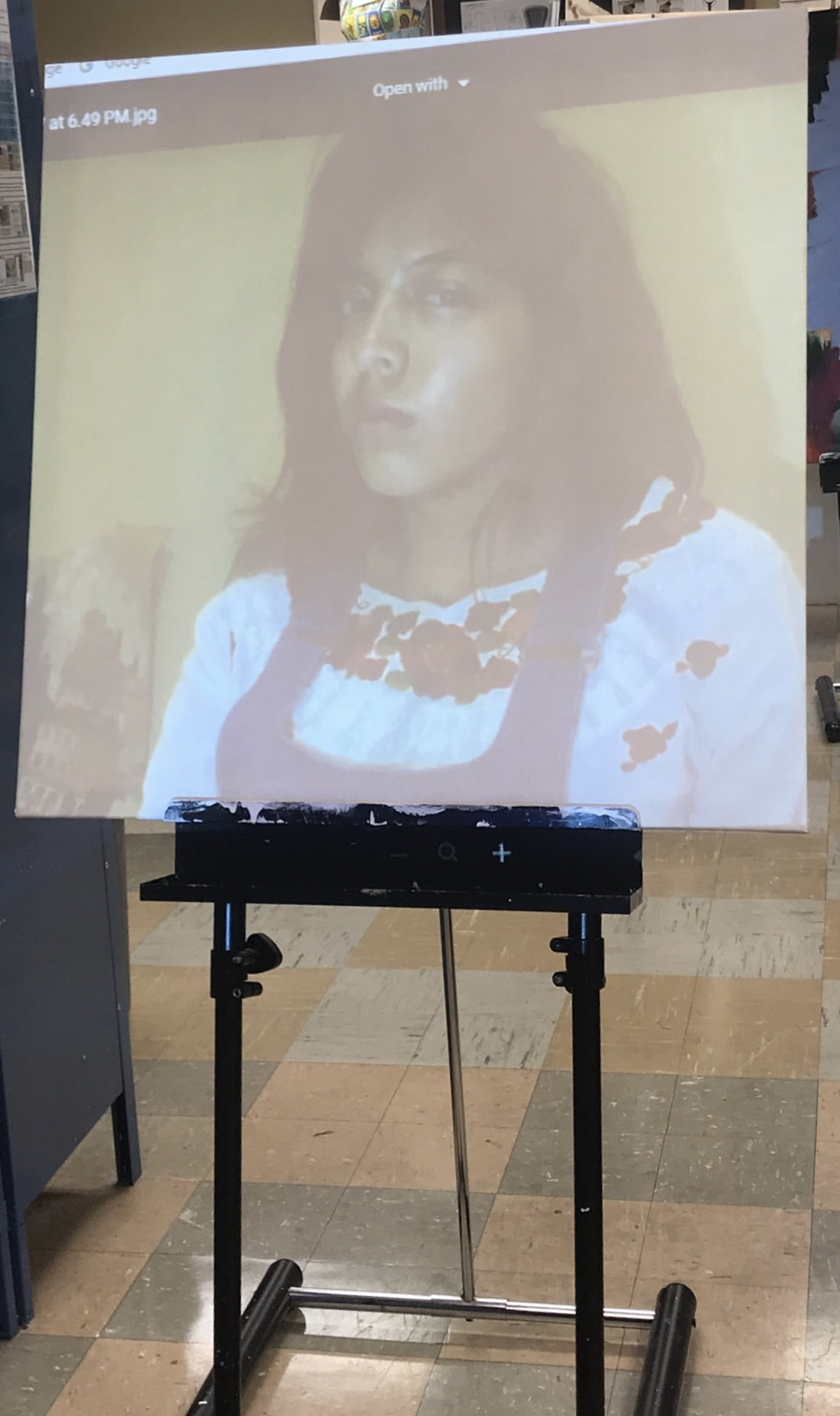
The next part was to project my image onto the canvas in order focus on the coloration of my piece and have an accurate depiction of myself.
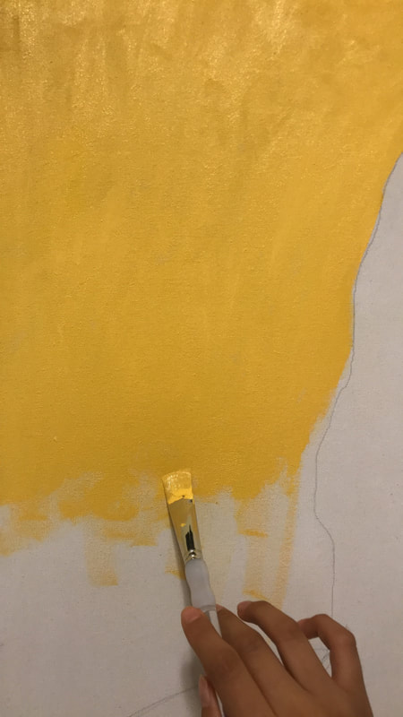
Part 3: Background & Face
Click to Enlarge
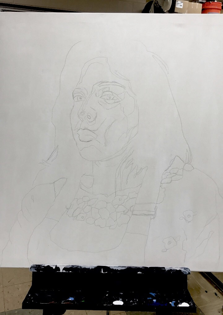
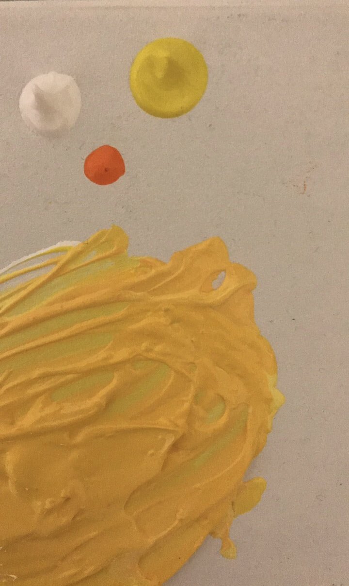
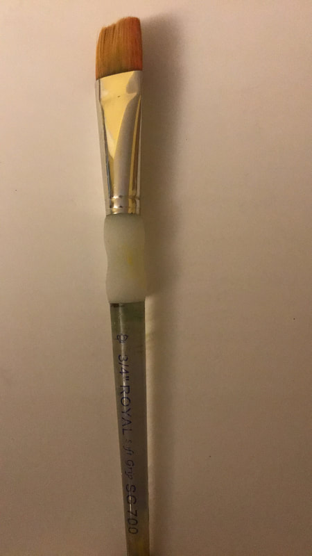
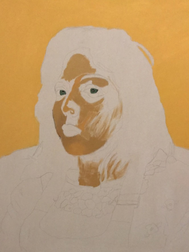
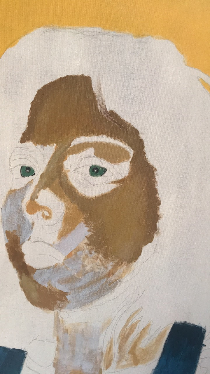
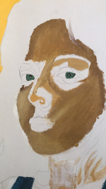
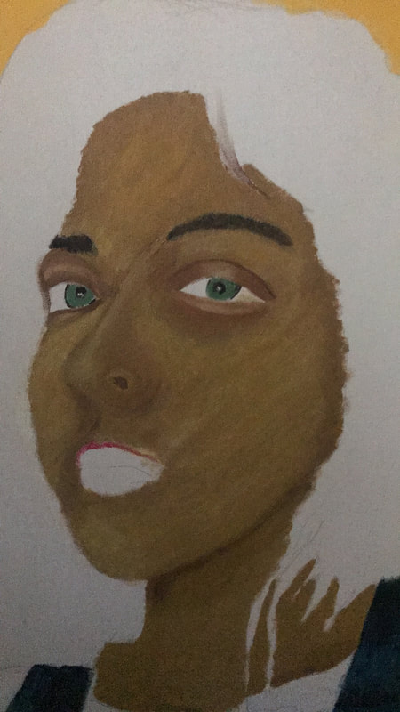
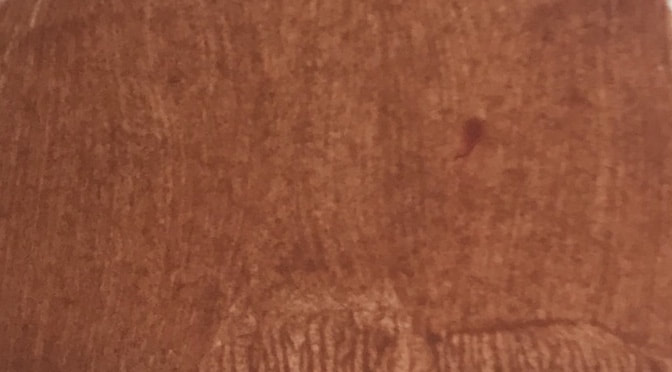
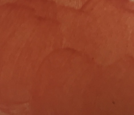
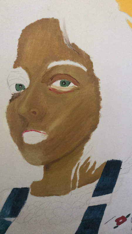
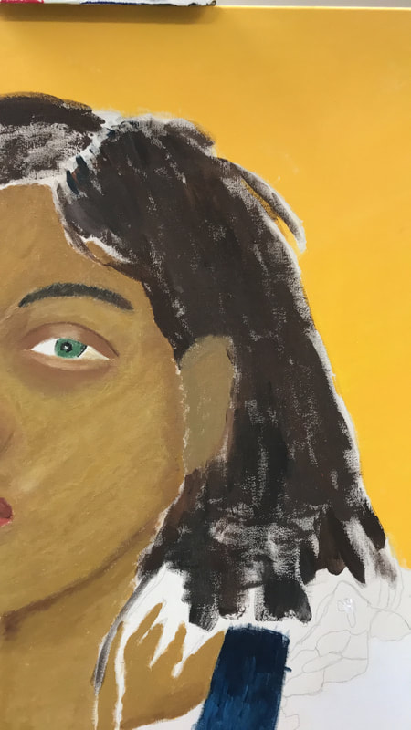
The first thing I did after I had transferred my image was create my background. To do so I mixed primary yellow, orange and white to get a golden, crisp yellow which I spread using a ¾ inch flat brush. After that I initially started painting the face and did a mid tone coat and then began to blend a yellow highlight onto the chin. Once I realized this normal blending technique was not achieving the same look as a Gauguin piece I decided to move on and go back to the face later.
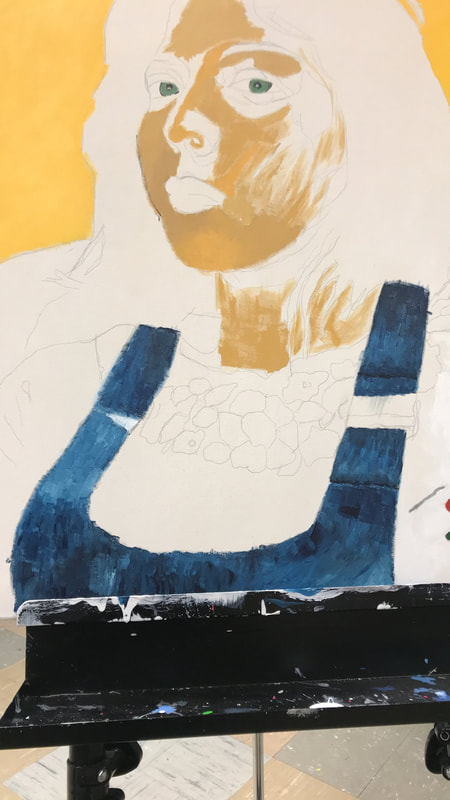
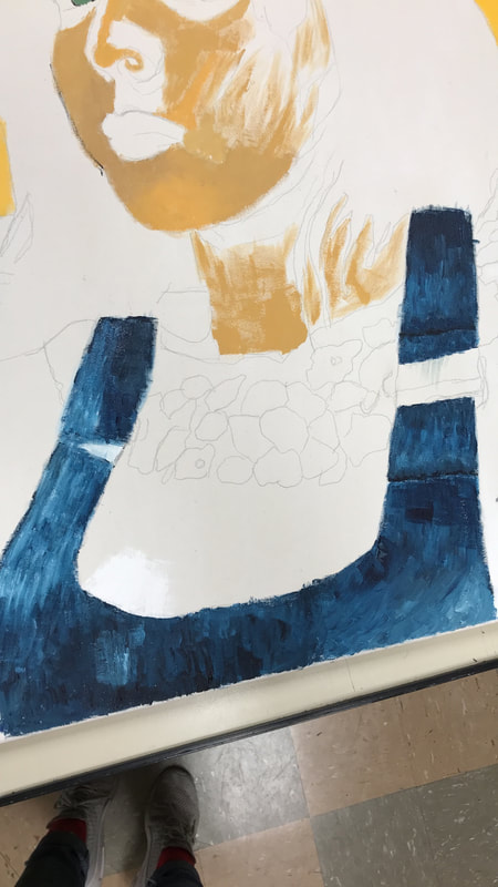
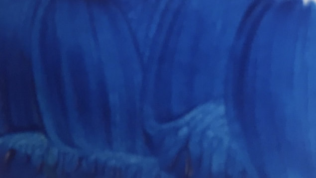
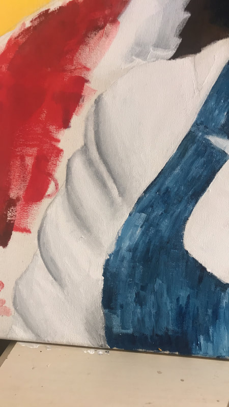
Part 4: Jean Jumper

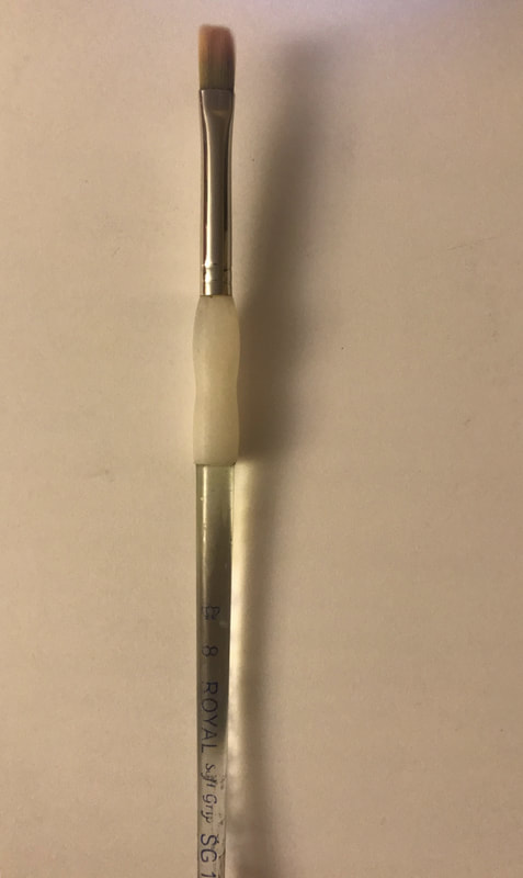


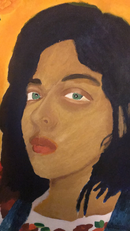
The next part I decided to do was the jean jumper which is where I most discovered how to implement Gauguin techniques for painting. I started off by apply blue tones in varying shades with the ¾ flat brush; after doing so I applied white using the same brush. Another thing that should be noted is that I hardly used water in the process to blend and more so would wipe my brush with napkins and then apply a new color. Then I used the a number 8 flat brush to roughly blend the colors into each other and then create a streaky look by adding more white or blue as I saw fit.
Click to Enlarge
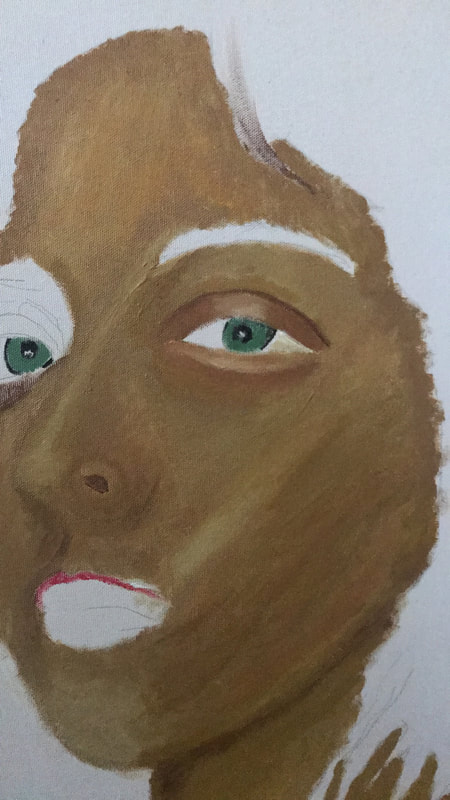
Part 5: Face


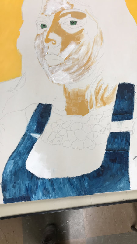
The face of my portrait went through a variety of phases which included skin tone and techniques. The first phase happened after I realized classic blending would not be the best way to achieve Gauguin’s style. So instead of trying to blend two distinct skin tones together with water I went a less conventional way. I instead used one skin tone and applied, straight out of the tube, brown, red, yellow, and white as I saw fit depending if there was more shadow or highlight.
This worked quite well until I realized that the vibrant, glowing skin tone that Gauguin was known for wasn’t appearing in my painting. That was when I started to apply a mix of more golden yellow and red on top of brown or white. This eventually helped achieve a more radiant look to the face.
This worked quite well until I realized that the vibrant, glowing skin tone that Gauguin was known for wasn’t appearing in my painting. That was when I started to apply a mix of more golden yellow and red on top of brown or white. This eventually helped achieve a more radiant look to the face.
Click to Enlarge
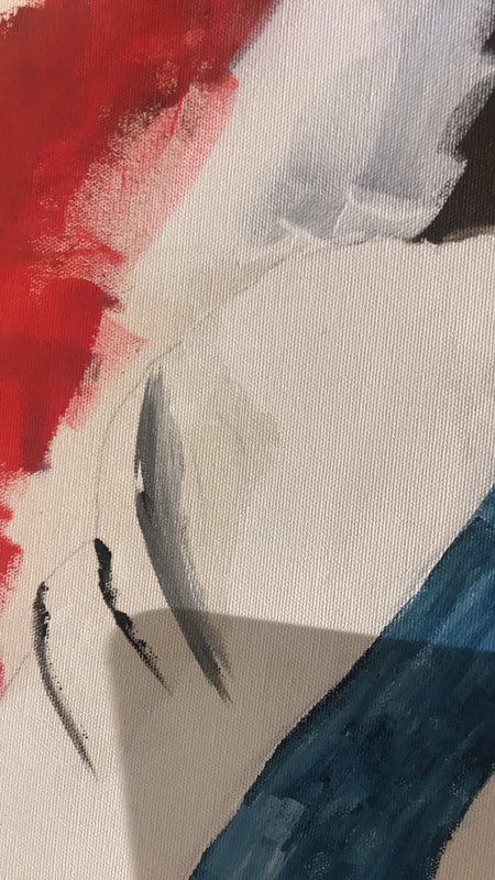
Part 6: Eyes


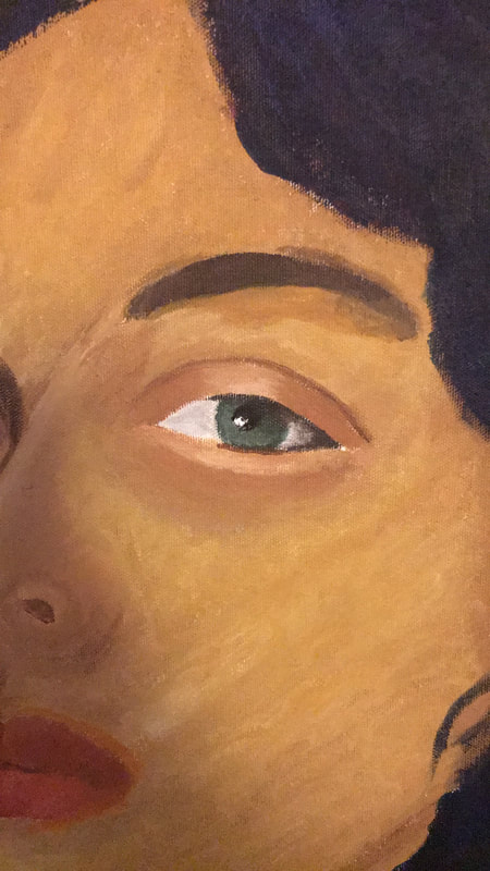
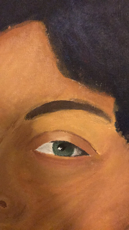
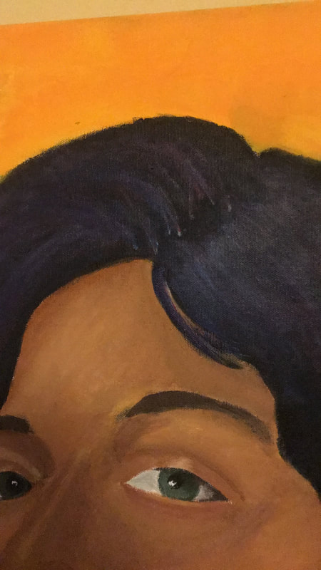
When painting the eyes I took the same route as the eyes, technique wise. Still for skin tone in this area I had to be much more detailed and used more traditional blending when it came to transitioning from the eyelid to the under bag area.
At first for the eye color and eyeball itself I was not as detailed since in Gauguin’s piece he didn’t seem to pay much attention to that area. Still upon closer inspection I realized how important the gaze of a subject is for Gauguin’s pieces. I also realized that if I wanted a stern look to be shown in my piece, the eyes are directly the place where that message will be achieved for the viewer. That is when I decided to do more value gradient in the green in my iris and the surrounding white eyeball.
At first for the eye color and eyeball itself I was not as detailed since in Gauguin’s piece he didn’t seem to pay much attention to that area. Still upon closer inspection I realized how important the gaze of a subject is for Gauguin’s pieces. I also realized that if I wanted a stern look to be shown in my piece, the eyes are directly the place where that message will be achieved for the viewer. That is when I decided to do more value gradient in the green in my iris and the surrounding white eyeball.
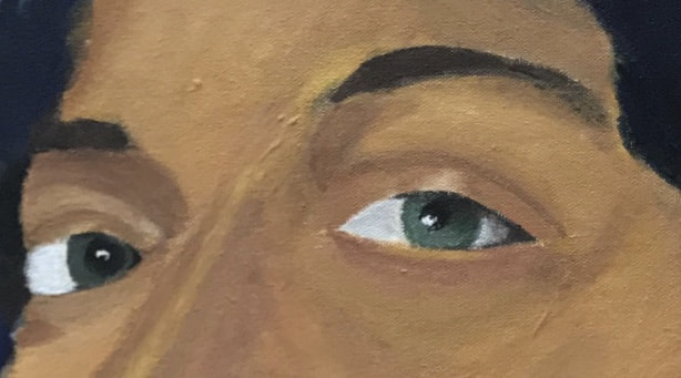
Click to Enlarge
Part 5: Hair


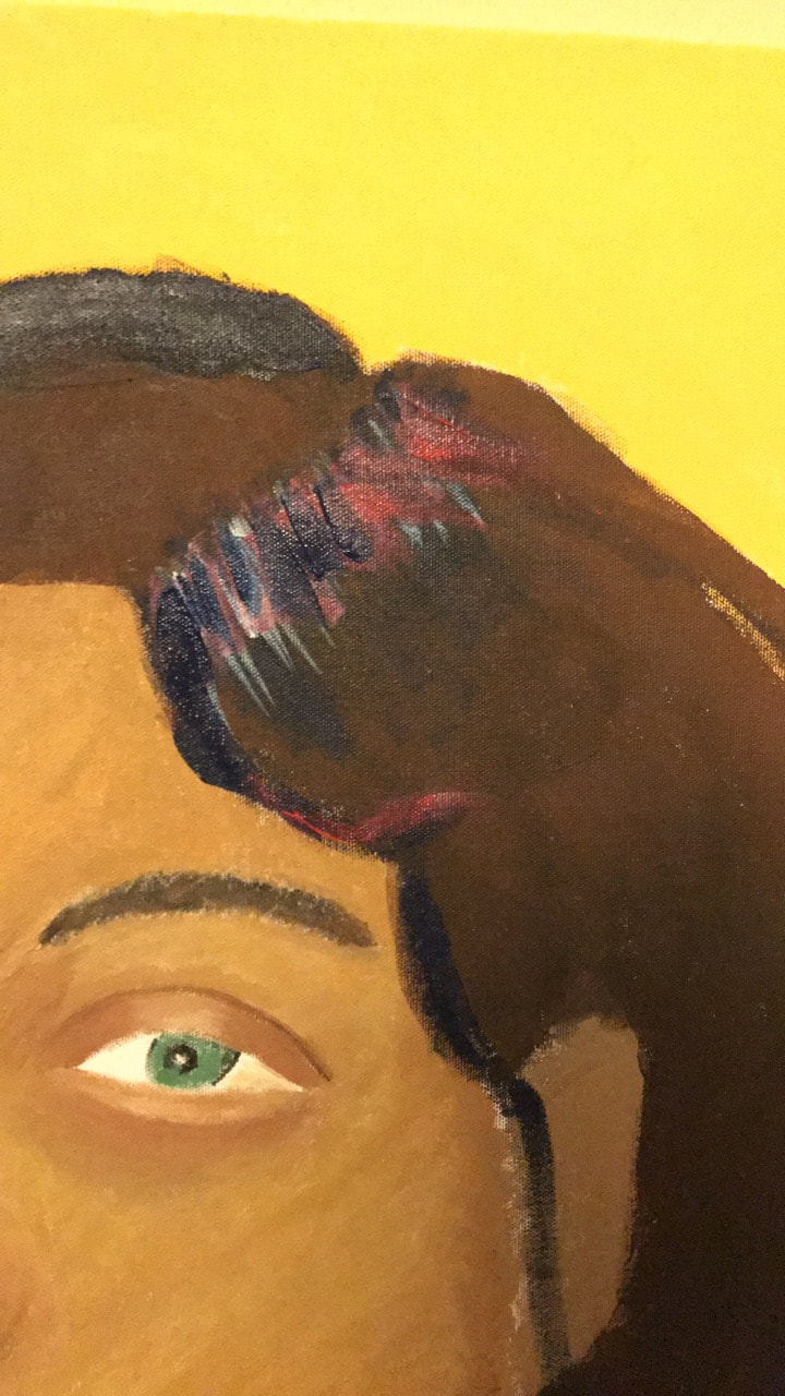
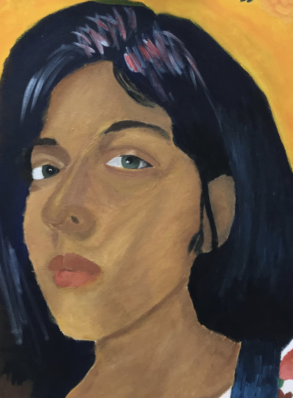
For the hair I had quite some difficulties achieving the same effect Gauguin does in his piece, Woman With Flowers. At first I started off with a rough brown and black base with a ¾ inch flat brush in order to not have the canvas poke through in this area. Then referencing Gauguin's Woman With Flowers piece I saw that the lighter areas in the hair tended to be an indigo, almost purple shade. To achieve this in my hair I would apply white streaks with number 8 flat brush, mimicking the movement in my hair. Then I would take a number 4 flat brush and apply layers of red and mixed dark blue, and blend to achieve a similar indigo color.
Click to Enlarge
missing final pic of whole hair
missing final pic of whole hair
Part 6: Shirt & Embroidery


The first thing I did when trying to achieve folds in the shirt was go over the whole shirt with white paint with both a ¾ inch flat brush and a number 8 flat brush. Then with black from the tube using the ¾ inch flat brush I outlined the folds, then I would interchange both the number 4 and 8 flat brushes to blend out the black until the transition was very smooth.
For the embroidery since Gauguin was known for outlined, flat shapes, I didn’t focus too much on the detail and painted according to color of the flower on the original shirt with the number 4 and 8 flat brushes.
For the embroidery since Gauguin was known for outlined, flat shapes, I didn’t focus too much on the detail and painted according to color of the flower on the original shirt with the number 4 and 8 flat brushes.
click to enlarge
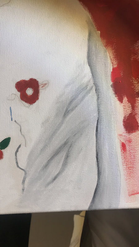
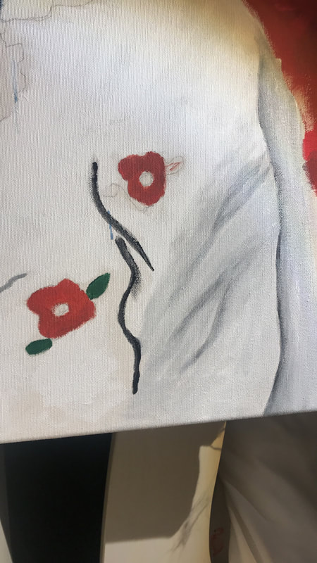
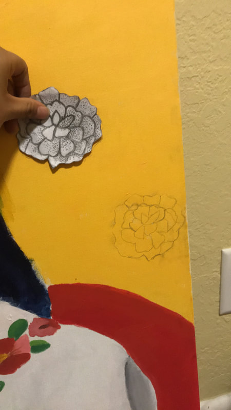
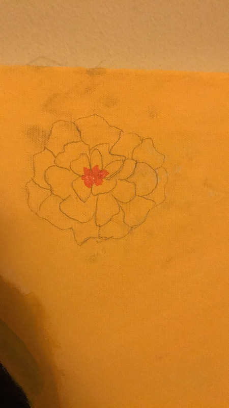
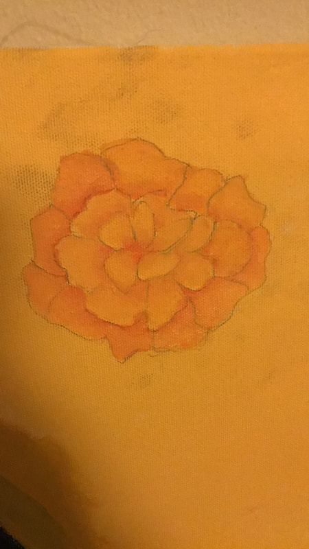
Part 7: Cempazuchitl


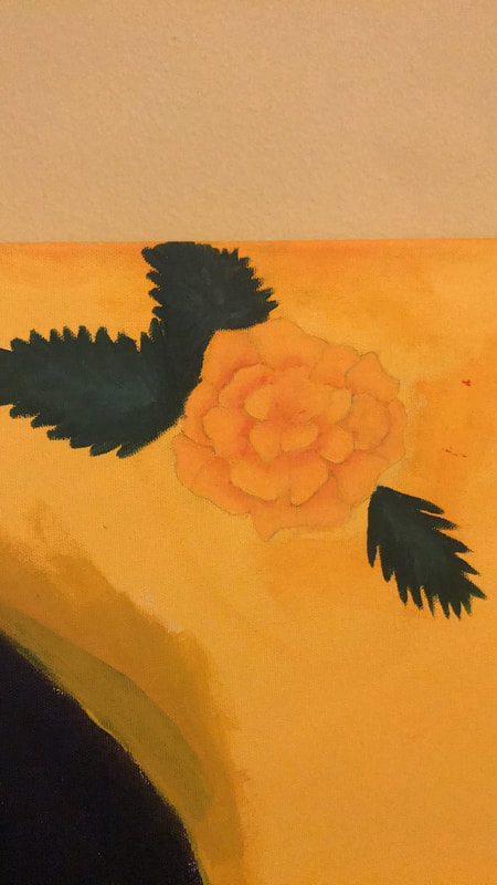
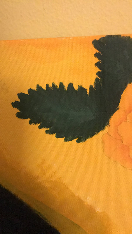
In order to create the cempazuchitl, I used a carbon transfer of a cempazuchi I had already drawn and placed it in a similar composition as Gauguin piece Woman with Flower. Once they were drawn out I mixed a vibrant mix of of yellow and orange. Using a number 8 flat brush I applied the orange to the areas of the pedal closest to the center. Then using a number 4 flat brush I blended out the the orange with white and sometimes yellow to achieve the final look for all the cempazuchitl.
Click to Enlarge
Experimentation/Development of Technique
Face :
|
Gauguin, Paul. Vahine no te tiare. 1891, Fondation Beyeler, Riehen.
|
Initially to achieve the same look in the face (color wise) as Gauguin’s Woman with Flowers I thought I could use a baroque style blending. My thought process was if I created vibrant skin tones (shadow, mid-tone, and highlight) the face would eventually look like Gauguin’s. Quickly I realized that this technique would not achieve the same look. That was when examining the face in Woman with Flowers I saw that while he does blend as seen through the many layers in the face it is fairly rough and limited to only a few shades. Taking that into account I decided that achieve the same look I would instead take one base skin tone and apply strokes of brown, red, white or a golden yellow with a number 8 and 4 flat brush. This would allow me to have a rough yet layered looked that seemingly transitioned into each other.
|
Jean Jumper:
|
Gauguin, Paul. Vahine no te tiare. 1891, Fondation Beyeler, Riehen.
|
The jean jumper was the area in my painting I most got into the mindset of Gauguin and his wild, almost reckless way of painting. It was here where initially I thought I would go about it in an impressionist matter, doing streaks of blue next to white, but not actually mixing them into each other or layering in great detail. It wasn’t until I looked at the blue dress in Gauguin’s Woman with Flowers that I realized it wasn’t streaky, it was actually blended into each other and varied in value ( included white highlight to dark navy blue). That’s when I started using a ¾ inch flat brush to apply layers of white and varying shades of blue and then use a number 8 flat brush to blend them out. It was paying attention to the details in his work that I could understand how to reproduce my piece in his style.
|
Background:
|
|
The background was where I had the most hiccups but it was the area in my painting that most mimics Gauguin’s Woman with Flowers. At first I experienced some difficulties, when trying to cover up an unwanted leaf, I ended up getting a peeling effect since I didn’t let the paint dry before I applied another coat. Still this provided inspiration on how to create the grainy and uneven (in color) background that Gauguin has.
|
That was when taking my ¾ inch flat brush I applied a lighter color paint ( white or yellow) to the background, quickly brushing over the area. I would then (using the same brush) apply the original yellow or red in the background, eventually after doing many layer of this I achieved the desired effect.
Reflection
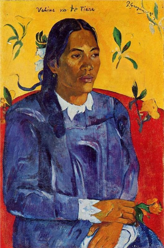
Gauguin, Paul. Vahine no te tiare. 1891, Fondation Beyeler, Riehen. Click To Enlarge
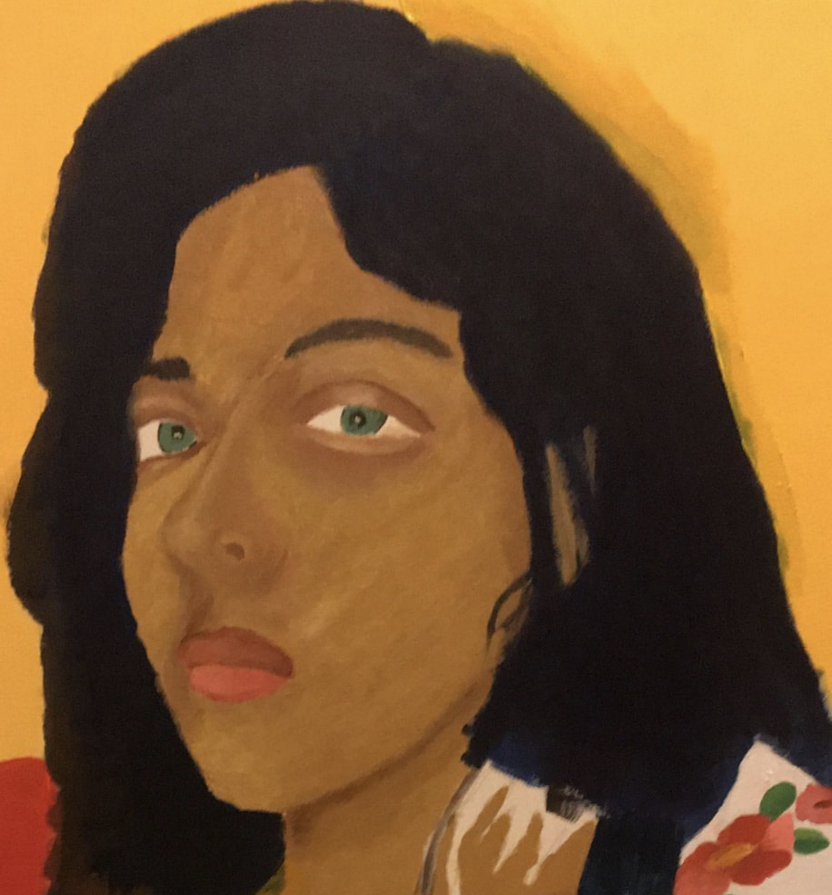
Overall I am quite proud of what I was able to produce with my piece, although I will say it could use better painting technique especially in the face to more similarly resemble Gauguin’s Women with Flowers. Still I will say my use of a majorly primary color scheme seems to nicely mimic Gauguin's famous use of primary colors. It really in my use of color, which Gauguin was known for, in the overall piece (face, clothing, background) that I felt I most aligned and made strong connection to Gauguin. Still in the aspect of shape and line there was more work to be done. I would say while the painting does seem flat, it isn’t consistent; for example in the shirt, the painting technique seems to be out of place ( almost like a whole other artist). As for line, outline is something Gauguin is known for but in my piece not only does it lack presence, but where I did I put it in the outline seems messy and out of place.
Still I will say the few major changes I made to Gauguin’s original Woman with Flowers really helped portray my theme nicely and I am very satisfied. To start out the cempazuchitl flowers came out better than expected and have a fiery orange shade. It really creates emphasis on itself with color and movement. This helps to show the importance of my message since the cempazuchitl is suppose to represent me calling to my ancestors, as they are a flower used in Dia de los Muertos altars to guide the dead back to the living, in Mexican culture. This is important because it stands for tradition and how women, especially Mexican women are made to feel weak by traditions that were outlined by our ancestors.The second change that was portrayed nicely was my clothing choice, jean jumper with huipil. It was a really simple choice but not only did it make the connection to my culture but the color scheme of it was very similar to Gauguin’s Woman with Flowers. The only thing I would improve for the sake of my theme is my expression, which lost a ton of the sternness that came from the original photograph. The fact that it isn’t as stern while I’m trying to portray the strength of women (especially Mexican women) makes it lose a lot of its meaning
Still I will say the few major changes I made to Gauguin’s original Woman with Flowers really helped portray my theme nicely and I am very satisfied. To start out the cempazuchitl flowers came out better than expected and have a fiery orange shade. It really creates emphasis on itself with color and movement. This helps to show the importance of my message since the cempazuchitl is suppose to represent me calling to my ancestors, as they are a flower used in Dia de los Muertos altars to guide the dead back to the living, in Mexican culture. This is important because it stands for tradition and how women, especially Mexican women are made to feel weak by traditions that were outlined by our ancestors.The second change that was portrayed nicely was my clothing choice, jean jumper with huipil. It was a really simple choice but not only did it make the connection to my culture but the color scheme of it was very similar to Gauguin’s Woman with Flowers. The only thing I would improve for the sake of my theme is my expression, which lost a ton of the sternness that came from the original photograph. The fact that it isn’t as stern while I’m trying to portray the strength of women (especially Mexican women) makes it lose a lot of its meaning
ACT Responses
1) Clearly explain how you are able to identify the cause-effect relationships between your inspiration and its effect upon your work?
The effect of my inspiration is obvious in my piece through both color and composition. I use the same mainly primary color scheme that is majorly dominated by warm colors. As for composition I portray myself in the same red couch and background as Gauguin's piece Women with Flowers.
2) What is the overall approach(point of view) the author (from your research) has regarding the topic of your inspiration?
The author of my research for Gauguin seemed to be very descriptive when not just talking about his art but him as a person too. This made it so that his point of view was of someone highly informed on not just Gauguin art style choices but his emotional mindset when making those choices.
3) What kind of generalizations and conclusions have you discovered about people, ideas, cultures, etc. while you researched your inspiration?
After learning about how Gauguin became the artist he did I realized that as an artist grows and explores different styles and obvious shift towards color for emotion rather than realism tends to be transcended. This decision seems to speak to a human need to communicate through color. Especially when it comes to strong emotions like passion or hate, color is a true teller of how we should move forward with our feeling or other's feelings, in short what we should make of them.
4) What was the central idea or theme around your inspirational research?
The theme behind my research is the strength of women, more so trying to prove it and challenge the preconceived notion (stereotype) that women are weak. This I wanted to especially focus on in my Mexican culture that has a very sexist, misogynist beliefs and traditions.
5) What kind of inferences (conclusions reached on the basis of evidence and reasoning) did you make while reading your research?
For Gauguin I had to infer many times why it was that he painted in such a wild, brash style yet remained so clean with his finished products. Although the research didn't outright say it, I could infer that when he was in Tahiti, his fascination of a wild, savage lifestyle, as he called it, was filtered in his art by painting in that fashion, yet as someone not native to land he could never truly be savage like.
