|
|
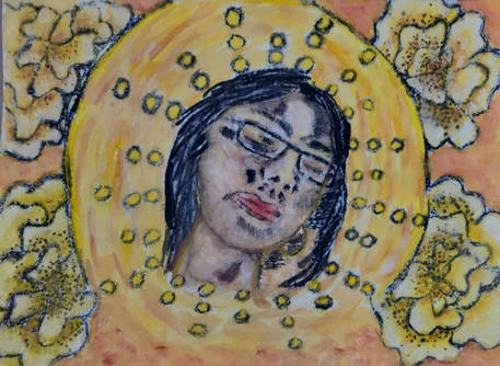
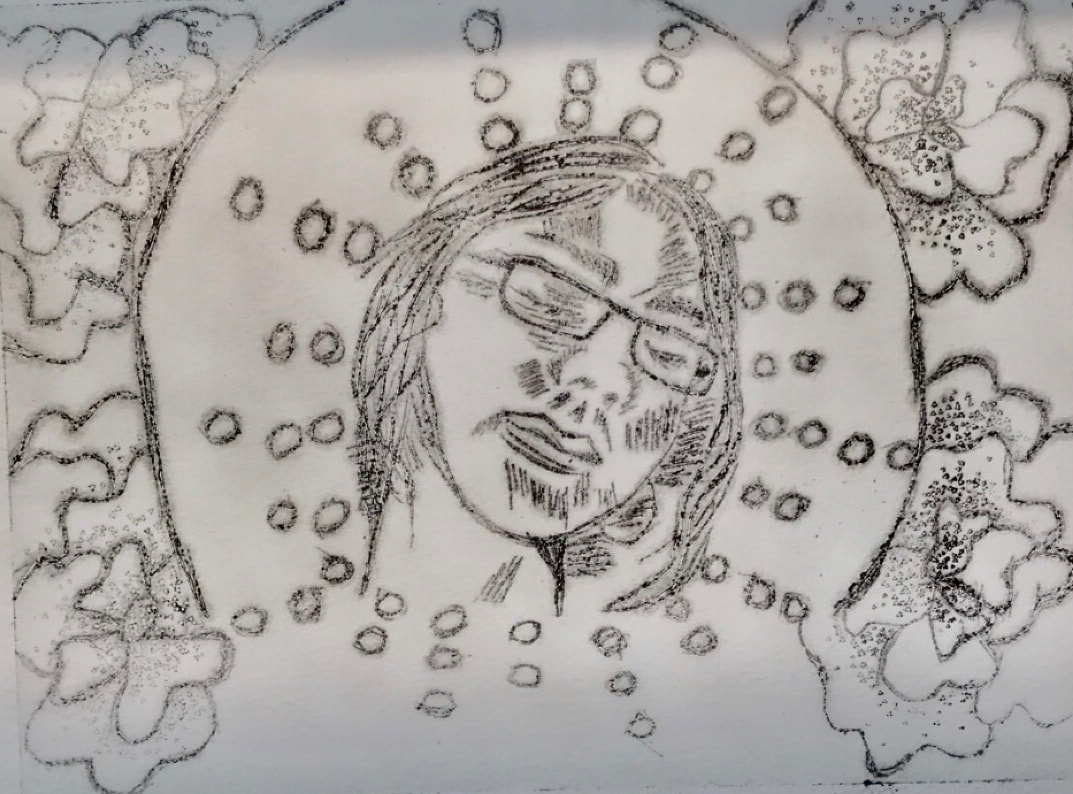
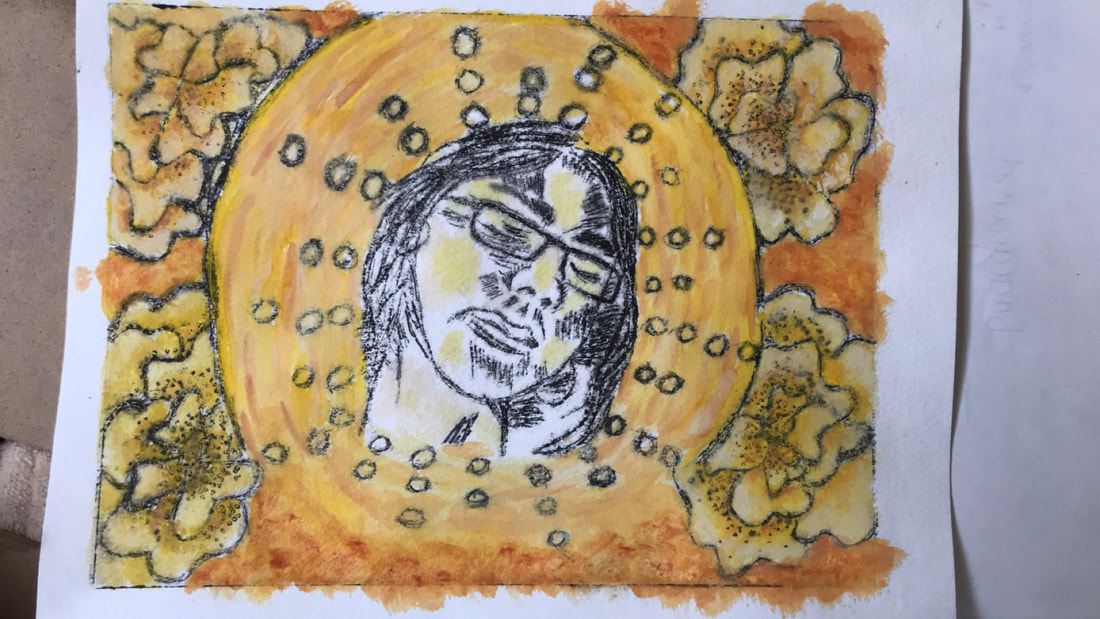
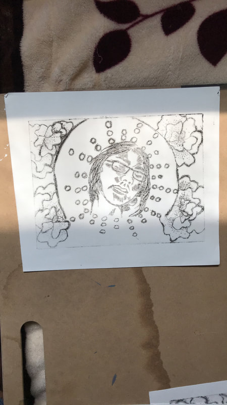
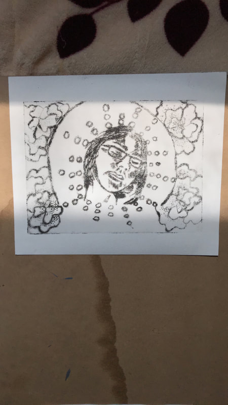
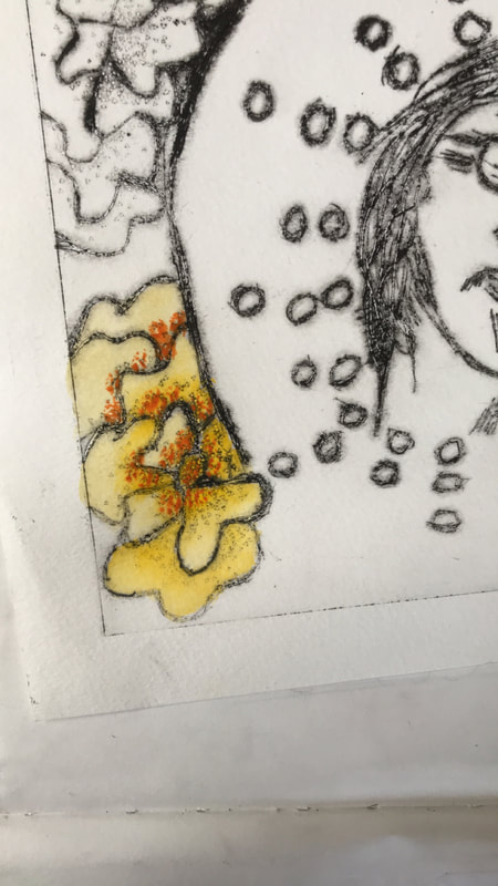
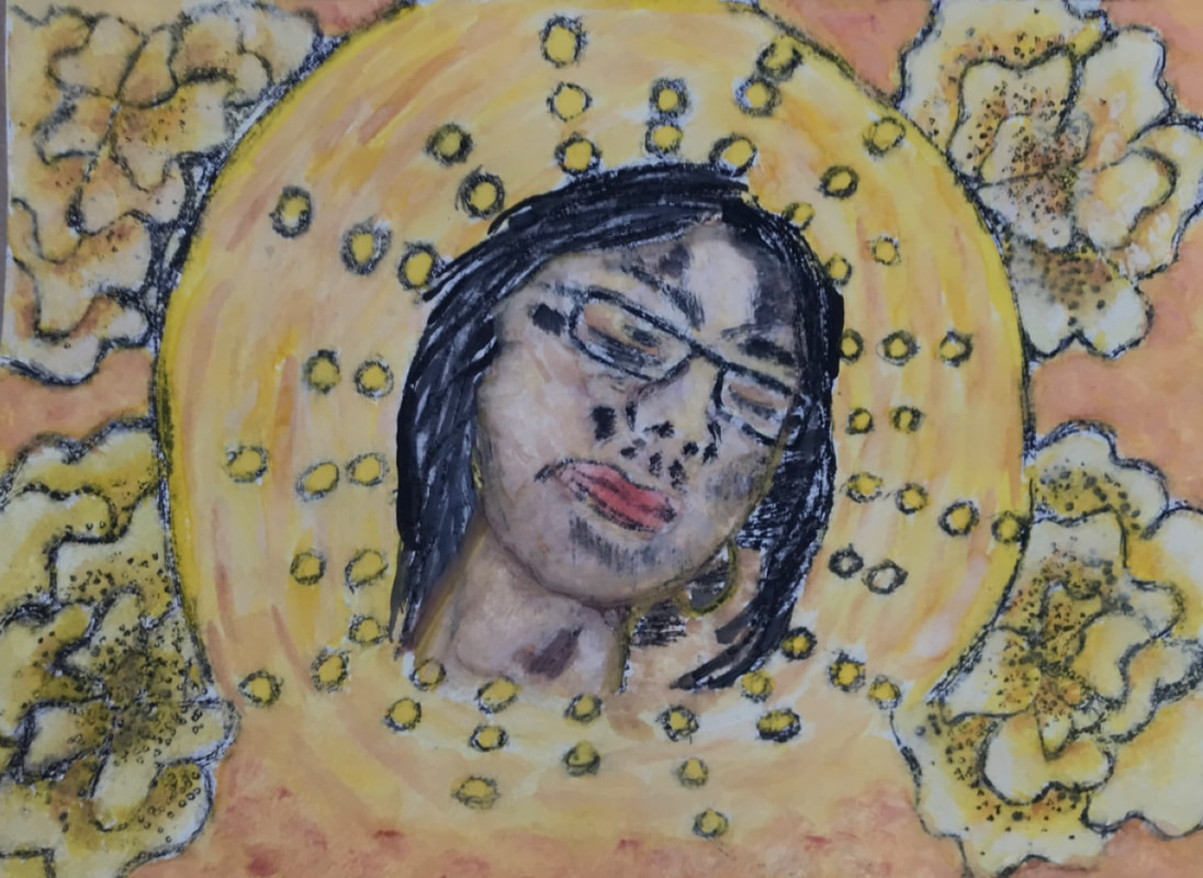
Title: God is a Woman
Size: 20 cm X 15 cm
Medium: Dry Point
Completion Date: August, 2018
Size: 20 cm X 15 cm
Medium: Dry Point
Completion Date: August, 2018
Exhibition Text
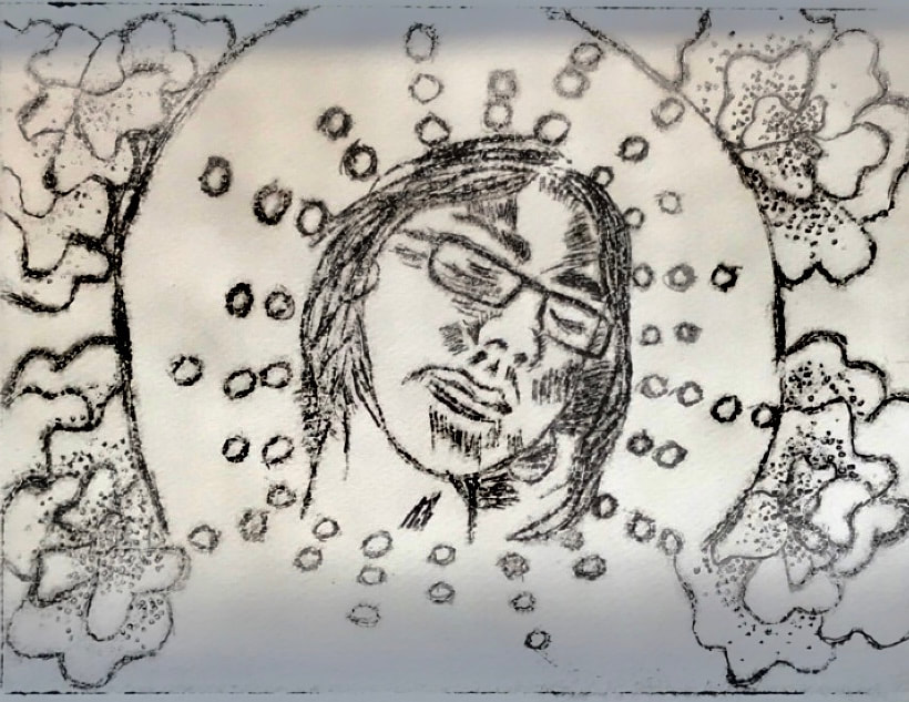
God is a Women is a drypoint that is suppose to be a celebration of the female struggle. Generally women in the Mexican culture are given responsively at a young age which males aren't upheld to. This piece doesn't hope to glorify women but instead to show an appreciation for them. It is primarily inspired by Paul Gauguin's La Orana Maria, with its religious theme and color palette and Reginald Baylor's White Lady, with its use of geometric shapes.
Investigation

click to enlarge image
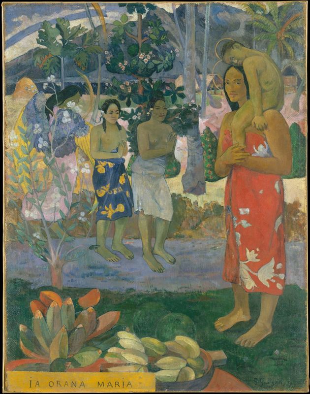
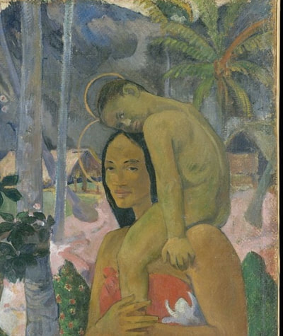
Gauguin , Paul. La Orana Maria . 1891, The Metropolitan Museum of Art , New York City .
Paul Gauguin
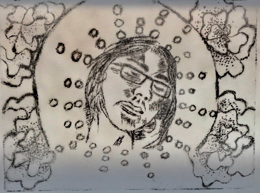
The main aspects I wanted to utilize from Gauguin and more specifically La Orana De Maria is the general color scheme. It is no secret that Gauguin prefers to work in warm colors, with that in mind I want to make a conscious decision for my color scheme to stay in the spectrum between yellow and orange. Another aspect I want to utilize is the religious portrayal that he is intentionally is using. In La Orana De Maria he is trying to make Mary and Jesus in the context of Tahiti, so he makes them Tahitian. This is something I want to do as well, I wanted to utilize my friend a Mexican woman into a background that would suggest she is a saint like Saint Anthony. This is to portray my narrative of celebrating women but also in a way that is a little controversial. This is because as portraying her as a saint I am leaving it up to be interpreted as worshipping her when in reality I am saying we should celebrate her as a female who has to go through obstacles, double standards, that Mexican men don’t. This leads into the coloration of the skin tone since I am depicting a Mexican women, the coloration that Gauguin utilizes when painting Tahitian women is one that I will keep in mind when watercoloring for the skin tone of my subject.
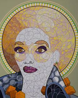
Reginald Baylor
|
Reginald Baylor is a local Milwaukee artist who is known for a Pop style. Many times the remnants of Milwaukee’s heavy segregation is seen in his work. For example in the piece I took inspiration in, White Woman, there a woman with heavy African-American features, such as the afro and lips but she is white. Many times Baylor has stated that this is his way of showing how irrelevant race and more so skin tone is because by easily making this African American women white, we are all confused but it shows how easy it was to change it, how irrelevant it is.
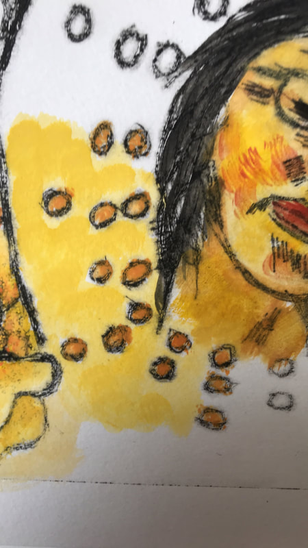
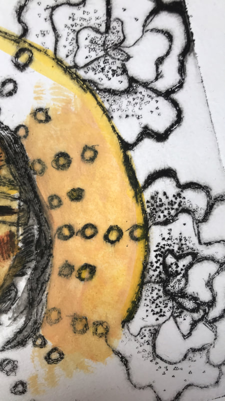
However the certain qualities I want to mimic from Baylor have to do more with his style. Baylor is known not only for his intricate line work that usually fills up all the space in his pieces but also his use of shape especially geometric shape. The way I want to incorporate this into my work is in the halo that I want my female subject to be encapsulated in. As in Baylor’s White Women, I only want her to be visible from the neck up and I want to create further emphasis on my female subject by making all the details from the halo orbit her. Although in White Woman Baylor did not intend to create a halo when he did the afro but he did intend to emphasise the woman’s appearance which is exactly what I want to do. The other aspect is I want to add geometric shape but I want to keep it to simple small circles since I think by having them be uniform I will be able to create a more aesthetically pleasing look, that doesn't distract from my female subject. Overall I just want to utilize small features from Baylor’s work. |
|
Baylor , Reginald. White Lady . 2009, Milwaukee.
Planning

click to enlarge
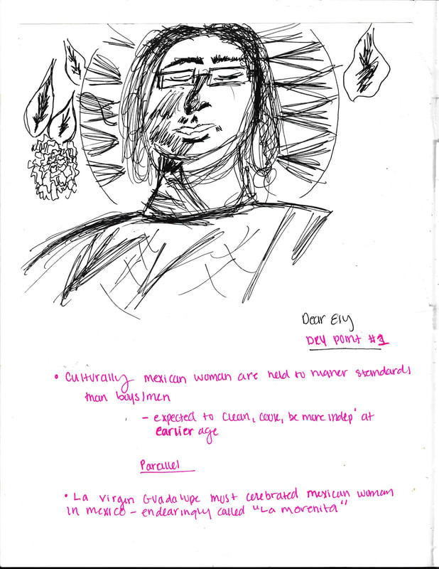
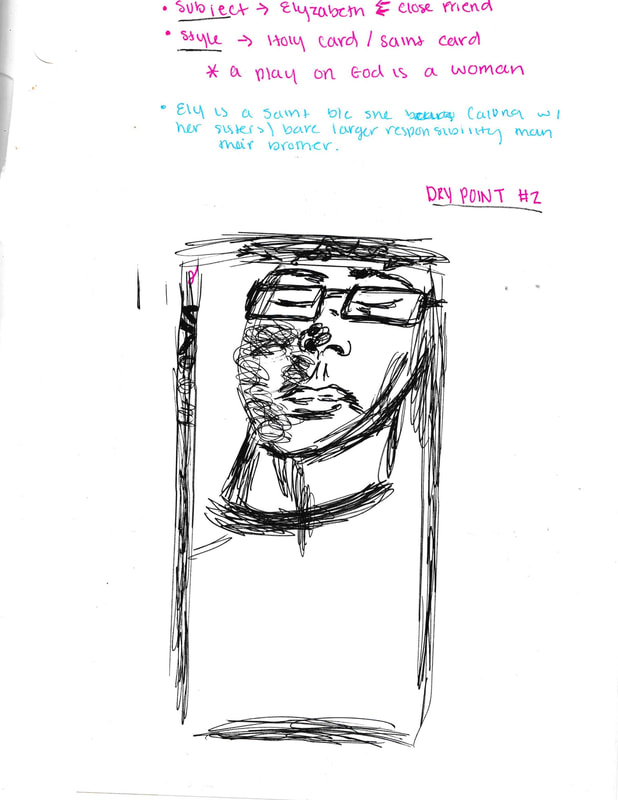
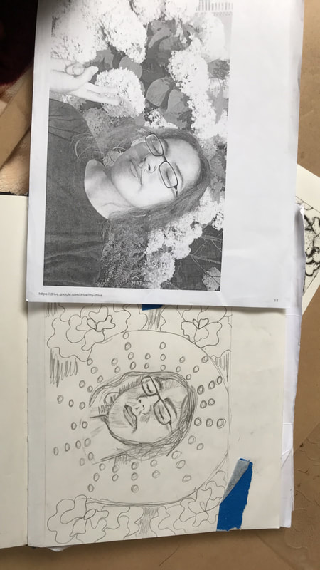
In order to properly do sketches I realized I needed a reference for a female figure. It only made sense to use a close friend since she has experienced the same double standards of our Mexican culture within her family.
From then on I began my first sketch, essentially this sketch was me trying to figuring out a layout that would make sense. It was in this sketch that I realized I needed three essential parts, a halo, flowery background and and a female face from the neck up. This would make sure to draw back to my inspiration since in White Women, it is also from the neck up and although in Baylor’s she has a afro, in mine the halo gives the same emphasis on the female figure by utilizing a circle, halo, around the female figure.
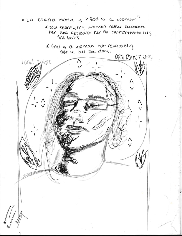
In the second sketch I began to play with the idea of cropping the image further and making it a close up. Still I quickly scratch that idea as I wanted to religious reference back to Gauguin “ La Orana Maria”. Essentially without the halo that whole idea is completely missed.
Finally in my third sketch I take the best aspects from my first sketch, the three essential parts and refine them. I also try to see how I can utilize Baylor’s use of shape more within the space the halo creates around my female figure. In this sketch i definitely solidify that there will be special emphasis to my female figure through the flowers, halo, and then shapes all orbiting around her.
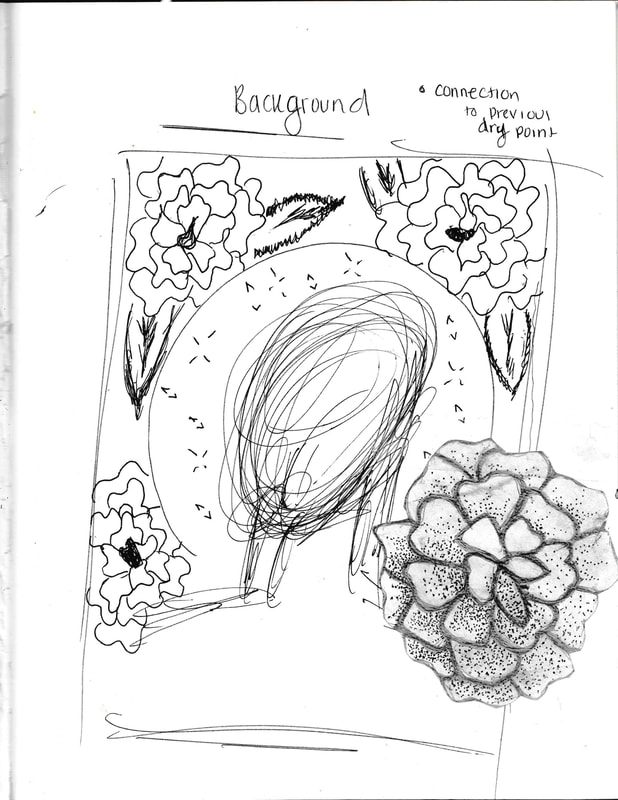
In the fourth sketch I try to figure out in better detail what the flowery additions will look like. At first I thought possibly the flowers from the original pictures would be the best fit. Still I quickly realized I wanted to keep up my motiff of the Cempazuchitl, as it connects my work and to the Mexican culture.
From then on I began my first sketch, essentially this sketch was me trying to figuring out a layout that would make sense. It was in this sketch that I realized I needed three essential parts, a halo, flowery background and and a female face from the neck up. This would make sure to draw back to my inspiration since in White Women, it is also from the neck up and although in Baylor’s she has a afro, in mine the halo gives the same emphasis on the female figure by utilizing a circle, halo, around the female figure.
In the second sketch I began to play with the idea of cropping the image further and making it a close up. Still I quickly scratch that idea as I wanted to religious reference back to Gauguin “ La Orana Maria”. Essentially without the halo that whole idea is completely missed.
Finally in my third sketch I take the best aspects from my first sketch, the three essential parts and refine them. I also try to see how I can utilize Baylor’s use of shape more within the space the halo creates around my female figure. In this sketch i definitely solidify that there will be special emphasis to my female figure through the flowers, halo, and then shapes all orbiting around her.
In the fourth sketch I try to figure out in better detail what the flowery additions will look like. At first I thought possibly the flowers from the original pictures would be the best fit. Still I quickly realized I wanted to keep up my motiff of the Cempazuchitl, as it connects my work and to the Mexican culture.
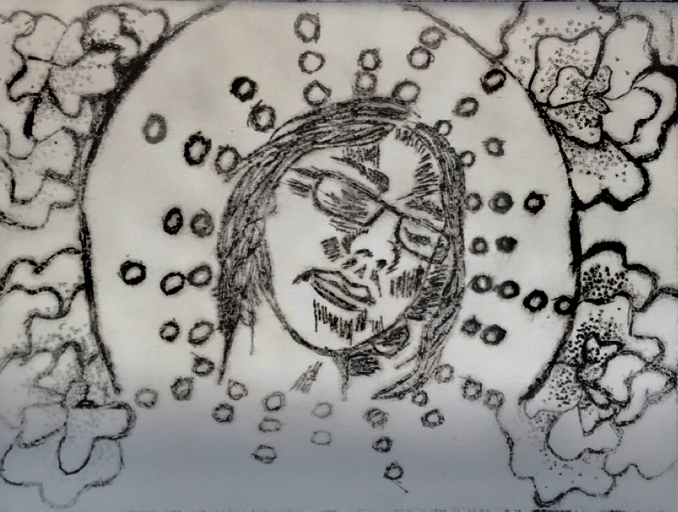
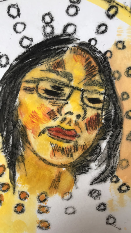
Process
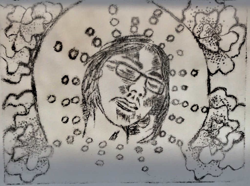
1. Drawing/Etching
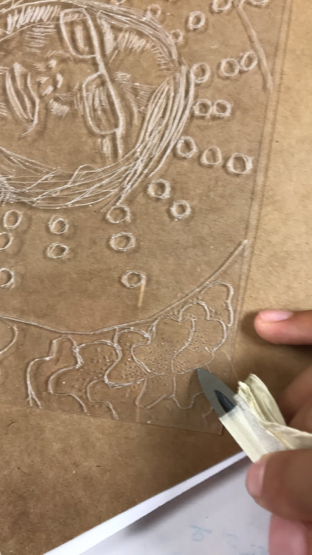
To start of my art making process I knew that I would have to draw out my friend in a more detailed version. At first I tried my hand at doing it freehand and although it came out pretty good it was definitely skewed in perspective. That is when I decided to print out a picture of my reference and in doing so I traced essential parts such as the nose and face shape. From that point on I went back in freehand and and added details like the glasses and hair, as well as a lot of shading through hatching.
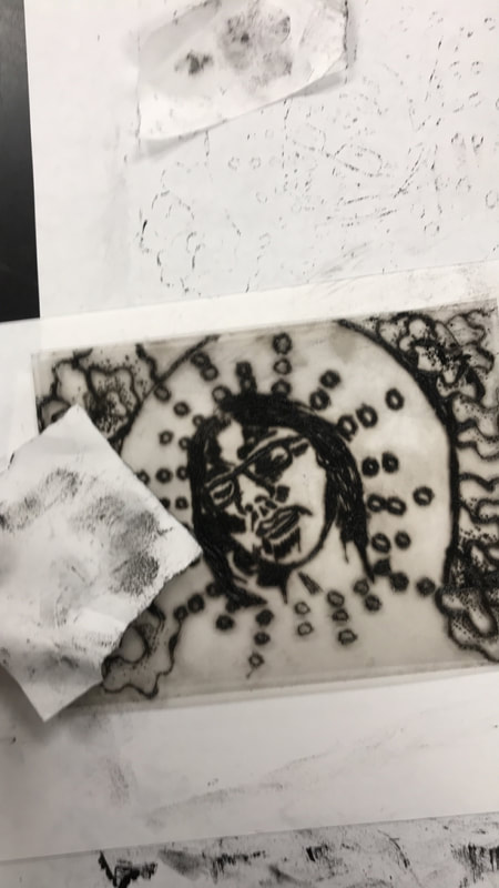
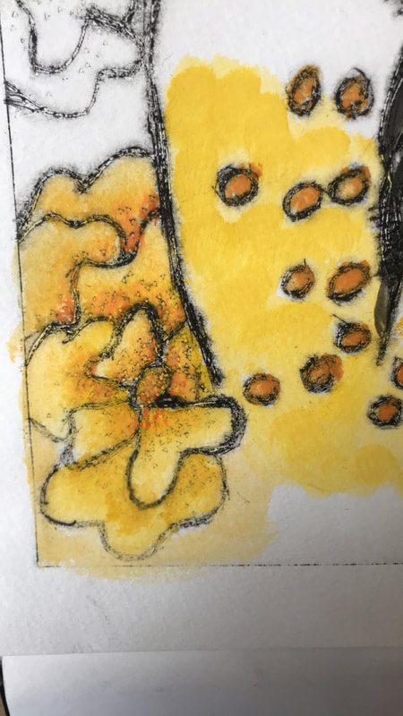
After I achieved the look I wanted I took a drypoint plastic plate and placed it over my sketch and using a dry point tool I etched my design into the plate. This went fairly well except in tiny details, for example the circles surrounding the female or the curves in the flowers. These details had to be especially maintained as the Cempazuchitl connects back to my Mexican culture. As well as the little circles were support to be my incorporation of geometric shape similar to Reginald Baylor. Ultimately I just had to slow down to do these details and if I messed up, went over certain lines, I just had to go over the boundary I had already set. Once I had finished that part I went back in to do stippling to add more value into the cempazuchitl. For the most part after having done the drawing the etching went fairly smooth.
To start of my art making process I knew that I would have to draw out my friend in a more detailed version. At first I tried my hand at doing it freehand and although it came out pretty good it was definitely skewed in perspective. That is when I decided to print out a picture of my reference and in doing so I traced essential parts such as the nose and face shape. From that point on I went back in freehand and and added details like the glasses and hair, as well as a lot of shading through hatching.
After I achieved the look I wanted I took a drypoint plastic plate and placed it over my sketch and using a dry point tool I etched my design into the plate. This went fairly well except in tiny details, for example the circles surrounding the female or the curves in the flowers. These details had to be especially maintained as the Cempazuchitl connects back to my Mexican culture. As well as the little circles were support to be my incorporation of geometric shape similar to Reginald Baylor. Ultimately I just had to slow down to do these details and if I messed up, went over certain lines, I just had to go over the boundary I had already set. Once I had finished that part I went back in to do stippling to add more value into the cempazuchitl. For the most part after having done the drawing the etching went fairly smooth.
click to enlarge images
2. Printing
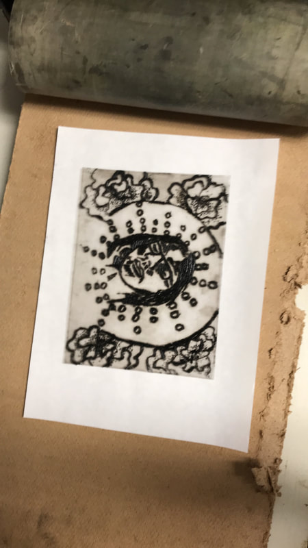
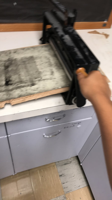
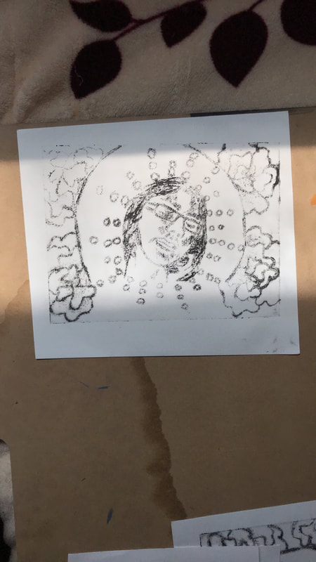
After I had a plate that was nicely etched I moved on to printing. First I took a couple sheets of watercolor paper and placed them in a tub full of water to soak. Then I took drypoint ink and using a palette knife I would add small dabs of ink on top of the plate, making sure to cover the areas that were etched. Then using newsprint paper I wiped off all the excess ink. Once the excess ink was wiped off I removed the watercolor paper from the water tub, I dried it off slightly with a towel and moved it to the printing press. In the printing press I simply placed the plate down with the inky side facing up and placed the watercolor paper on top. I then covered the whole set up and rolled it through the printing press. This was a very time consuming process, for which I had to do about 5 to 7 trials to get a print that captured most of the details.
After I had a plate that was nicely etched I moved on to printing. First I took a couple sheets of watercolor paper and placed them in a tub full of water to soak. Then I took drypoint ink and using a palette knife I would add small dabs of ink on top of the plate, making sure to cover the areas that were etched. Then using newsprint paper I wiped off all the excess ink. Once the excess ink was wiped off I removed the watercolor paper from the water tub, I dried it off slightly with a towel and moved it to the printing press. In the printing press I simply placed the plate down with the inky side facing up and placed the watercolor paper on top. I then covered the whole set up and rolled it through the printing press. This was a very time consuming process, for which I had to do about 5 to 7 trials to get a print that captured most of the details.

click to enlarge images
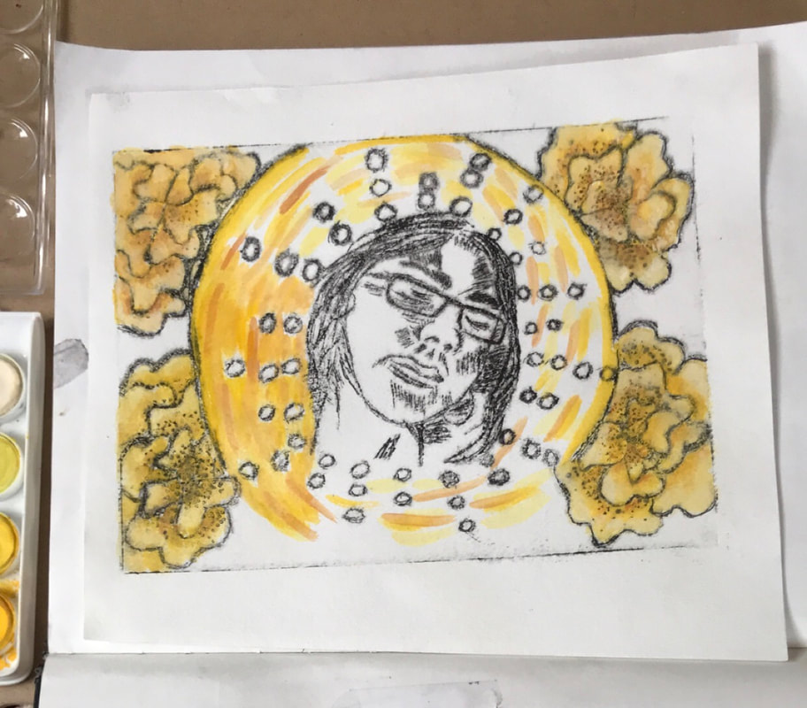
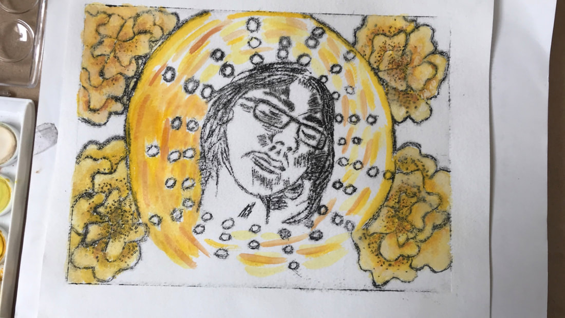
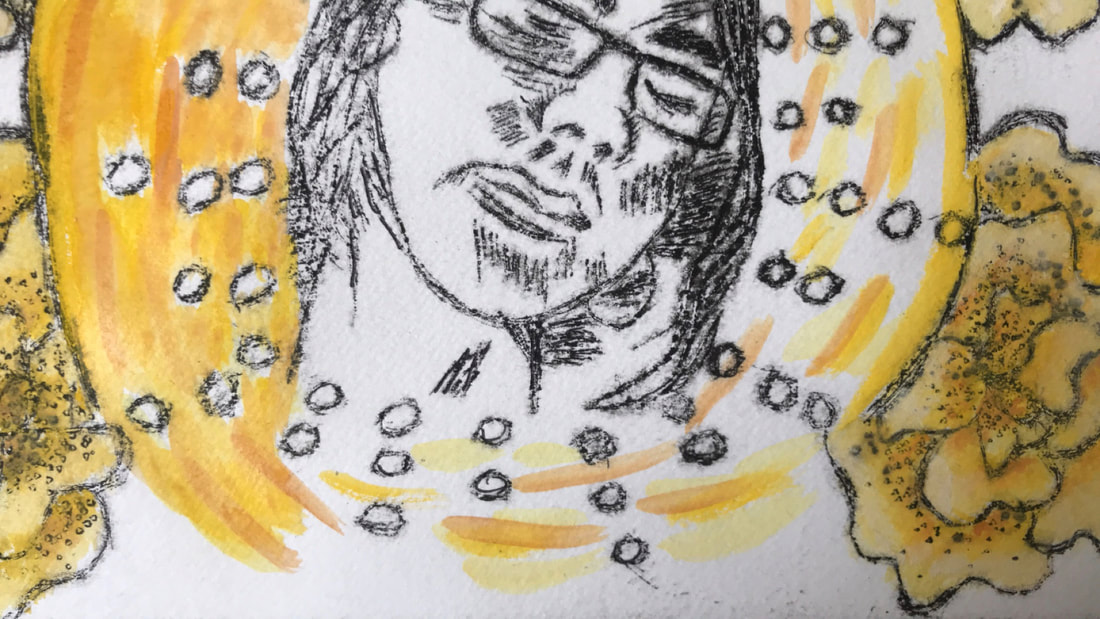
3. Watercolor
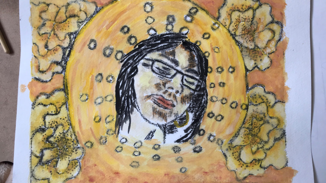
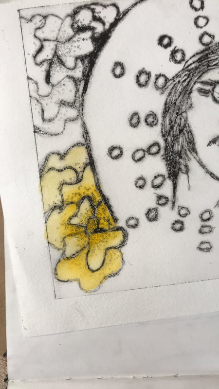
The final part after achieving a satisfying print was to watercolor it. This was something that was highly important as it would relate back to my inspiration of Gauguin. With that in mind I knew I wanted to use warm colors especially yellow and orange. This first step was painting the Cempazuchitl, which I’ve done many times but the last time I tried to do so in watercolor the result was not satisfactory. Still this time I decided to instead of mixing many colors, I would instead utilize the water to lighten or many times blend out hues. After that I worked on the halo, to which I added slight strokes in a circular pattern in a variation of warm colors, from golden yellow to burnt orange. Afterwards I worked on the details of the face which was probably the most difficult part. For one getting a golden skin tone proved to be tough, I first started with washes but I couldn’t really blend them well. Still I kept adding brown, orange and white until the skin tone was somewhat satisfying. In the end I added the final touches such as the hair and fixing the background.
The final part after achieving a satisfying print was to watercolor it. This was something that was highly important as it would relate back to my inspiration of Gauguin. With that in mind I knew I wanted to use warm colors especially yellow and orange. This first step was painting the Cempazuchitl, which I’ve done many times but the last time I tried to do so in watercolor the result was not satisfactory. Still this time I decided to instead of mixing many colors, I would instead utilize the water to lighten or many times blend out hues. After that I worked on the halo, to which I added slight strokes in a circular pattern in a variation of warm colors, from golden yellow to burnt orange. Afterwards I worked on the details of the face which was probably the most difficult part. For one getting a golden skin tone proved to be tough, I first started with washes but I couldn’t really blend them well. Still I kept adding brown, orange and white until the skin tone was somewhat satisfying. In the end I added the final touches such as the hair and fixing the background.

click to enlarge images
Experimentation
|
|
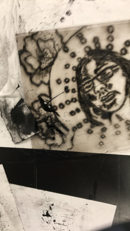
The process of printing is one that will always take many trials. At first I would get very patchy prints, half the piece was not as inked as the other. To fix this I would just go back and add a lil more ink in those problematic areas. Still at one point I got a very faint print, which was a little puzzling, still I thought perhaps the printing press needed to have a little more pressure cranked in. Another huge problem was essentially many times the prints would not to a full extent pick the ink from the stippling which was a key point in the piece to create value in the flowers. Ultimately a combination of the pressure and ink would help create the final two prints which had the right amount of value in the right areas.
|
click to enlarge image
|
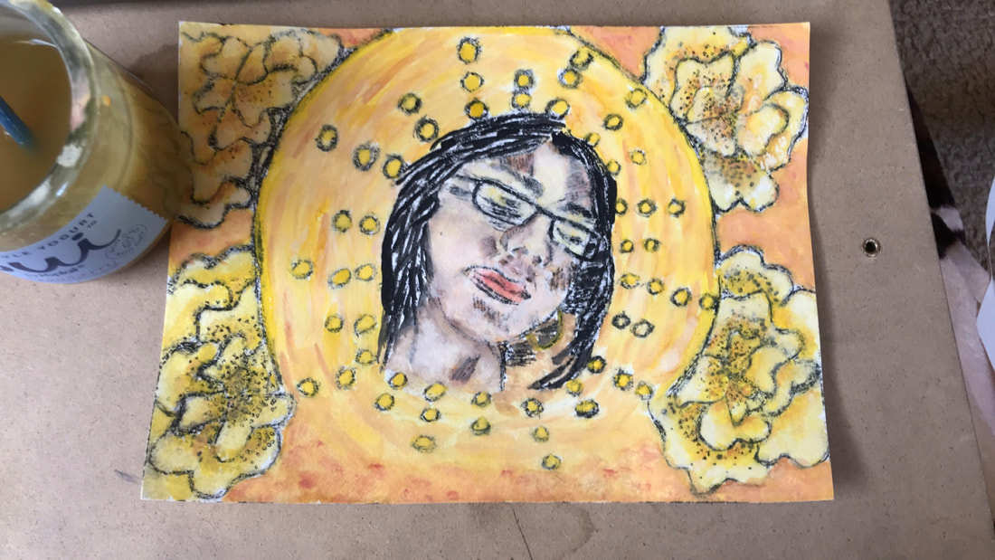
Watercolor is a medium that I have very little experience in and everytime I do utilize it, it doesn’t have the best results. Still this time I was determined to get the correct look. That is why I decided to do a trial run with one of my prints. Not only did I try to figure out which hues would create the color scheme of my piece, as seen in the halo, but also how to do the face. Getting the correct skin tone was something that was very difficult for me, especially since watercolors don’t necessarily blend like acrylic. Still I knew that I had to start with washes, ultimately I realized unlike acrylic where I could pack on the same hue to try to correct it, with watercolor the key was less is more. Not only that but I got a general idea that brown, with a bit of orange would help to create more shading then just trying to add darker variations of orange hues. Overall I took the time to see what would really work when watercoloring.
|
|
click to enlarge image
Reflection

click to enlarge images
SuccessesMy primary inspiration for this work was Paul Gauguin for both the religious topic he is depicting in La Orana Maria but also the color scheme he is known for. In my piece I also take a woman of color and juxtapose her in a religious setting somewhat similar to that of a holy card. In doing so not only do I bring out the the key factor of recognizing women and their efforts, as holy cards usually have saints that are bought for their protective features that make them celebrated figures. This connects to Paul Gauguin as he took Mary and Jesus and made them Tahitian, and employed a religious theme by adding Halos to them. The other connection was in the color scheme Paul Gauguin usually works with warm colors, especially in his pieces that depicted Tahitian women. This was overall very similar in my piece not only in the coloration of the skin tone but in the flowers and general background too.
Another success was just overall connecting this piece to my previous pieces especially my last drypoint. In my previous drypoint Beautiful Little Girl, I utilized my sister and not only that but I also put her amongst a background of cempazuchitl. That means that again I used a subject that was close and meaningful to me but that they were young women of color that I identify with. This not only shows that I am starting to make a more solid theme of trying to celebrate woman but that I have a common motif of the cempazuchitl. |
FailuresDoing drypoints is always a bit difficult because it is almost as if you are working with pencil and paper. This is in the fact that the line work is very similar yet the plastic surface and drypoint tool give you minimal control. Keeping that in mind I feel like many times my etching is very rough which translates to the lines in my work being very rough. This is especially clear in small details like the circular pattern which looks sloppy mostly because you can tell where I had to go over it multiple times. This is something that I think is fixed by just having more practice with this medium.
Another place of improvement would be in my connection to Reginald Baylor which now in hindsight seems very superficial. Of course Baylor’s calling feature is in the fact that he does a lot of line work and that he uses geometric shapes and forms. I thought that by similarly utilizing a circular shape recurrently through my piece I could create a solid connection. Still I feel like I could have added some more intricate line work to solidify that connection. |
ACT Connections
1) Clearly explain how you are able to identify the cause-effect relationships between your inspiration and its effect upon your work?
My first inspiration was Gauguin and the effect he had on my work was my use a color scheme that used mostly warm colors like orange and yellow. As well as the religious imagery in his piece La Orana Maria. My second inspiration was Reginald Baylor who uses a lot of geometric shapes which is why I had a very circle centered design.
2) What is the overall approach(point of view) the author (from your research) has regarding the topic of your inspiration?
The authors of my research continue to be objective in explaining the artistic style of Reginald Baylor and Paul Gauguin. In both the authors they comment directly in how their surrounds, Tahiti and Milwaukee, have directly influenced their work.
3) What kind of generalizations and conclusions have you discovered about people, ideas, cultures, etc. while you were researching?
A conclusion I was able to come across on is the impact the surrounding of people can influence their outlook. For Gauguin being in Tahiti made him feel homesick, a huge struggle since Tahiti was suppose to be a paradise, which is something you can see in his need to portray tranquility in his pieces. For Baylor, he grew up in a segregated city which is why he always tries to portray white women with black features and vice-versa.
4) What was the central idea or theme around your inspirational research?
The theme that inspired my research was the idea of celebrating women and there load they bear especially in the frame of double standards in Mexican culture. It isn't God is a Woman, as in to glorify women but to say that they deserve their credit too.
5) What kind of inferences (conclusions reached on the basis of evidence and reasoning) did you make while reading your research?
The biggest inference I was able to make is that no matter the artist there is a general idea that their work makes up for something missing in their life or what they believe is missing from society. As seen in both Gauguin's and Baylor's work which work with specific groups of people in society.
Bibliography
images:
“Ia Orana Maria (Hail Mary).” The Met Museum, The Metropolitan Museum of Art, www.metmuseum.org/art/collection/search/438821.
Schumacher, Mary Louise. “Artist Reginald Baylor Releases Coloring Book-like App.” 'Scatman' Paces Marathon Record-Setter, The Milwaukee Journal Sentinel, 29 Feb. 2012, archive.jsonline.com/blogs/entertainment/140930223.html.
Sources:
Kessler, Molly. “Profile: Reginald Baylor.” Urban Milwaukee, Urban Milwaukee, INC, 20 Aug. 2012, urbanmilwaukee.com/2012/08/20/profile-reginald-baylor/.
Kosidowski, Paul. “Stroke of Genius .” Milwaukee Magazine , 21 Oct. 2012, www.milwaukeemag.com/StrokeofGenius/.
Walther, Ingo F., and Michael Hulse. Gauguin, 1848-1903: the Primitive Sophisticate. Taschen, 2017.
