
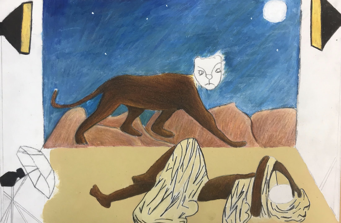
Title: The Gate of the Sands II
Size: (30.5 cm x 40.6cm)
Medium: Acrylic and Color pencil on Illustration Board
Date: November 30th 2017
Size: (30.5 cm x 40.6cm)
Medium: Acrylic and Color pencil on Illustration Board
Date: November 30th 2017
Exhibition Text
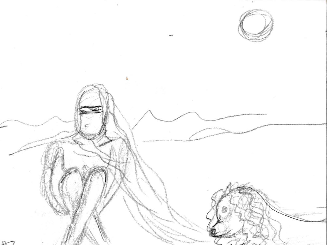
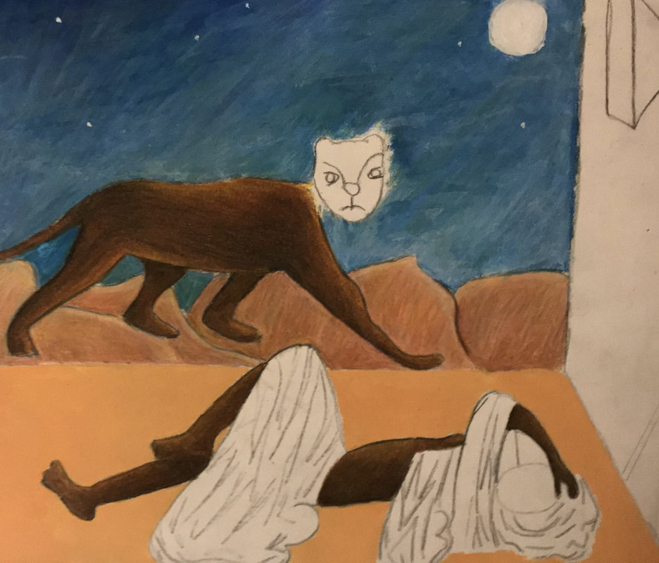
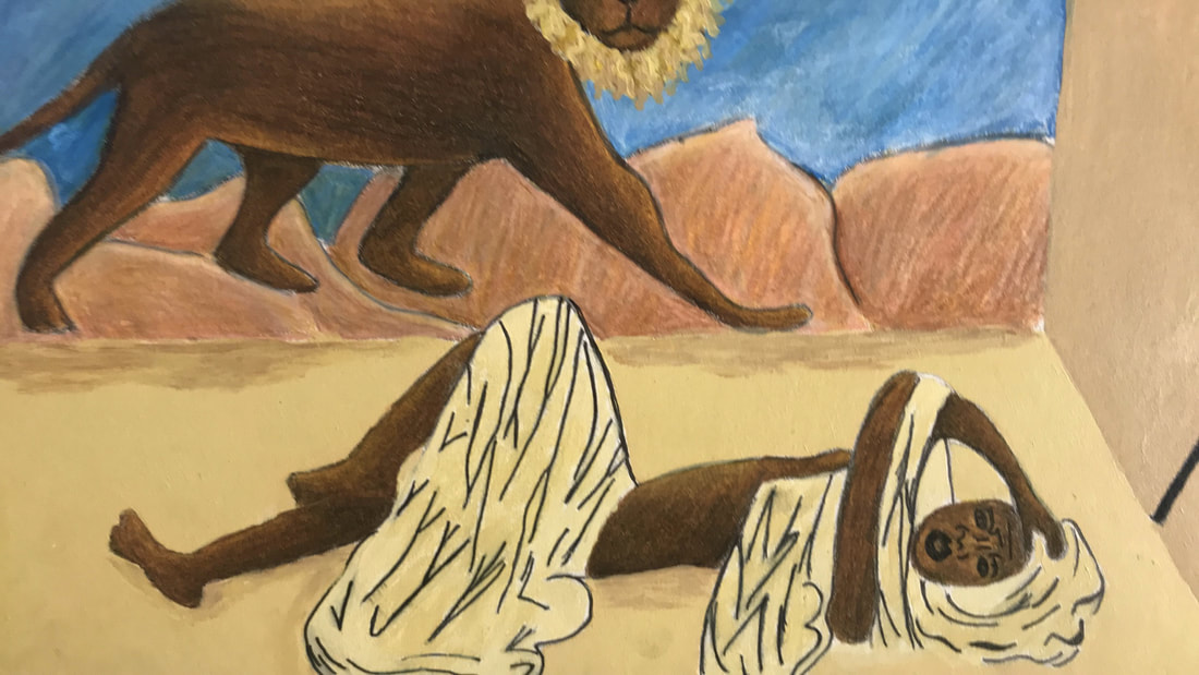
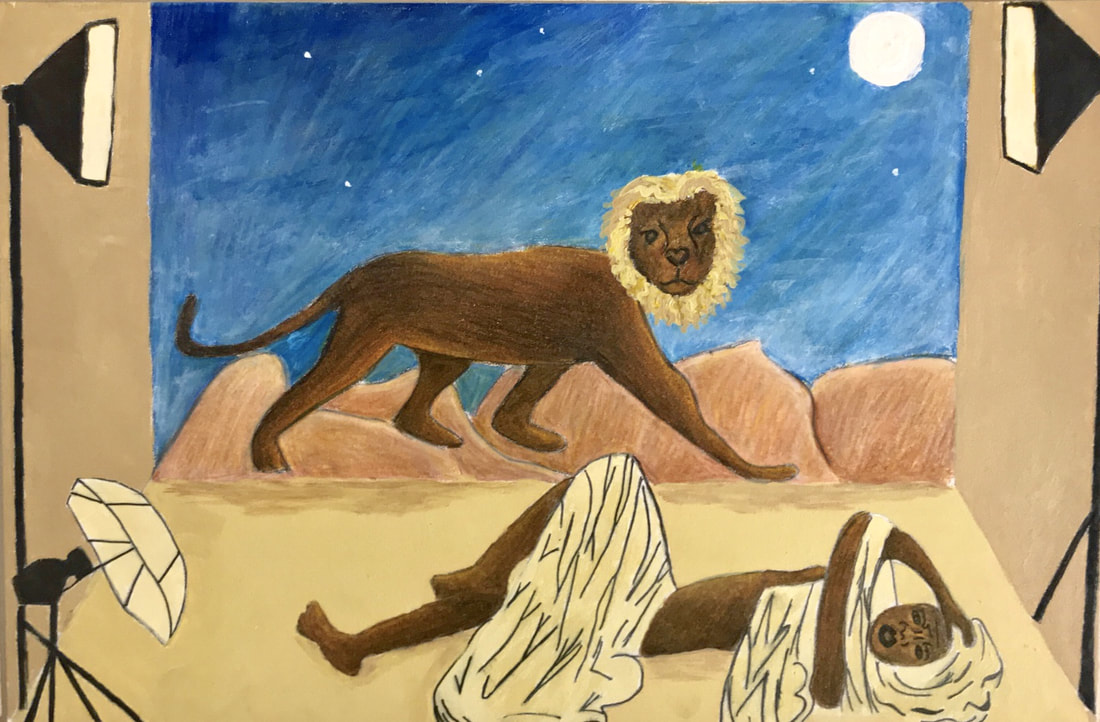
The Gate of the Sands II is an illustration piece that portrays the struggle to express female sexuality and more so comments on how popular media shapes those ideas. It is largely inspired by the novel The Sand Child and its main character Zahra/Ahmed's struggle to accept their female identity. It also takes from Henri Rousseau's desert background in The Sleeping Gypsy and Coles Phillips use of lines and space.
Inspiration
Henri Rousseau
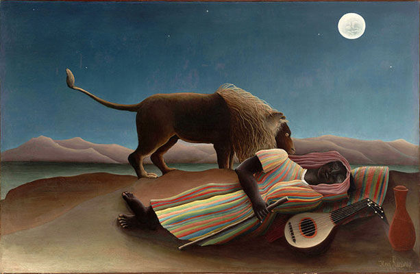
Rousseau, Henri. The Sleeping Gypsy . 1897, Museum of Modern Art , New York City.
“His art the end of the nineteenth century represented the first childlike art of the modern period and provided standards for acceptable primitivism and romantic innocence”
Henri Rousseau is one of the most prominent figures of the symbolism movement. He is mostly known for his dreamy, almost child like pieces. Although his pieces were at times ridiculed for his lack of technical skill they speak to his self-taught painting skills, a true feat in itself. The piece that I will be taking inspiration is a desert scene known as the “The Sleeping Gypsy”.
This piece depicts a sleeping female gypsy exhausted by her travels she lays in the middle of the desert in the moonlight; she lays next to her jug of water and mandolin and strangely enough a lion comes up to her but does not harm her. It is representative of not just a dream like scene but showcases human’s harmony with animals.
I knew that the figures could be re-interpreted not only into The Sand Child but also into a modern juxtaposition. Still I wanted similar qualities from “The Sleeping Gypsy” and Rousseau style in general. The number one thing I had to keep the same was the background of piece, this included the mountains and the moonlit sky. This was important not only as a direct connection but the background, is so flat in shape and dull in color it helps the foreground figures stand out. The other thing I wanted to utilize is his use of skewed perspective and proportion since this helped draw attention to the skin tone of the body. This doesn't mean not caring about the craftsmanship of the piece but making up for it by having bold and intense colors to balance the lack of technical skill.
“Henri Rousseau Biography, Art, and Analysis of Works.” The Art Story, www.theartstory.org/artist-rousseau-henri-artworks.htm#pnt_3.
Hunter, Sam, and John Jacobus. Modern art from post impressionism to the present: painting, sculpture, architecture. Henry N. Abrams, INC, 1976.
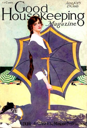
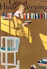
Coles Phillip

|
|
|
Phillips, Coles . Woman Reading in a Room. Good Housing Keeping Magazine, 1915.
|
Phillips, Coles. Woman Kneeling in the Sand. Good Housing Keeping Magazine, 1915.
|
Coles Phillip is a celebrated illustrator of the early 20th century, illustrating covers for various well known media outlets such as Good Housekeeping, The Saturday Post, and Life magazine just to name some.
There is one thing that I would like to incorporate into my piece from Coles Phillip. That would be his technique of using of negative space with positive space to create a faded out look into the background of his work. I mostly want to use this because I want to create this same effect between the haik that my subject will be wearing and the sand she will be laying in.
“COLES PHILLIPS.” National Museum of American Illustration, americanillustration.org/project/coles-phillips/.
The Sand Child
Jelloun, Tahar Ben. The Sand Child. Johns Hopkins University Press, 2000.
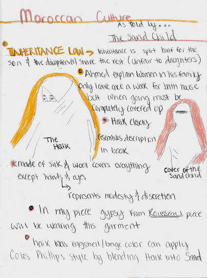
Moroccan Culture
“Traditional Moroccan Clothing:” Morocco, www.moroccopedia.com/traditional-moroccan-clothing/.
Planning
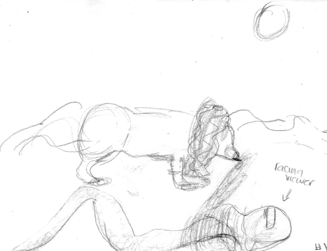
first sketch
|
second sketch
|
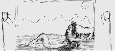
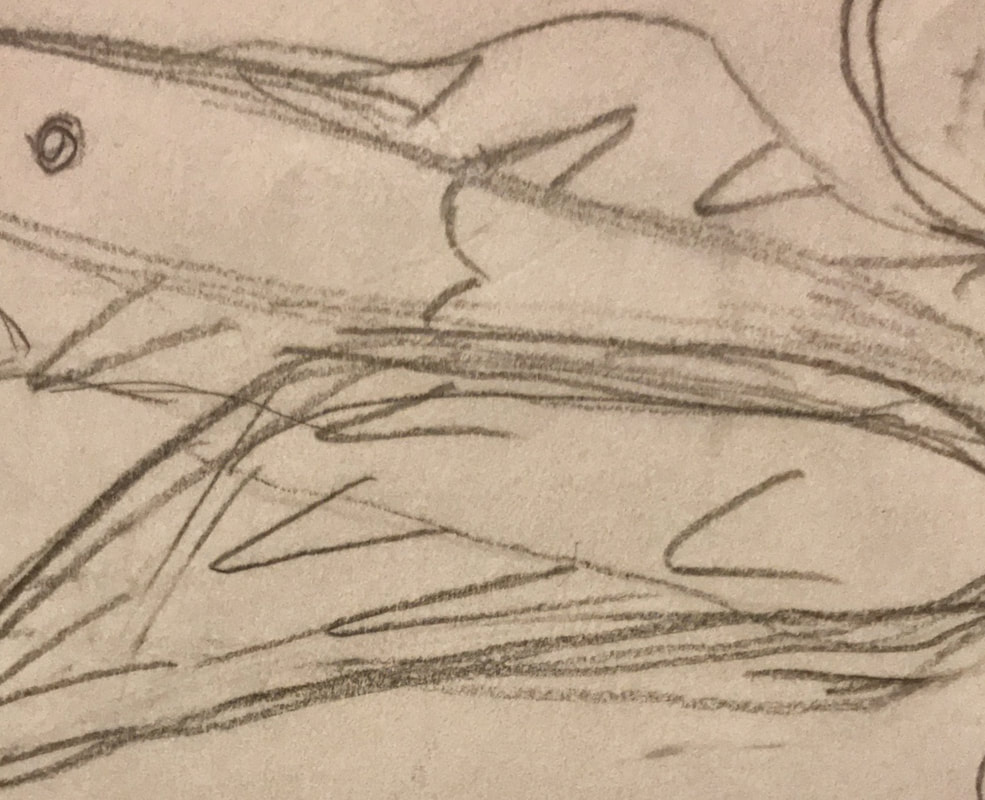
For the first two sketches I wanted to first figure out how I wanted to compose my female subject's, Zahra, body. For the first sketch I have her lying on her side, while for the second sketch she sits up cross legged. Still for both I wanted to have the lion figure, representative of her male identity, to bother her trying to expose her to assert the conflict between her two identities. Ultimately sketch 1 made it to the final cut because the way Zahra's body was composed (crossed legged, sitting) was not sending the same image of struggle.
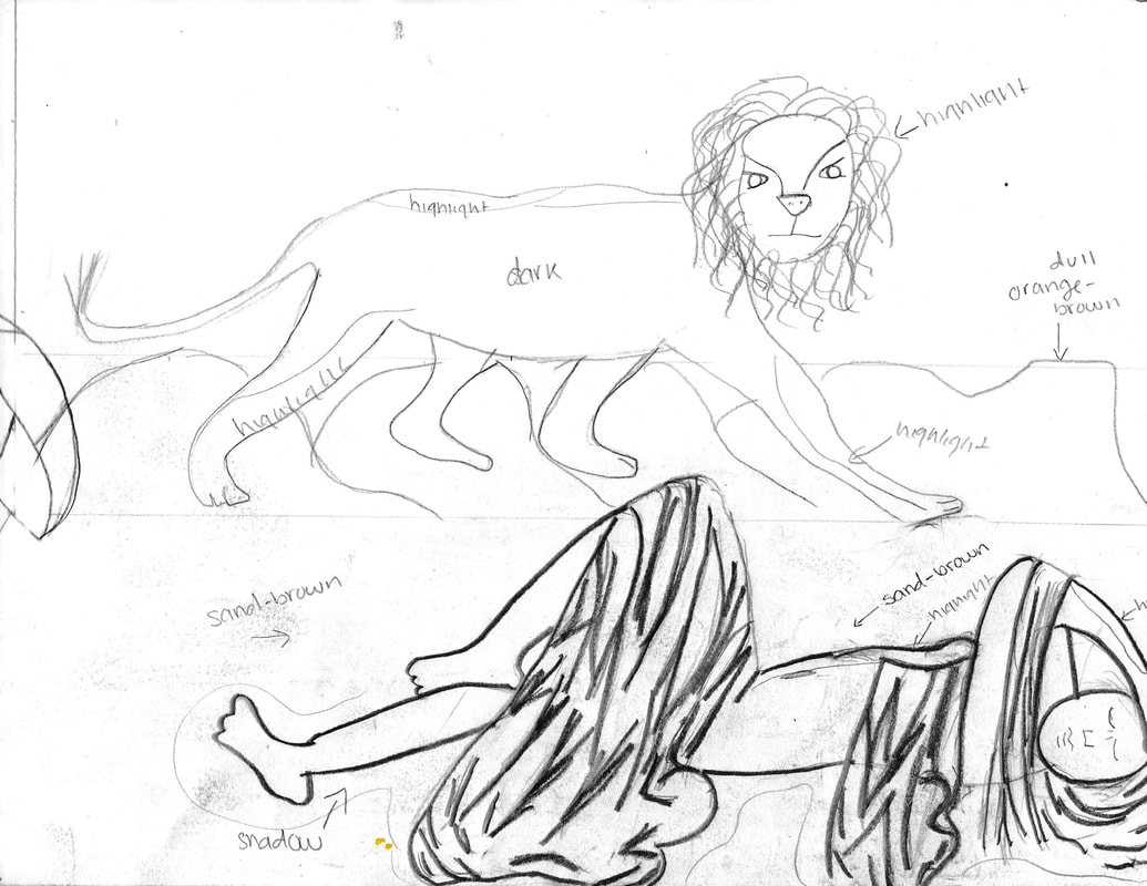
 third sketch
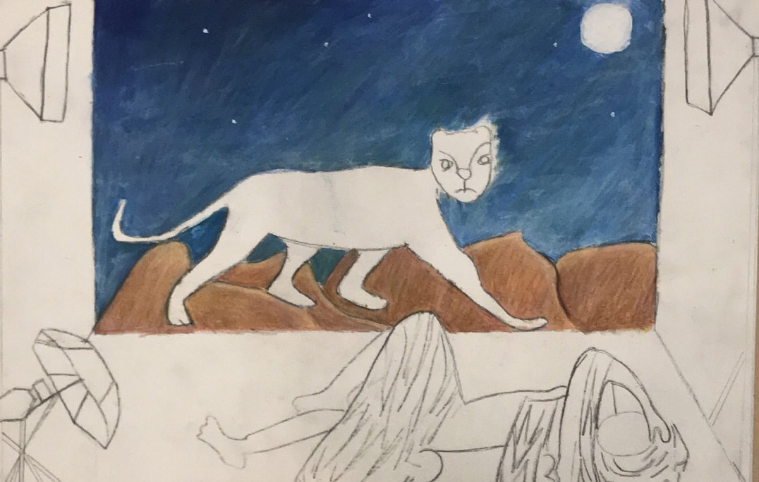
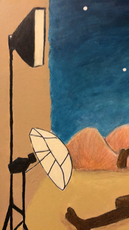
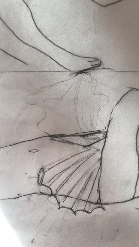
The final sketch utilizes the same scene from sketch number one, but now it is panned out to show a photoshoot set. The lion, representative of her male identity is still trying to pull of her clothes as she struggles to keep them on. The set itself is rather simple just the backdrop and the bright lights that are markers of a photoshoot set. This sketch incorporated all the aspects that I found important to communicate my message so I decided to continue with it.
Planning continued
|
http://video.vogue.com/watch/vogue-in-motion-on-set-at-the-petal-pushers-shoot
“Illuminator 5500K Continuous Lighting System.” The University of Fame Cherry, 8 Jan. 2011, famecherry.com/essential-studio-equipment/lights/illuminator-continuous-lighting/. |
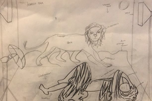
The main point of this piece is to show how media dictates how we feel about our sexuality, in this piece's case it's negative and something shameful. With that in mind I knew I had to look at fashion magazine photoshoot and how they were set-up to get an idea of how to configure my piece. The first thing that came to mind was to look at Vogue Magazine, the most prominent fashion magazine out there. Looking at one of there photoshoots is how I knew how to stretch the bottom corners of the "backdrop" in my piece to the edges of the illustration board. As well as how I found out where I was going to position the lights.
The final step was finding professional lights to use as reference. The lights themselves were very geometrical shapes so it was no problem in sketching them. Together I was able to create a more accurate scene for my piece. |
|
|
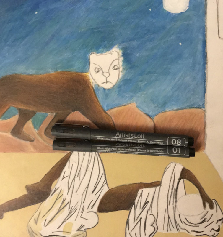
In this piece The Sand Child's Ahmed, the male side of Zahra would be represented by a similar lion to the one in The Sleeping Gypsy. In The Sleeping Gypsy the lion together with the gypsy is suppose to represent the harmony, still I wanted to play around with that and instead have the lion interrupt this and be a more intimidating to the other figure which is suppose to be Zahra. That's why I looked for a lion with an outstretched paw in order to show that he is trying to force Zahra (the female side) to reveal herself.
|
“Isolated on white background lion body profile.” Shutterstock, Shutterstock, inc., www.shutterstock.com/image-photo/isolated-on-white-background-lion-body-226512898?src=iZx56d54YTnBNV58r8sZnw-1-7.
|
|
The female subject is one of the most important figures, not only does she represent the main character in The Sand Child, but her body language and expression will communicate that she feels exposed and unsure of her nudity. I used V Magazine's photoshoot as reference, which showed Gigi positioned very seductive yet comfortable. Still I wanted to play around with the pose and make the face and clothes together change the body language to send the message that the figure is uncomfortable.
|
“V96 Gigi & Bella.” V Magazine Shop , V Magazine, LLC., 22 June 2015, vmagazineshop.com/past-issues/v96.
Final
Once I had each separate component drawn I took a big sheet of paper that was the same size as the illustration board and transferred them in. I did this by doing a carbon copy of each individual piece onto the new sheet; basically shading the back with my ebony pencil and then placing it onto the area I wanted and tracing the figure I had already drawn. The end result was something that I thought was satisfying enough to do a carbon copy, of the whole thing, onto the illustration board.
Coloration
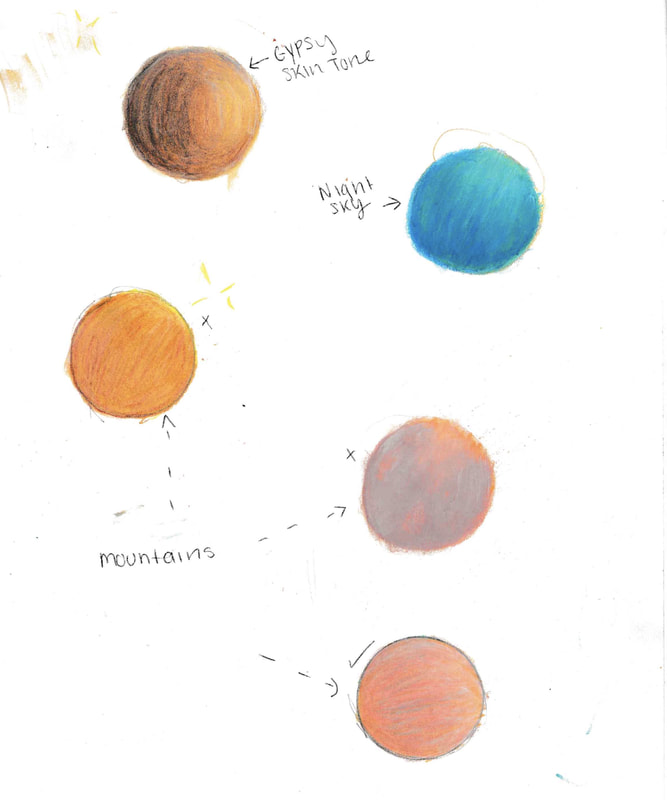
My final step was to plan out how I was going to color the different aspects of the piece. I also practiced the different colors it would take, with both acrylic and color pencil, to get the ideal coloration for the sky or skin tone.
click to enlarge image
Process
1. The first step once I had finalized my sketch was to make a carbon copy of it. This was simply using my ebony pencil I shaded the back of my sketch, then I lined up the sketch to the illustration board and proceeded to trace everything that I had drawn.
click to enlarge
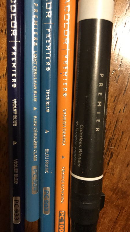
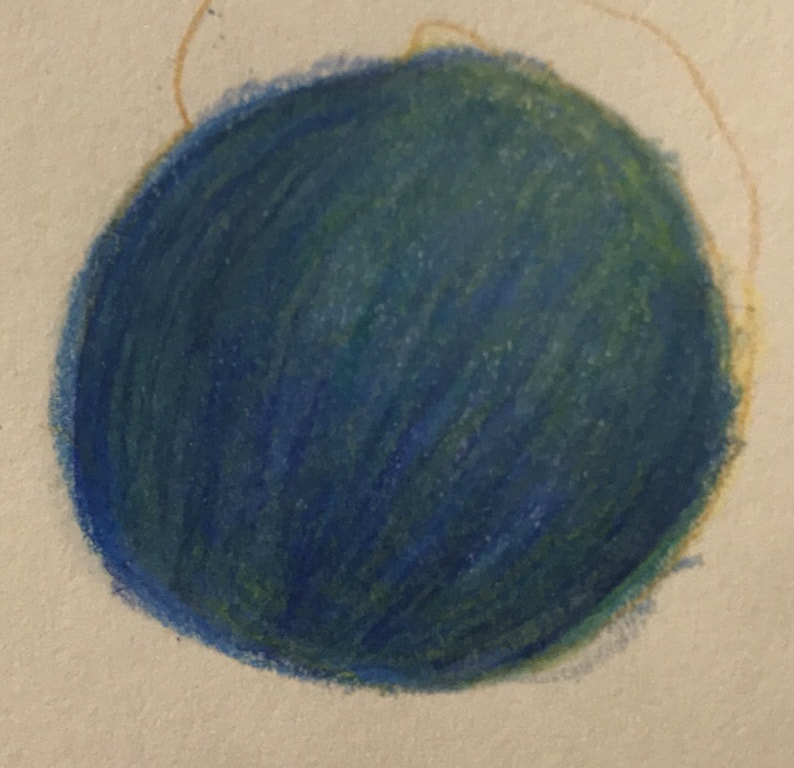
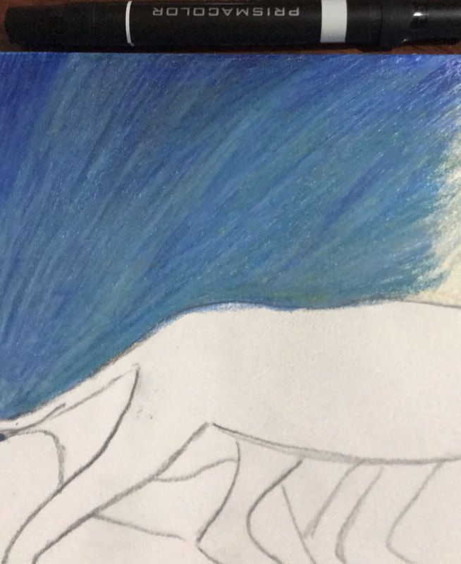
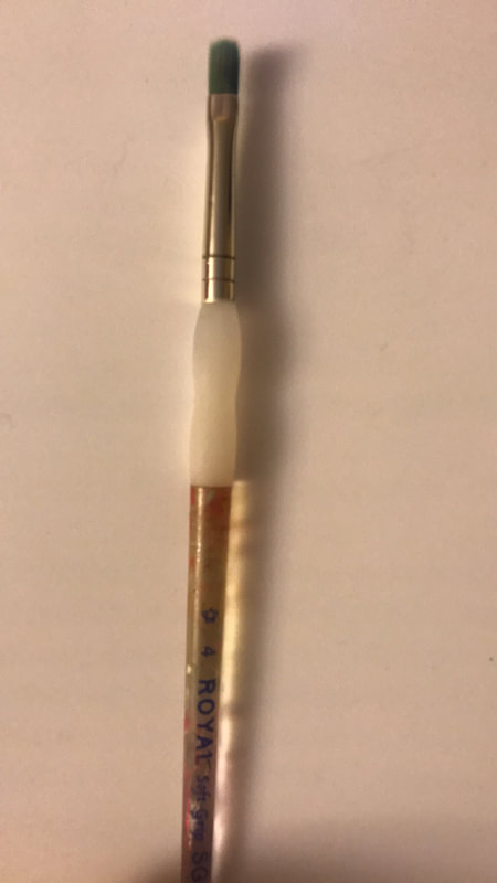
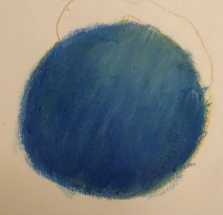
2. After I had completed the transfer I decided to work on the night sky first. I first decided to work with color pencils. To begin I colored with my lightest color yellow I proceeded to add light blue, true blue, and violet-blue in that order, then I used the colorless blender marker to smooth out and blend the colors. Still the lines felt to harsh so I decided to use a light coat of white and blue acrylic. I did this by taking my #4 flat brush and applying watered down white to the already lightest part and spreading it out, I did the same for the blue paint in the darker areas. This allowed for the sky to not have such harsh lines and look much more soft.
click to enlarge
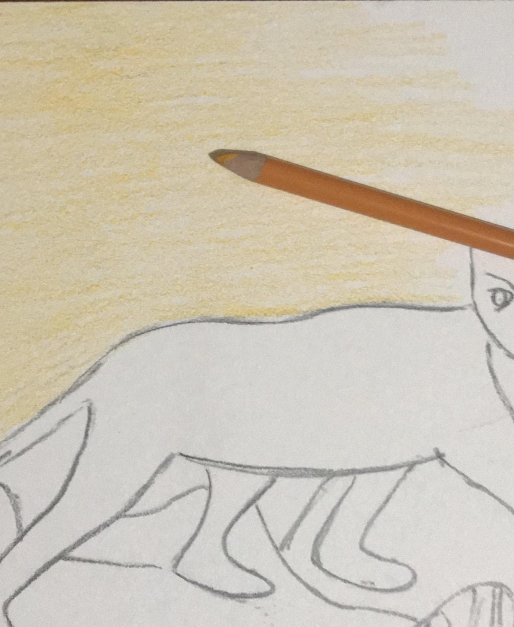
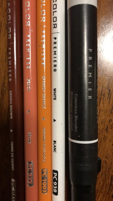
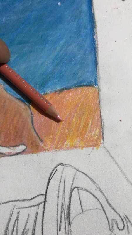
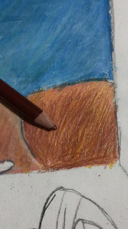
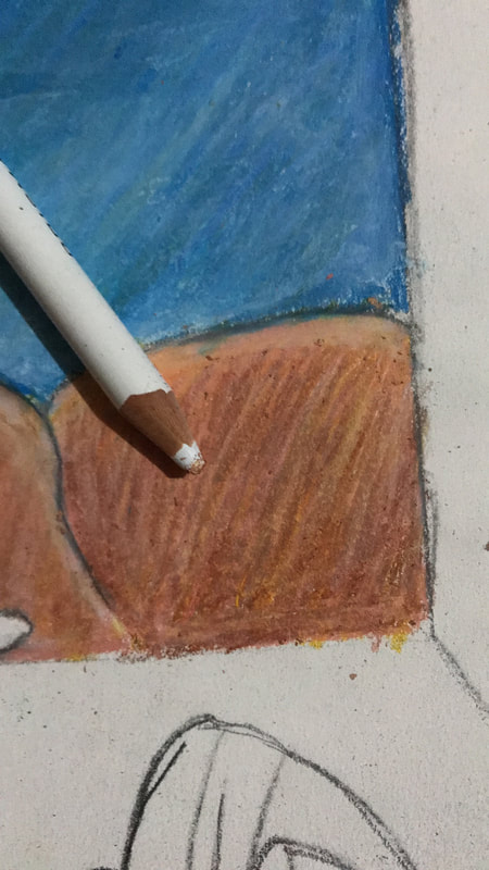
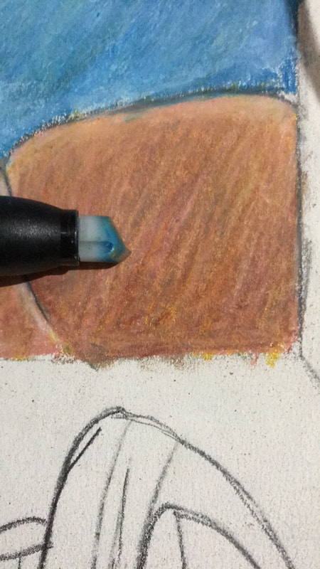
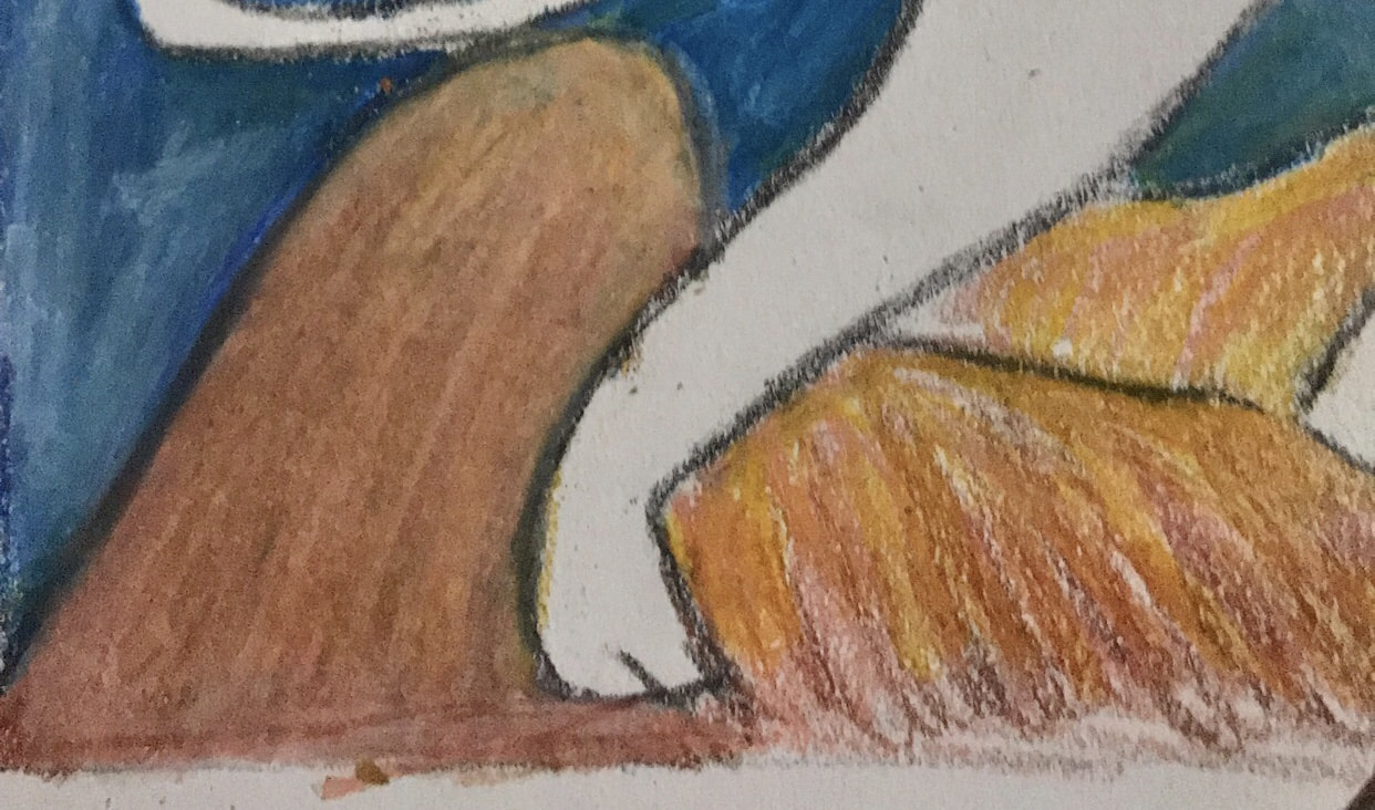
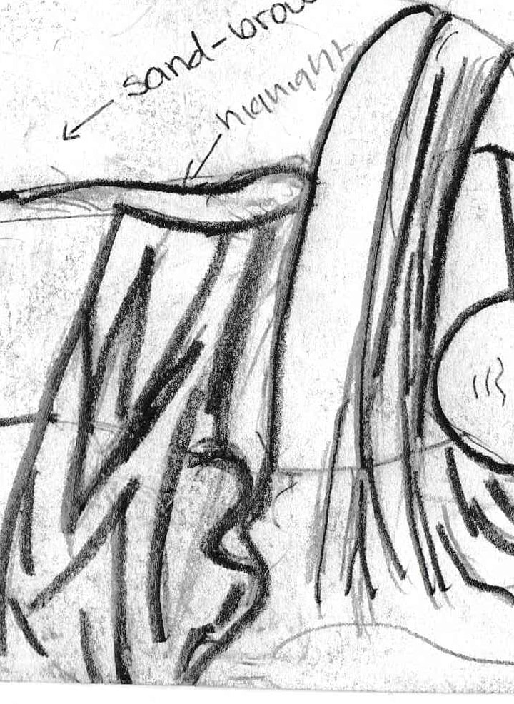
3. Next I worked on the mountains in the background. First I used my lightest colors, spanish orange and peach to coat most of the mountain. Next I used brown to get a darker look at the base of the mountain and moved by way up to get a more seamless transition when blended. Then I used white to get the same highlights that are seen in the mountaintops of The Sleeping Gypsy, but also apply white all around to get a more blended look. Finally I used the colorless blender marker to blend all the colors together and get a seamless transition within values.
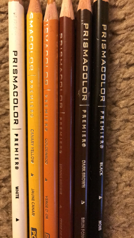
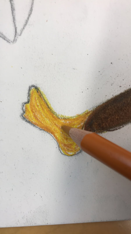
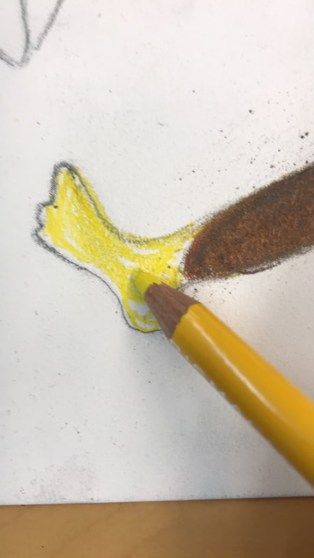
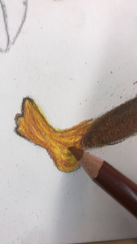
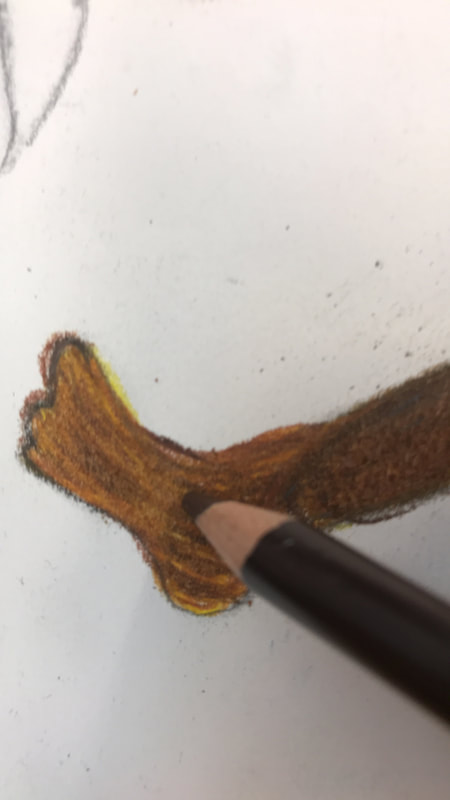
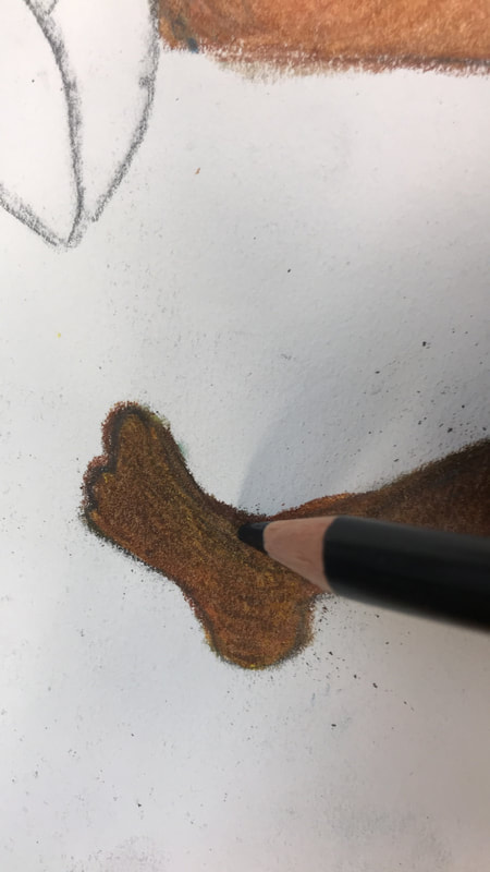
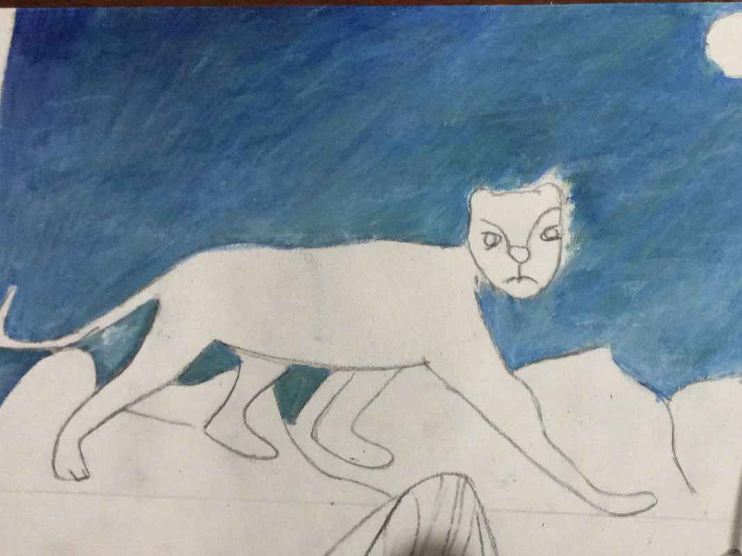
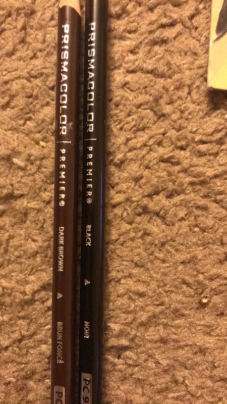
4. Afterwards I did the skin tone for both the lion and the woman (Zahra), they were essentially the same tone, just different variations of where values were (highlight changes). In order to produce a similar skin tone for both I started by adding a base of yellow and golden rod this would set it up so I could add highlight but also if I wanted shadow it could have a richer color. Then I would add sienna brown and dark brown, adding more where I wanted the area darker and then reducing as I went to the highlight. It was very beneficial to first use dark brown instead of black right away, to get darker values, because it added a more rich and easily blend-able color. Then I would add black to areas that needed a darker value, very minimally and would blend it into the area by first using sienna brown and then dark brown. I would apply these coats by layering; many times I would have to go back and add goldenrod or sienna brown to cover white spot completely.


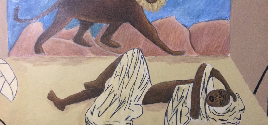
5. After I finished the skin tone I moved onto the sand aspect. At first I started by taking my number 4 flat brush and applying a layer of an orange-peach color. Ultimately I decided to change the coloration to something more neutral especially since the coloration of the skin tone needed to shine equally to establish the connection to The Sleeping Gypsy. That when I decided to use a beige color around the female figure. I finished off the sand by adding brown to the areas that I felt needed shadow, such as the mountain bases.
Afterwards I worked on the clothing, an important aspect that linked my piece to Coles Phillips style. I started by taking a 0.8 mm and 0.1 mm fine point pen to outline the folds in the females clothing. Then I took the beige color and added white to it and used it to paint the clothes of the female. This was a bit of a mistake as I got paint on the folds and had to go back and go over them again.
Afterwards I worked on the clothing, an important aspect that linked my piece to Coles Phillips style. I started by taking a 0.8 mm and 0.1 mm fine point pen to outline the folds in the females clothing. Then I took the beige color and added white to it and used it to paint the clothes of the female. This was a bit of a mistake as I got paint on the folds and had to go back and go over them again.
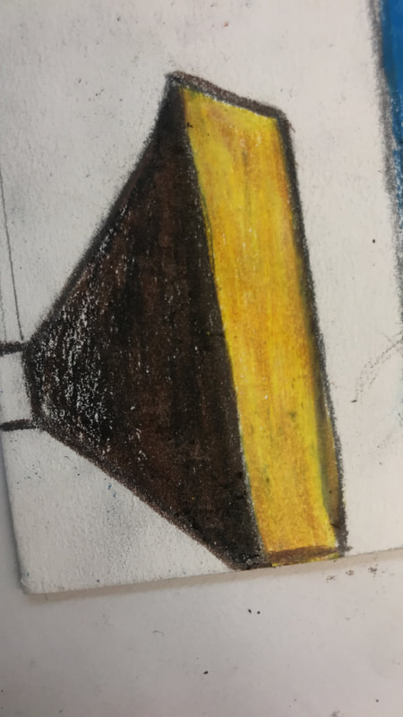
6. The final thing I i did was the photo shoot lights which I made by layering dark brown and black onto each other. Originally I colored the lights yellow but fearing it looked too messy I used the left over white-beige color to re-color it. Then I took the same beige color and added brown to darken up the color to use for the background. I used my number 4 flat brush to try to create clean edges the best I could and finish off the work.
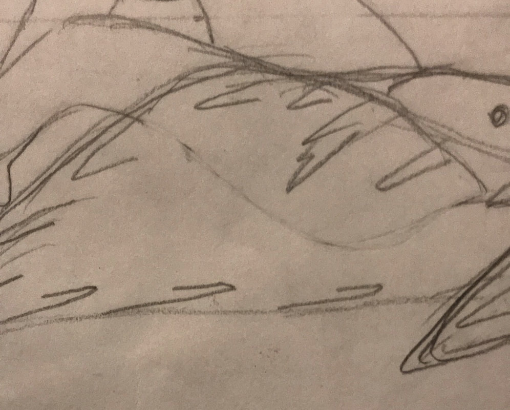
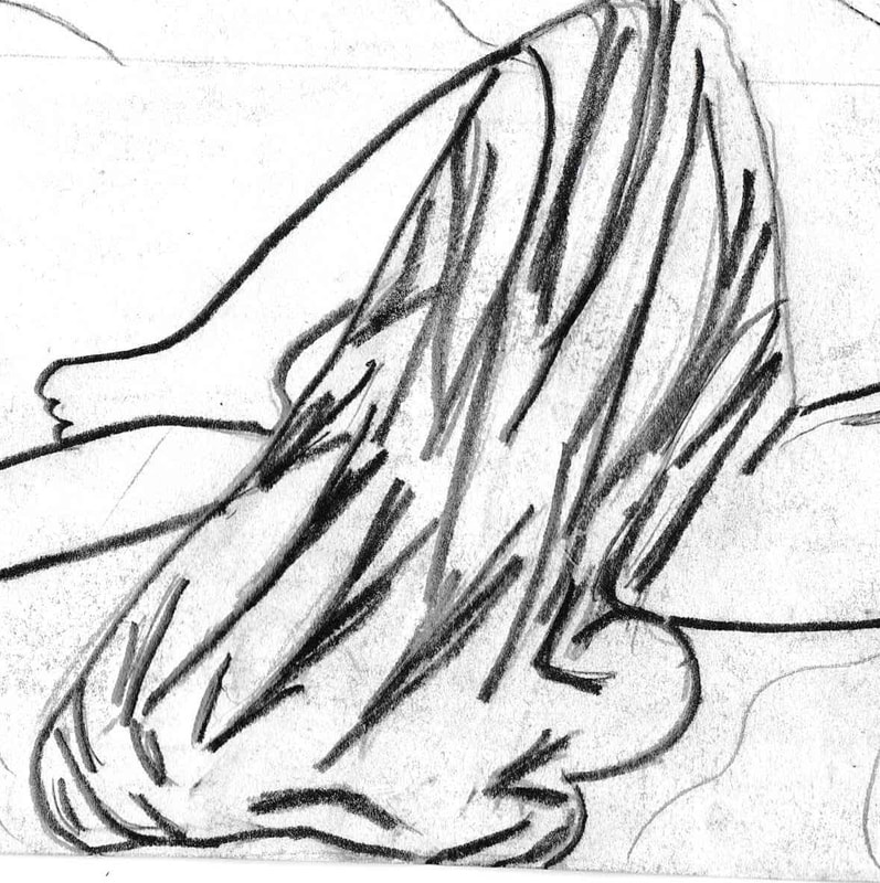
Expirimentation/ Development of Technique
Texture
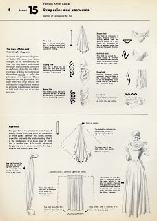
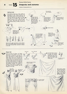
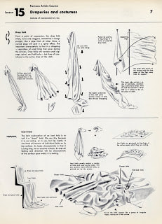
Diaper Fold, Pipe Fold, Drop Fold and Half Lock Folds
Tips on how to create folds in clothes while drawing
Click to enlarge
|
Click to enlarge
|
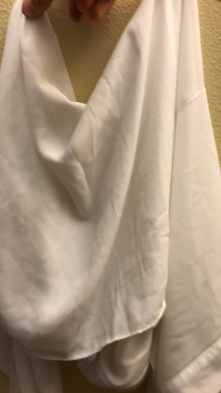
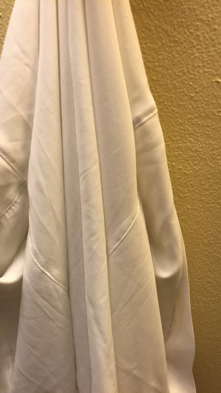
Originally I used very little line work and used a simple tear like folds in order to create texture. Still I felt like I could do so much more, I wanted to show dynamic movement in the fabric. This led to me using one of my own shirts to understand what it was that I was trying to recreate. Still I realized I needed more reference which led me to finding out about diaper folds, which is what is seen in my shirt. With that in mind I began to utilize it in the torn apart head scarf part of the haik. This ultimately led to a version of the head piece that had more movement.
|
|
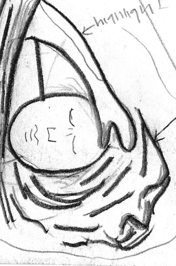
It is in the torn fabric of the haik in the body portion that I have much more movement than the original version. It is here that I begin to use pipe folds, drop folds, and half lock folds, to create texture that mimics real life qualities of fabric. It is in especially drop folds that I began take more freedom with my line work. Since it is a folds that focuses more on the direction (downward) of the line than how it is shaped, unlike other folds that rely on more geometrical shapes as guidelines in order to create.
|
|
Click to enlarge
“Folds.” Temple of the Seven Golden Camels, 23 June 2012, sevencamels.blogspot.com/2012/06/folds.html.
|
|
My biggest reason for wanting to add more texture was I wanted a stronger connection to Coles Phillips especially his technical work. That is why I wanted to research and experiment with texture and look into creating different fold types. It is when looking at my piece and his together that you can see how I began to emulate his use of texture and line work.
|
Reflection
Coles Phillips |
Henri Rousseau |

click to enlarge images
|
I will say that in this piece the connection to Coles Phillips could have been stronger due to the fact that I wanted that connection to come across from the torn clothing from a single figure. Although I do have those details in the folds they lack the high contrast seen in Phillips' work. It also didn't help my piece's theme which bases around the female being uncomfortable with showing skin, which the torn clothing would help draw to that conclusion, which I had to counter balance by emphasizing her expression of horror.
|
I am somewhat unsatisfied with the background of the piece especially because it doesn't mimic the original piece as much as I would have liked. It came down to coloration of the sky and the overly large mountains that really change the piece. Another thing I feel overwhelmingly unsatisfied with is the lion's mane because while the body tone is spot on in my eyes, the mane looks like it lacked attention and no where mimics the original lion. This comes from my misconception of trying to make everything child-like, to be like Henri Rousseau, but that did not mean make things sloppy and that is what it comes across as. Overall as a whole I feel like all the parts together do help depict my theme of her being uncomfortable with her sexuality, which was largely thanks to the female's expression.
|
ACT Responses
1) Clearly explain how you are able to identify the cause-effect relationships between your inspiration and its effect upon your work?
The effect of my inspiration of Coles Phillips can be seen through texture and use of space, this can be seen in the folds of the clothes and in the fading of the female figure into the sand. The effect of my inspiration of Henri Rousseau can be seen through color and shape this is seen in in the off and skewed proportions of the body and the recreation of the background of The Sleeping Gypsy.
2) What is the overall approach(point of view) the author (from your research) has regarding the topic of your inspiration?
There were various authors that I came across when doing my research but the main distinction for both Coles Phillips and Henri Rousseau was the tone of utter most respect for both artists. The authors in both were well informed of the effect of there art work on their respective fields, illustration and painting. Still my inspiration of The Sand Child also allowed me to get the point of view of someone who was struggling, felt oppressed by their society.
3) What kind of generalizations and conclusions have you discovered about people, ideas, cultures, etc. while you researched your inspiration?
One of my was the book The Sand Child, it was here that I began to understand the how different cultures view the female body and more so the female sexuality. For example here in the United States there is more of inclination, through popular media, to accept the body and its sexuality in its full glory. Still somewhere like Morocco in the 1950's where this book takes place they are more conservative especially since the popular media or social norms came from a conservative interpretation of the Koran.
4) What was the central idea or theme around your inspirational research?
The central idea of in my research is female sexuality, more so how it can be oppressed, which is something that The Sand Child hints at especially in Ahmed reconnecting with her female sexuality. As well as playing of the idea that popular media affects how we feel about this idea, hence researching fashion photo shoot sets which popularize what we think of the body and sexuality of females.
5) What kind of inferences (conclusions reached on the basis of evidence and reasoning) did you make while reading your research?
The key idea that came from my research of The Sand Child was inferring that in the setting of the book Zahra/Ahmed's female sexuality was repressed. This is something that through the presentation of things like the inheritance law and how as a little boy she found female body disgusting but as she gets older she begins wanting to get show she is a women openly. The combination of both show how culturally the body was something to hide, something sacred in a sense that it was disrespectful to show off.
