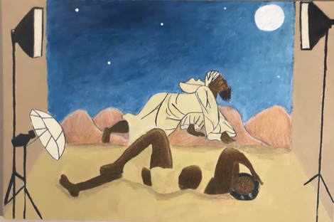
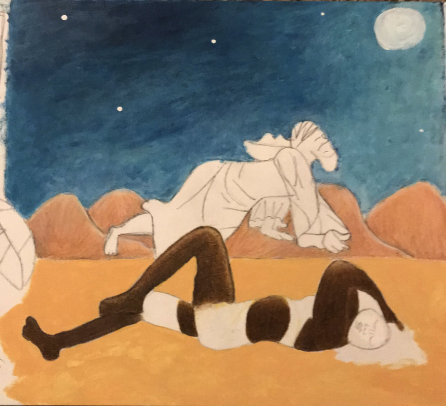
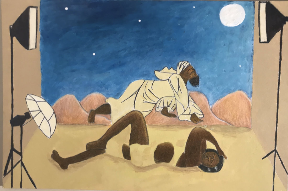
Title: The Gate of the Sands I
Size: 30.5 cm x 40.6cm
Medium: Acrylic and Color Pencil on Illustration Board
Date: November 30th 2017
Size: 30.5 cm x 40.6cm
Medium: Acrylic and Color Pencil on Illustration Board
Date: November 30th 2017
Exhibition Text
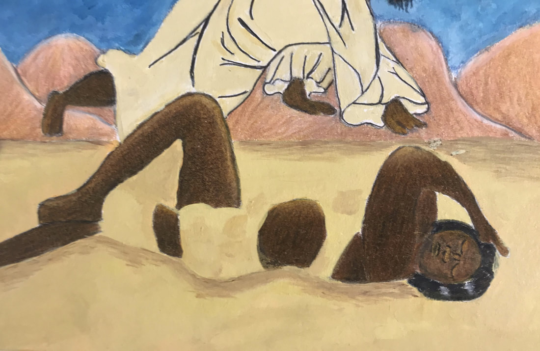
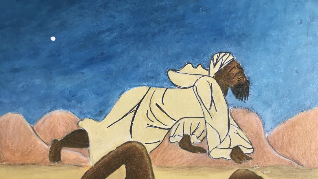
The Gate of Sand I is an illustration piece that portrays the freedom that comes from expressing female sexuality and more so comments on how popular media shapes those ideas. It is largely inspired by the novel The Sand Child and its main character Zahra/Ahmed's struggle to accept their female identity. It also takes from Henri Rousseau's desert background in The Sleeping Gypsy and Coles Phillips use of lines and space.
Inspiration
Henri Rousseu
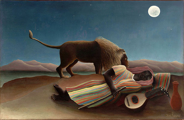
Rousseau, Henri. The Sleeping Gypsy . 1897, Museum of Modern Art , New York City.
“His art the end of the nineteenth century represented the first childlike art of the modern period and provided standards for acceptable primitivism and romantic innocence”
Henri Rousseau is one of the most prominent figures of the symbolism movement. He is mostly known for his dreamy, almost child like pieces. Although his piece were at times ridiculed for his lack of technical skill they speak to his self-taught painting skills, a true feat in itself. I decided that I would try to mimic one of the most parodied piece's, a desert scene known as “The Sleeping Gypsy”.
This piece depicts a sleeping female gypsy exhausted by her travels she lays in the middle of the desert in the moonlight; she lays next to her jug of water and mandolin and strangely enough a lion comes up to her but does not harm her. It is representative of not just a dream like scene but showcases human’s harmony with animals.
I knew that the figures could be re-interpreted not only into The Sand Child but also into a modern juxtaposition. Still I wanted similar qualities from “The Sleeping Gypsy” and Rousseau style in general. The first thing I wanted to keep the same was the shape, Rousseau uses incredibly flat and at times angular shapes. I wanted to keep true to this in order to have a direct connection back to “The Sleeping Gypsy,” because it is the shape that also gives it the skewed and off portion look that Rousseau is famous for. Another thing I wanted to keep the same was the space, particularly the background but the foreground as well. Not only did I want to maintain this for a direct connection to the artwork but also the desert setting was imperative to creating the narrative that fit with The Sand Child, which takes place in Morocco. Another thing I would like to utilize is his use of color, which is deep, intense, and at times unnatural colors. It gives off a child like essence that is a trademark of Rousseau. Still utilizing the value that he implements with the color helps to gives the eerie glow that is a true marker of “The Sleeping Gypsy,”. Especially since the setting (in both “The Sleeping Gypsy” and my own) is during a full moon, it helps to bring full circle the narrative, since it adds connection within the piece itself.
“Henri Rousseau Biography, Art, and Analysis of Works.” The Art Story, www.theartstory.org/artist-rousseau-henri-artworks.htm#pnt_3.
Hunter, Sam, and John Jacobus. Modern art from post impressionism to the present: painting, sculpture, architecture. Henry N. Abrams, INC, 1976.
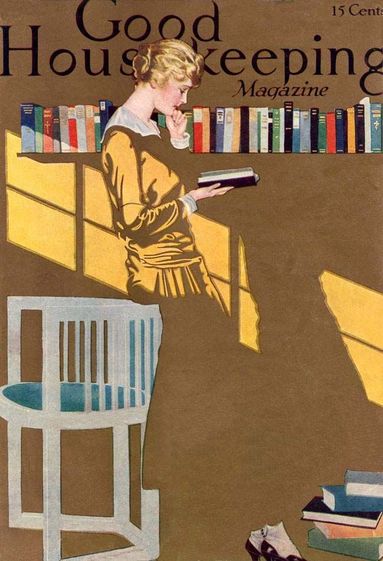
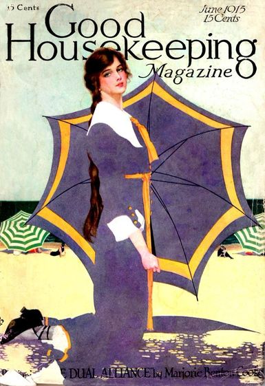
Coles Philllips
|
|
|
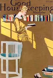
Phillips, Coles . Woman Reading in a Room. Good Housing Keeping Magazine, 1915.
|
Phillips, Coles. Woman Kneeling in the Sand. Good Housing Keeping Magazine, 1915.
|
Coles Phillips is a celebrated illustrator of the early 20th century, illustrating covers for various well known media outlets such as Good Housekeeping, The Saturday Post, and Life magazine just to name some.
There is one thing that I would like to incorporate into my piece from Coles Phillips. That would be his technique of using of negative space with positive space to create a faded out look. I mostly want to use this because I wanted her into the sand, signifying she is getting lost in time, since time can usually be represented by sand. Partially because in the book it takes time for her to accept her sexuality.
“COLES PHILLIPS.” National Museum of American Illustration, americanillustration.org/project/coles-phillips/.
The Sand Child
Jelloun, Tahar Ben. The Sand Child. Johns Hopkins University Press, 2000.
Planning
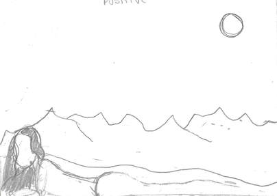
First Sketch
Third Sketch
|
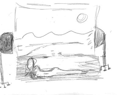
Second Sketch
Fouth Sketch
|
|
The first two sketches are representative of how I wanted to arrange the actual body of the female in my piece, the female being Zahra. I experimented with having her laying on her stomach and then laying on her back while Ahmed hovered over her. Still I couldn't decided which suited the piece better so I decided to try new sketches with the actual photoshoot scene incorporated.
|
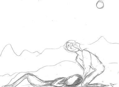
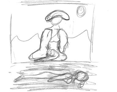
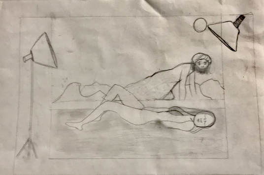
In sketch number 3 and 4 I work with the full scene of the desert and the photoshoot set that I planned on implementing.
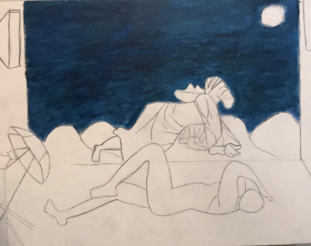
In sketch 3 I draw Zahra by herself laying on her stomach and her face facing the viewer of the piece. Still I did't like the fact that this sketch lacked balance, it was then that I decided I would need to utilize Ahmed's character to achieve balance. It was in sketch 4, the sketch that will resemble my final piece the most, that I used both Zahra and Ahmed. Zahra in this piece faces the viewer with most of her body exposed while Ahmed representative of the lion from," The Sleeping Gypsy" hover over her. Ahmed much like the lion in the original piece, only looks at Zahra but doesn't harm her, he lets her be. I went ahead with this sketch because it cover the different aspects I wanted: balance between two figures, a seductive womanly figure, and a metaphorical representation of the lion figure. |
Planning Continued
|
Out of those four sketches I made one that encompassed all the different aspects in each one. Still this was just a general idea of what I was going to do, I still needed to refine my idea. Especially since I was going to make a carbon copy of my final sketch onto the illustration board. Essentially my final sketch would have to be my exact vision for my final piece.
|
Getting the Right Look |
|
http://video.vogue.com/watch/vogue-in-motion-on-set-at-the-petal-pushers-shoot
“Illuminator 5500K Continuous Lighting System.” The University of Fame Cherry, 8 Jan. 2011, famecherry.com/essential-studio-equipment/lights/illuminator-continuous-lighting/. |
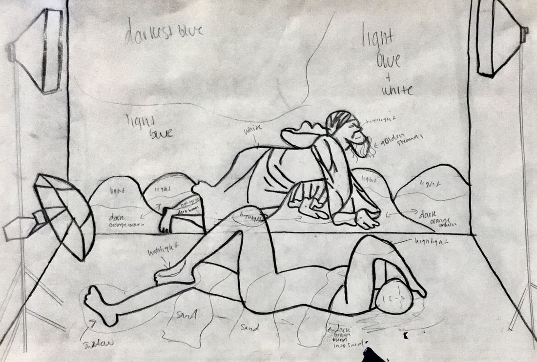
The main point of this piece is to show how media dictates how we feel about our sexuality, in this piece's case it's freeing and positive. With that in mind I knew I had to look at fashion magazine photoshoot and how they were set-up to get an idea of how to configure my piece. The first thing that came to mind was to look at Vogue Magazine, the most prominent fashion magazine out there. Looking at one of there photoshoots is how I knew how to stretch the bottom corners of the "backdrop" in my piece to the edges of the illustration board. As well as how I found out where I was going to position the lights.
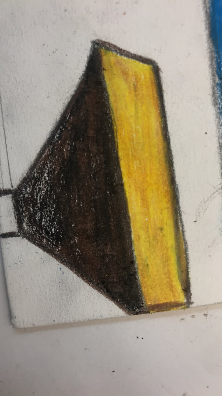
The final step was finding professional lights to use as reference. The lights themselves were very geometrical shapes so it was no problem in sketching them. Together I was able to create a more accurate scene for my piece. |
|
“V96 Gigi & Bella.” V Magazine Shop , V Magazine, LLC., 22 June 2015, vmagazineshop.com/past-issues/v96.
|
The female subject is one of the most important figures, not only does she represent the main character in The Sand Child, but her body language and expression will communicate that she feels free by being bare bodied. In the end I used V Magazine's photoshoot as reference; the way Gigi was positioned in a very seductive yet comfortable way made for the perfect match.
|
|
“Young woman in a ruined building. Secretly crawling on a floor.” Shutterstock, Shutterstock, inc., www.shutterstock.com/search/woman crawling.
“A Berber in Morocco.” Getty Images , Getty Images, www.gettyimages.com/detail/news-photo/berber-in-morocco-news-photo/3355525. |
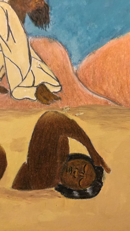
This is the second figure that is equally as important as the first, as it represents the male side of the main character in The Sand Child. His body language was also important because it would have to represent Henri Rousseau's The Sleeping Gypsy. In The Sleeping Gypsy, the lion together with the gypsy is suppose to represent the harmony between both figures, more so is that communicated through the lion who could have easily devoured the gypsy. That is why I looked for pictures that showed a crawling man or woman, an animal like pose, to make them representative of the lion. The second thing I looked for was the type of garments men in Morocco wear, so I could make a direct connection The Sand Child. Together I came out with a figure that encompasses both man and animal.
|
Coloration
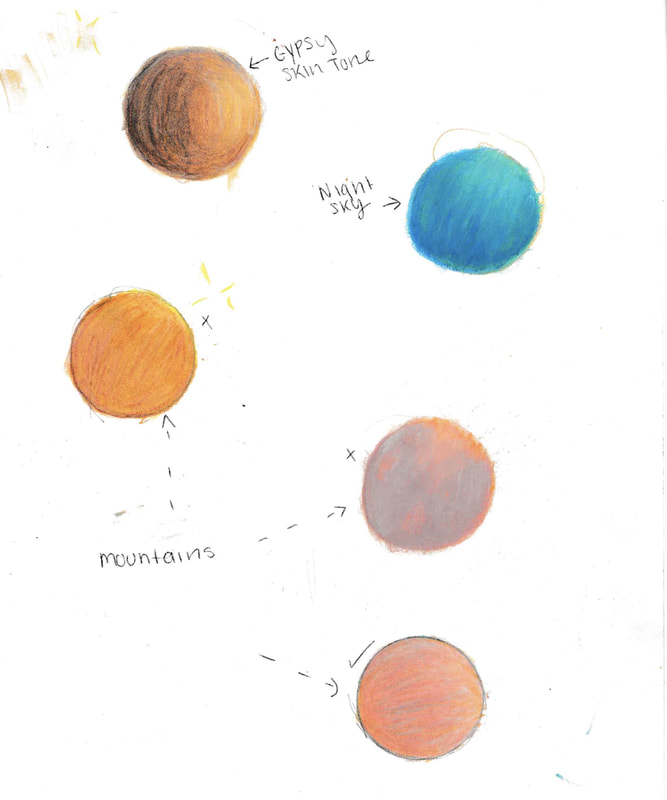
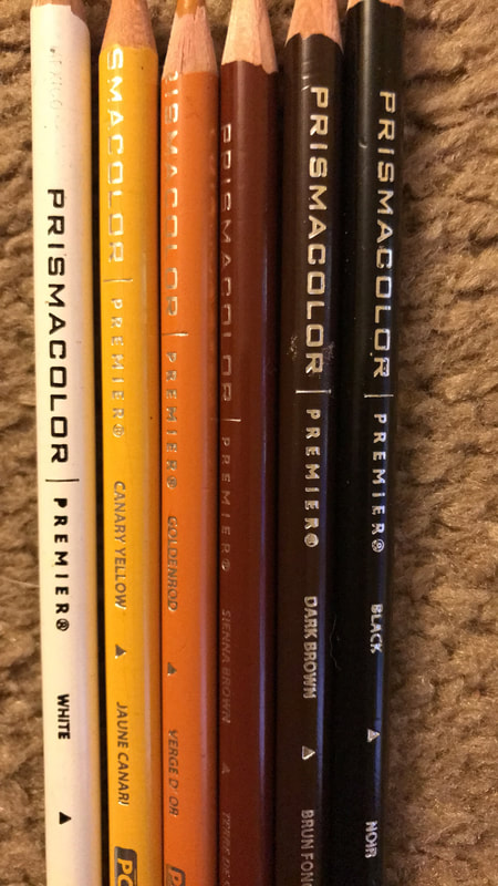
Finally I drafted how I was going to lay out different hues and their values on the piece. As well as experimented with color pencils and acrylics to figure out how I could get the colors, I needed, for different aspects of the piece such as the skin tone of the face and the sky's coloration.
click to enlarge
Final
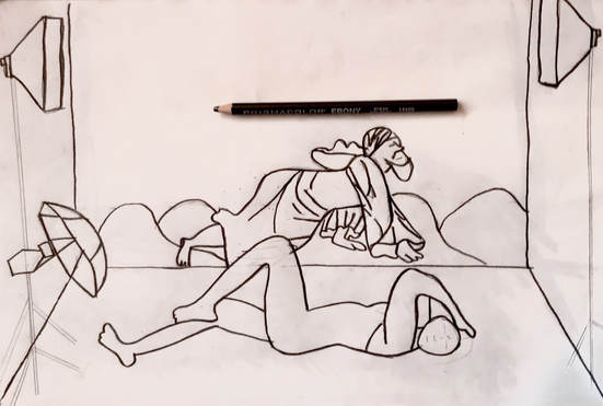
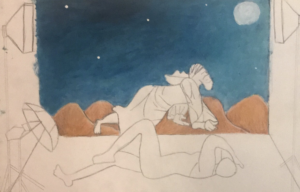
Once I had each separate component drawn I took a big sheet of paper that was the same size as the illustration board and transferred them in. I did this by doing a carbon copy of each individual piece onto the new sheet; basically shading the back with my ebony pencil and then placing it onto the area I wanted and tracing the figure I had already drawn. The end result was something that I thought was satisfying enough to do a carbon copy, of the whole thing, onto the illustration board.
Process
1. The first step once I had finalized my sketch was to make a carbon copy of it. This was simply using my ebony pencil I shaded the back of my sketch, then I lined up the sketch to the illustration board and proceeded to trace everything that I had drawn.


click to enlarge
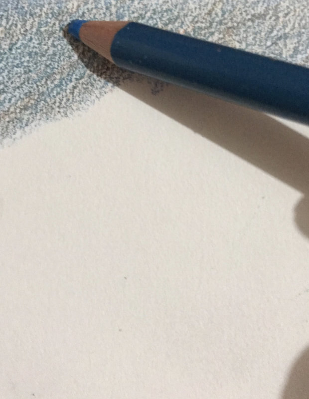
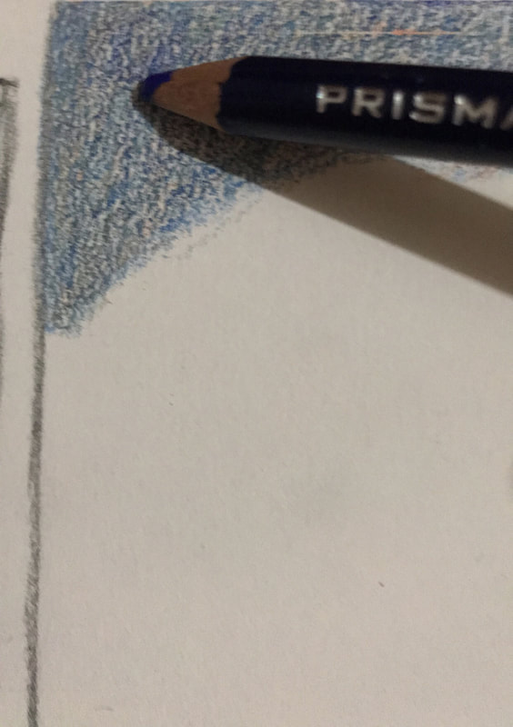
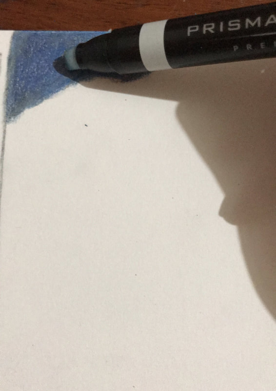
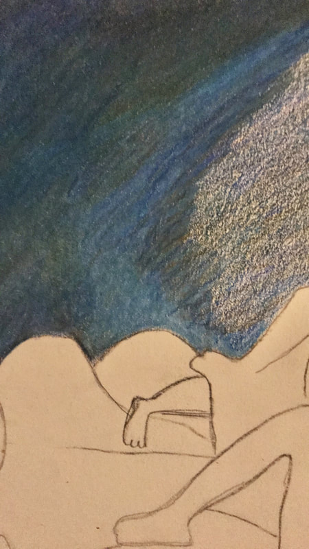
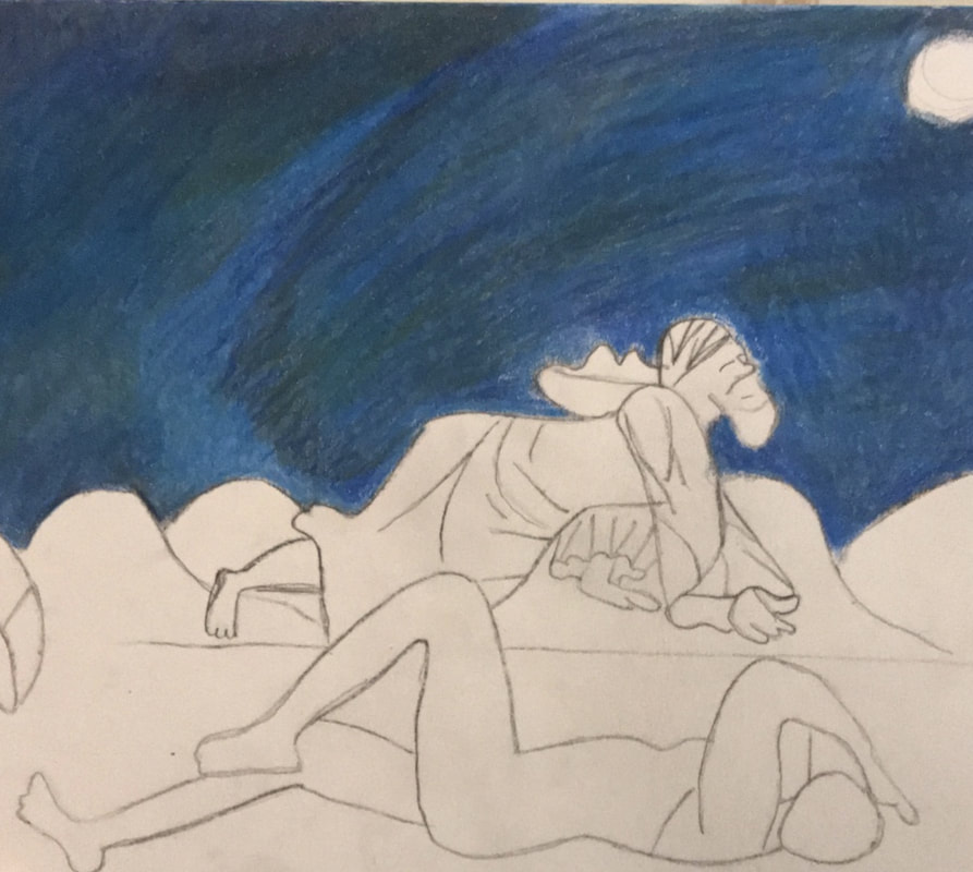
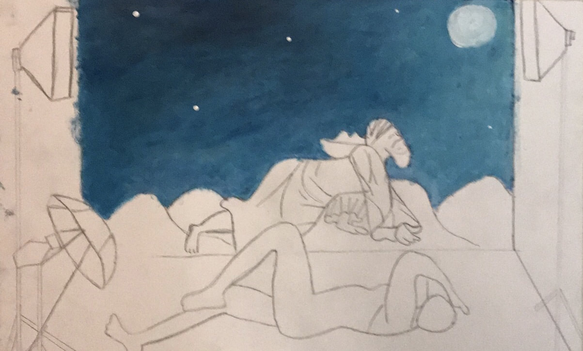
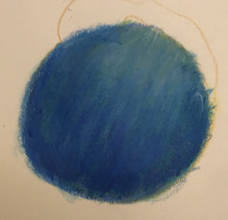
2. After that point I decided to work on the background feature first, the night sky. This would have to almost completely emulate The Sleeping Gypsy 's background. Using my number 4 flat brush I coated the board (background) with a layer of dark blue. Then using the same brush I added white in the lighter areas represented in The Sleeping Gypsy. Afterwards any transitional areas I used the medium blue to blend the dark and light values together. For blending I worked in small areas working my way down as I saw fit.
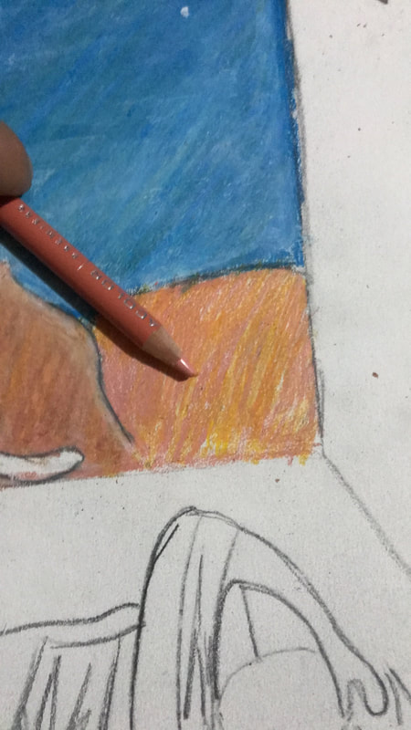
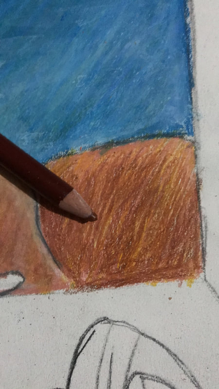
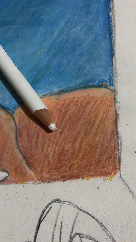
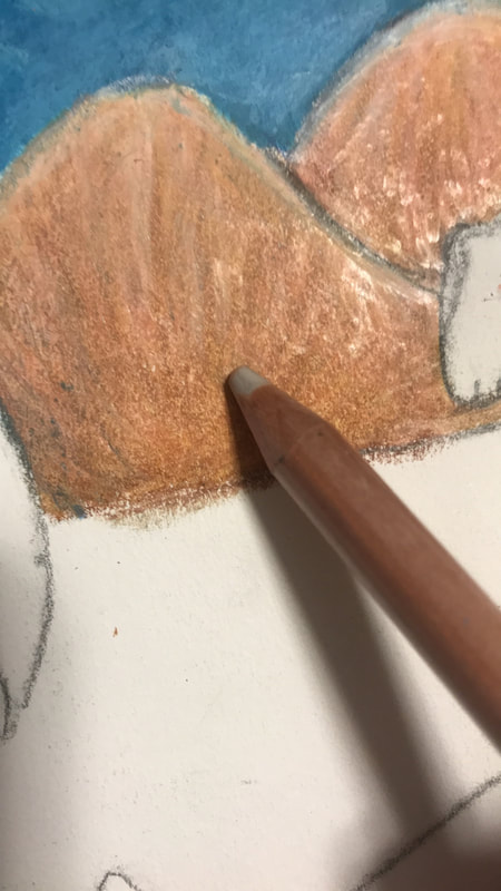
3. Next I decided to do another feature of the background in the same fashion as The Sleeping Gypsy, that being the mountains. For this I decided to work with color pencil and achieve a blended look, like acrylic, using a colorless color pencil. First I used my lightest colors, spanish orange and peach to coat most of the mountain. Next I used brown to get a darker look at the base of the mountain and moved by way up to get a more seamless transition when blended. Then I used white to get the same highlights that are seen in the mountaintops of The Sleeping Gypsy, but also apply white all around to get a more blended look. Finally I used the colorless color pencil to blend all the colors together.
click to enlarge


click to enlarge
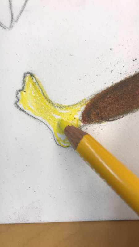
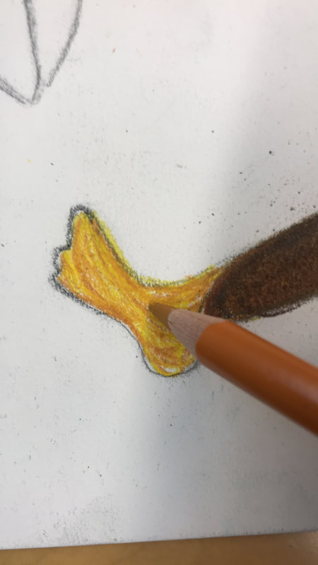
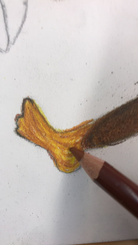
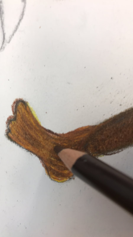
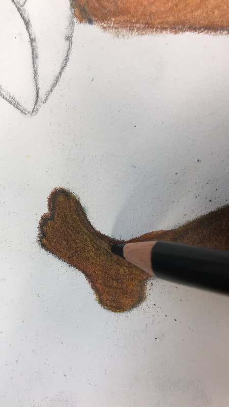
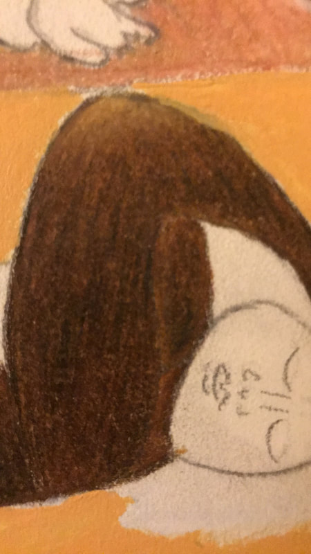
4. The next thing I did was the skin tone for both the man (Ahmed character) and the woman (Zahra), they were essentially the same tone, just different variations of where values were (highlight changes). In order to produce a similar skin tone for both I started by adding a base of yellow and golden rod this would set it up so I could add highlight but also if I wanted shadow it could have a richer color. Then I would add sienna rod and dark brown, adding more where I wanted the area darker and then reducing as I went to the highlight. It was very beneficial to first use dark brown instead of black right away, to get darker values, because it added a more rich and easily blend-able color. Then I would add black to areas that needed a darker value, very minimally and would blend it into the area by first using Sienna brown and then dark brown. I would apply these coats by layering; many times I would have to go back and add goldenrod or sienna brown to cover white spot completely.
click to enlarge
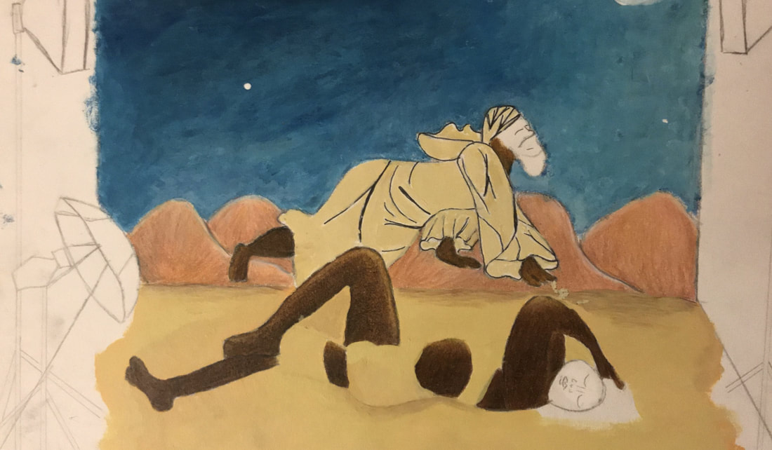
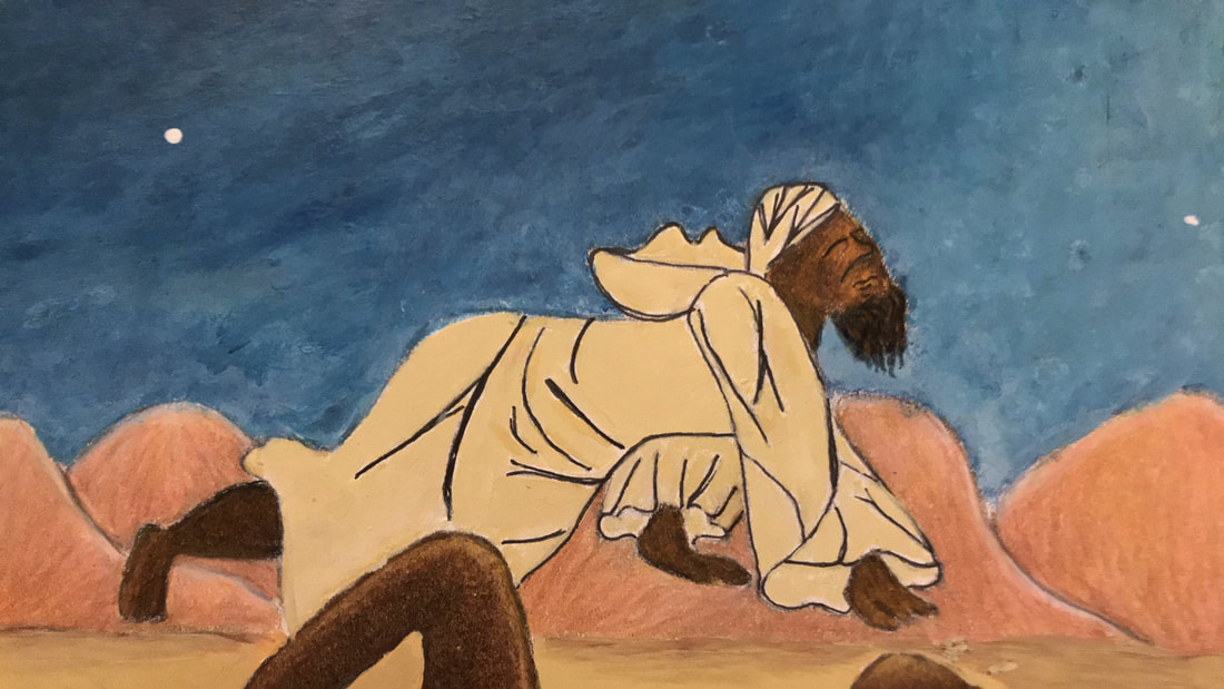
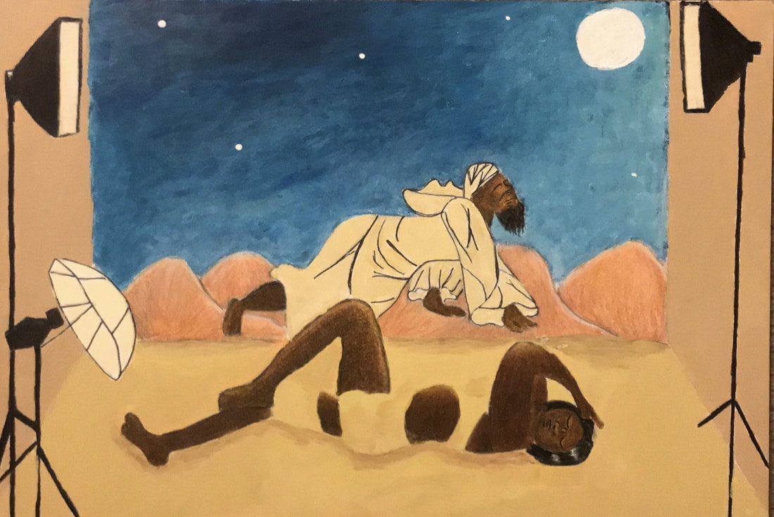
5. After I finished the skin tone I moved onto the sand aspect. This was an important part of my piece that would link my inspiration of Coles Phillips. At first I started by taking my number 4 flat brush and applying a layer of an orange-peach color. Ultimately I decided to change the coloration to something more neutral especially since the coloration of the skin tone needed to shine equally to establish the connection to The Sleeping Gypsy. This led to a neutral beige color that I first applied to the ground, everywhere except the female figure itself. After wards I applied the beige color to the designated areas on the body of the female. Realizing it looked much too blocky I used brown and the same beige color to make shadow, to give her body a more distinguishable shape. Afterwards I used a 0.8 and 0.5 fine point pen to outline the folds in the man's clothes; this was another mark of Coles Phillips work. I finished off by painting the area with the beige color and a little white added to it.
click to enlarge

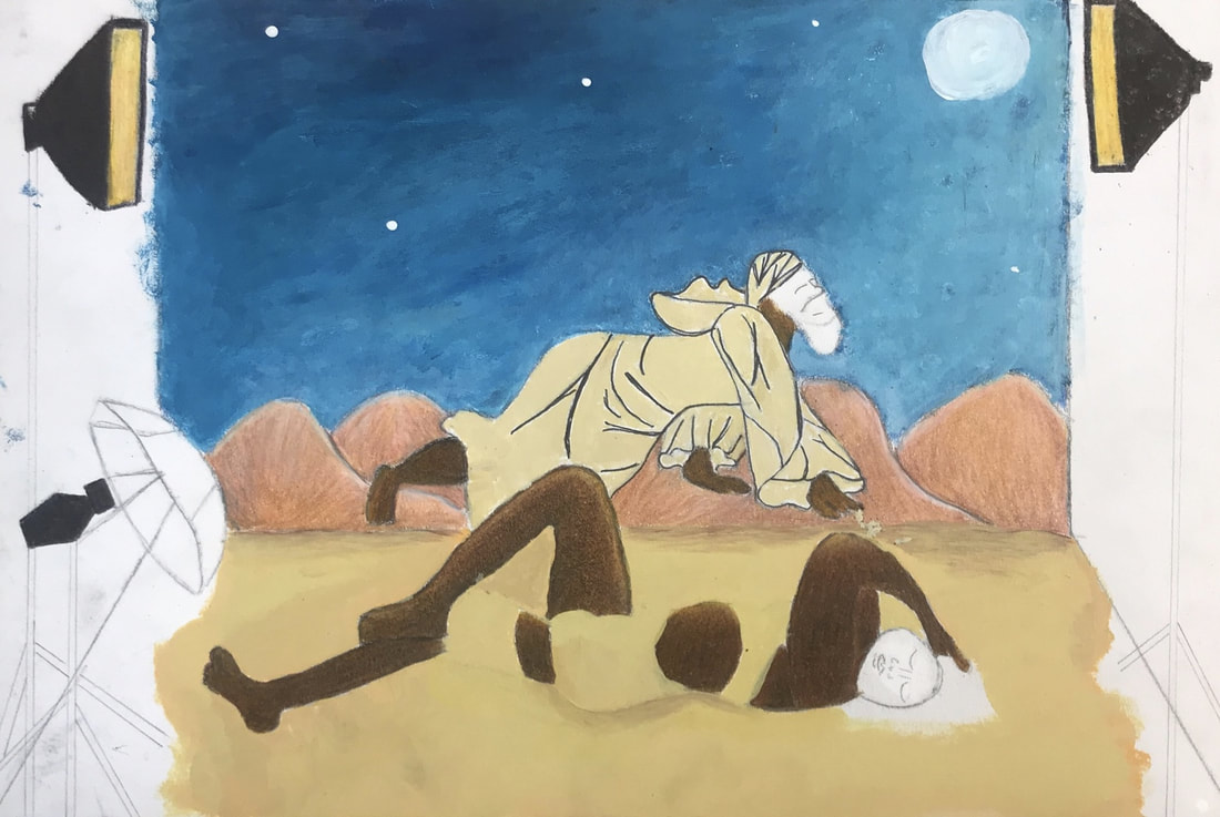
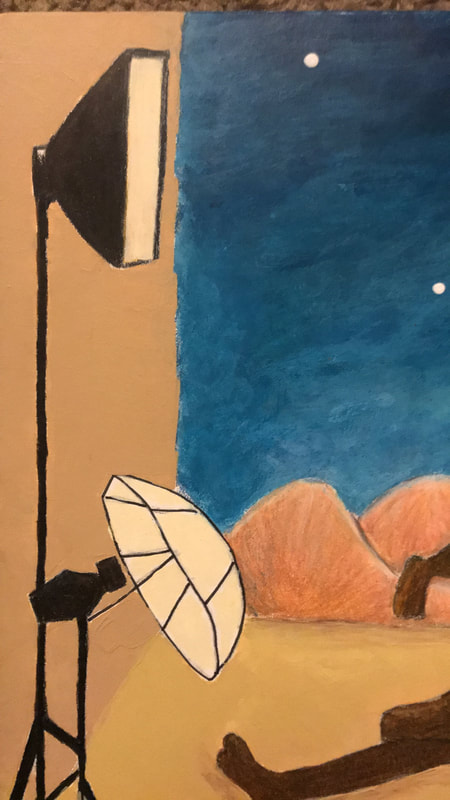
6. The final thing I i did was the photo shoot lights which I made by layering dark brown and black onto each other. Originally I colored the lights yellow but fearing it looked too messy I used the left over white-beige color to re-color it. Then I took the same beige color and added brown to darken up the color to use for the background. I used my number 4 flat brush to try to create clean edges the best I could and finish off the work.
click to enlarge
Expirimentation/ Development of Technique
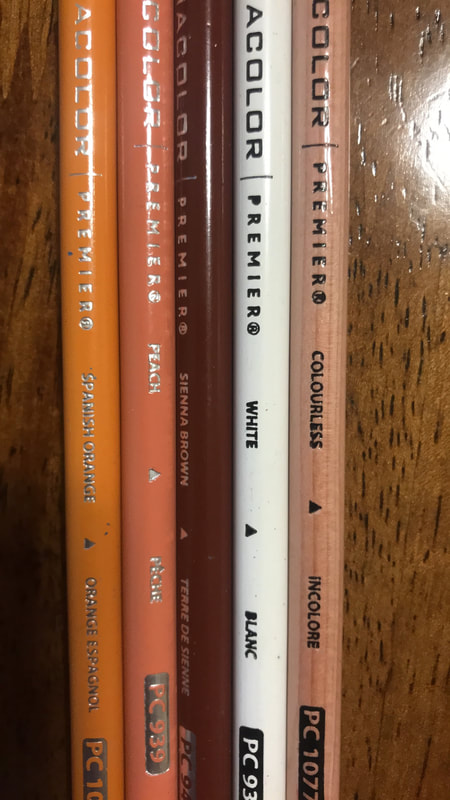
Color Pencil vs. Acrylics
Color Pencil
|
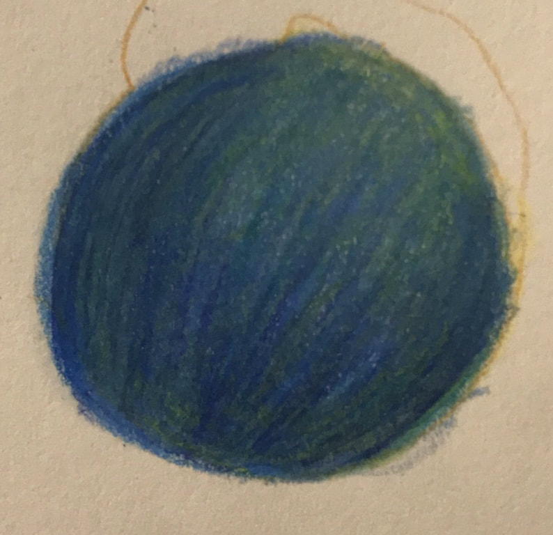
Color pencil is definitely a more arduous medium since it takes more layering and doesn't have as seamless of transition.
As can be seen many times if you don't color in a circular fashion, in the final product you can see the lines of the color pencil. This makes for a harsher look since the lines can be seen; as well as there is no smooth transition. As can be seen from the very light blues next to very dark areas with no seamless blend. Another important thing is there isn't much flexibility when blending color since everything takes layering. As can be seen when I tried layer orange and blue to get a duller darker blue, the blending wasn't totally effective, even when using a colorless blender marker. Many times you can see greenish lines poking through which makes for an odd look. |
click to enlarge
|
Acrylics
|
Click to enlarge
|
As for acrylics although it is much faster and offers more seamless blending, it does have it's own defects. Very apparently it takes only a couples colors to blend and in this case, white was the color that helped creates those different values that transitioned nicely. That being said although they blended nicely, many times, since they are acrylics, the paint would dry before anything could be blended. Still at the end of the day it created a look much more similar to the original piece The Sleeping Gypsy.
|

|
|
In the end after a side by side comparison with the original piece, acrylic creates a smoother effect. Still I believe using color pencils could do a similar job but in smaller areas where you can focus in on specific areas. |
Reflection
Coles Phillips |
Henri Rousseau |
|
|
|

click to enlarge
|
I'm satisfied with the links I was able to make with Coles Phillips who's style I was strongly connected to. Still I will say in the clothes of my male figure I feel like there could have been much more variety. My biggest problem is I was so scared to work with acrylics to make the folds since it was such a small space. Still I felt acrylics and blending instead of just a pen would have made a clearer emulation. Another struggle for me was blending the sand background to the female's body. Mostly because I failed to see that Coles Phillips added little details; like having the female seated on something and having her arm in just the right position to still give her body form. That was where I failed but I was able to bounce back by adding shadow to repair the damage. Surprisingly enough I am most proud of the hair in the female, I think that little detail really ties everything together.
|
From far away I feel rather unsatisfied by the whole look but I do think that the little details in the piece help repair the overall unity and likeness to The Sleeping Gypsy. First off I really wanted the background to be dead on to the original, especially since it sets the scene, since the book my piece is inspired by takes place in Morocco (desert). Still the sky is very off in the coloration and the mountains lack the smoothness and the proportion, they are just way too big. Still I'm really proud of the blending in the skin tone, especially since I had never worked in color pencil to that extent. Overall I would say it feels a bit empty but then I think back to the idea that this represents a photoshoot and most photoshoots are very bare bone with the model as the star. It is paying attention to the star in my piece Zahra, that the viewer can start to understand that I am trying to show how peaceful she is in all her naked glory.
|
ACT Responses
1) Clearly explain how you are able to identify the cause-effect relationships between your inspiration and its effect upon your work?
The effect of my inspiration of Coles Phillips can be seen through texture and use of space, this can be seen in the folds of the clothes and in the fading of the female figure into the sand. The effect of my inspiration of Henri Rousseau can be seen through color and shape this is seen in in the off and skewed proportions of the body and the use of bold colors.
2) What is the overall approach(point of view) the author (from your research) has regarding the topic of your inspiration?
There were various authors that I came across when doing my research but the main distinction for both Coles Phillips and Henri Rousseau was the tone of utter most respect for both artists. The authors in both were well informed of the effect of there art work on their respective fields, illustration and painting. Still my inspiration of The Sand Child also allowed me to get the point of view of someone who was struggling, felt oppressed by their society.
3) What kind of generalizations and conclusions have you discovered about people, ideas, cultures, etc. while you researched your inspiration?
One of my was the book The Sand Child, it was here that I began to understand the how different cultures view the female body and more so the female sexuality. For example here in the United States there is more of inclination, through popular media, to accept the body and its sexuality in its full glory. Still somewhere like Morocco in the 1950's where this book takes place they are more conservative especially since the popular media or social norms came from a conservative interpretation of the Koran.
4) What was the central idea or theme around your inspirational research?
The central idea of in my research is female sexuality, more so the freedom of it, which is why The Sand Child which speaks subtlety to this was key in the research. As well as playing of the idea that popular media affects how we feel about this idea, hence researching fashion photo shoot sets.
5) What kind of inferences (conclusions reached on the basis of evidence and reasoning) did you make while reading your research?
The key idea that came from my research of The Sand Child was inferring that in the setting of the book Zahra/Ahmed's female sexuality was repressed. This is something that through various quotes I was able to infer since Zahra says she feels like a weight off her shoulders once she gets to openly be a female, moreover a scantly clad female.
